
navigating to the bill of materials in the library
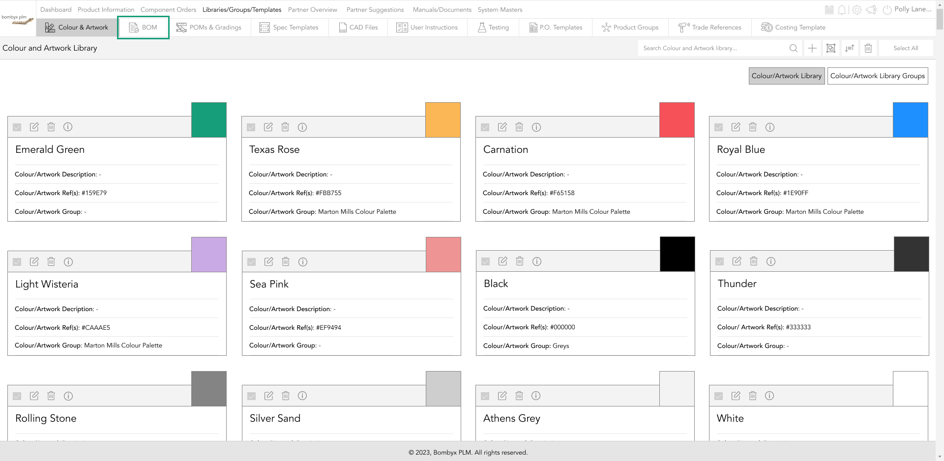
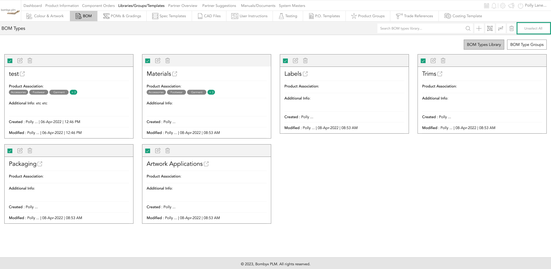
To be able to access the ability to see the bill of materials you will need to click on Libraries/Groups/Templates which can be found in the top bar.
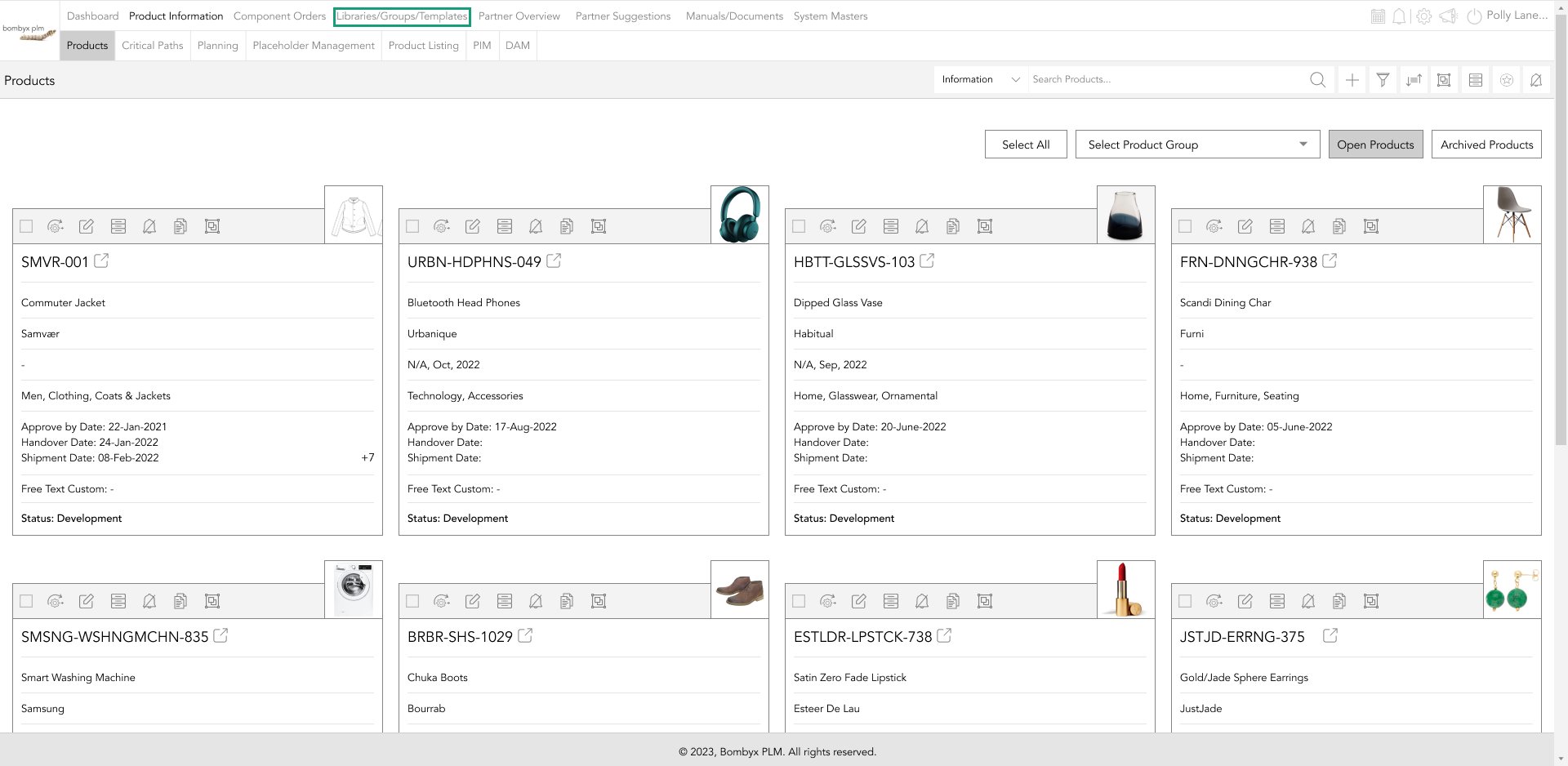
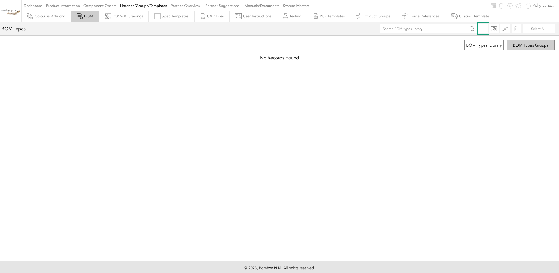
Once you are here if you look across the middle bar you will see the BOM tab you will need to click this to enter the bom type library.
adding bom types
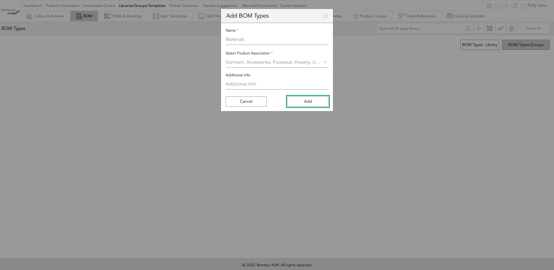
Once in the bom library, to add a bom type tap the plus icon that is located to the right of the search bar.
A popup will appear, it will require you to enter a Name and select an association to your product from the dropdown. Last is a space for you to enter any additional information…
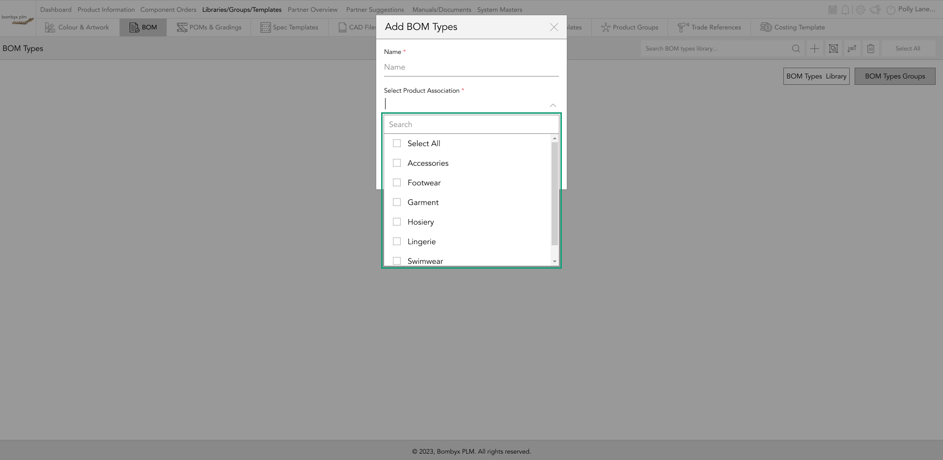
Once done tap add to create a bom type for the library.
edit bill of material types
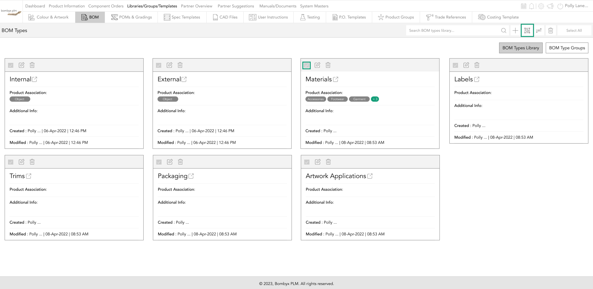
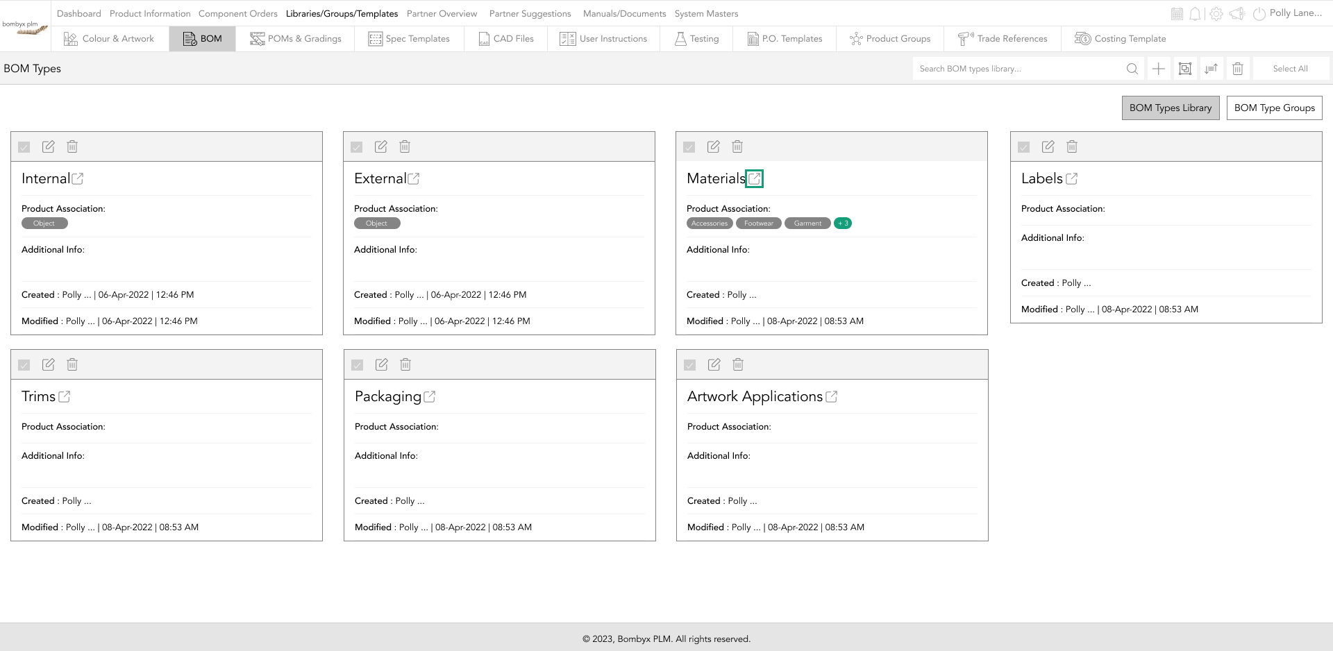
To Edit the information you have previously created, tap the edit icon on the bom cards grey bar.

This will take you back to the popup to update the bom.
add bom types to a group
To add your bom type to a group tap the checkboxes of each bom type you want to add,
once selected, tap the add to group icon, next to the search bar.
This will prompt a popup where you can select from the dropdown list which group you want to add the bom types.
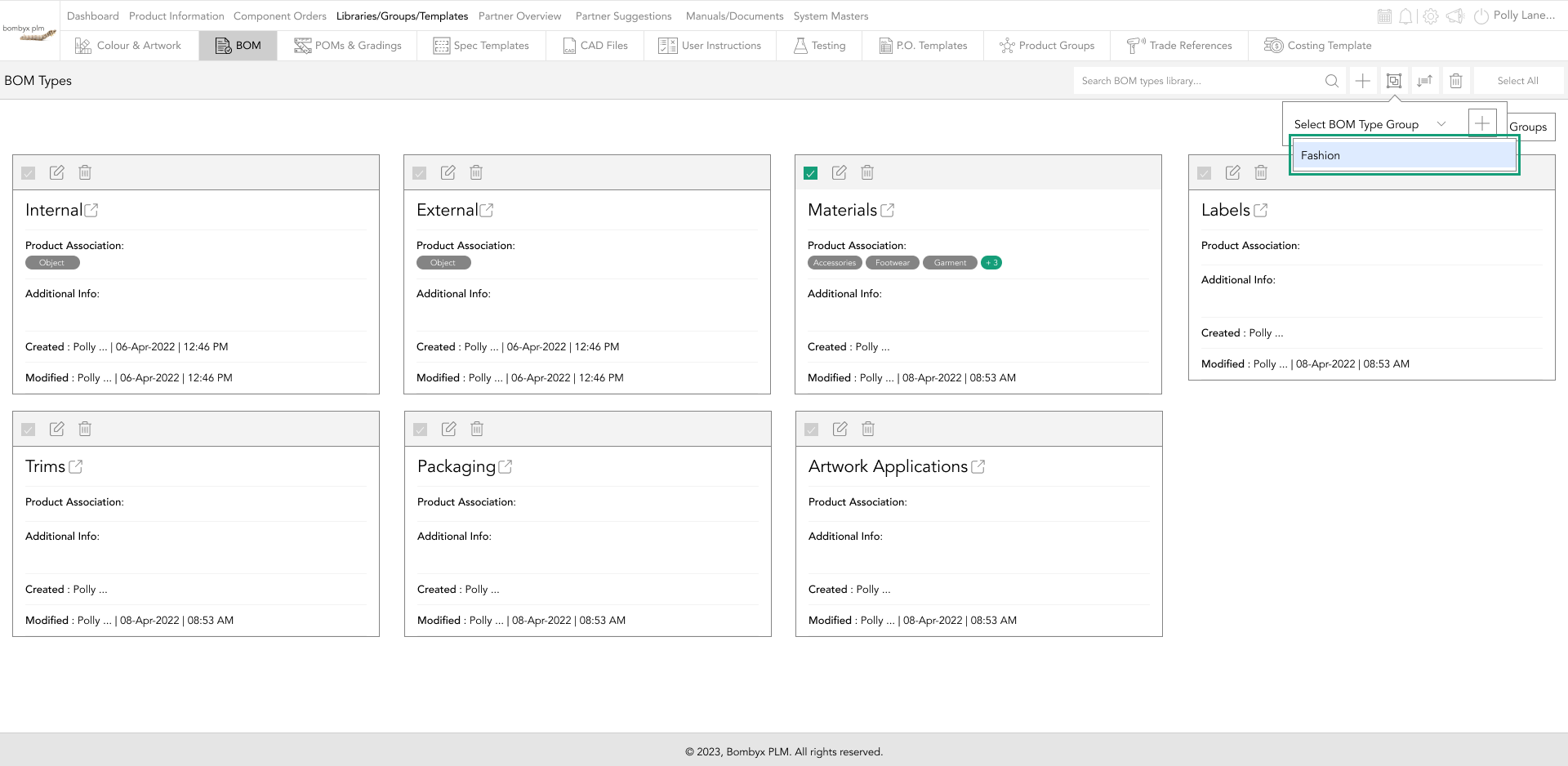
Or if the group is not yet created, tapping the plus icon will take you to create a new group, or you can go into the Colour & Artwork Library Tutorial to find out more.
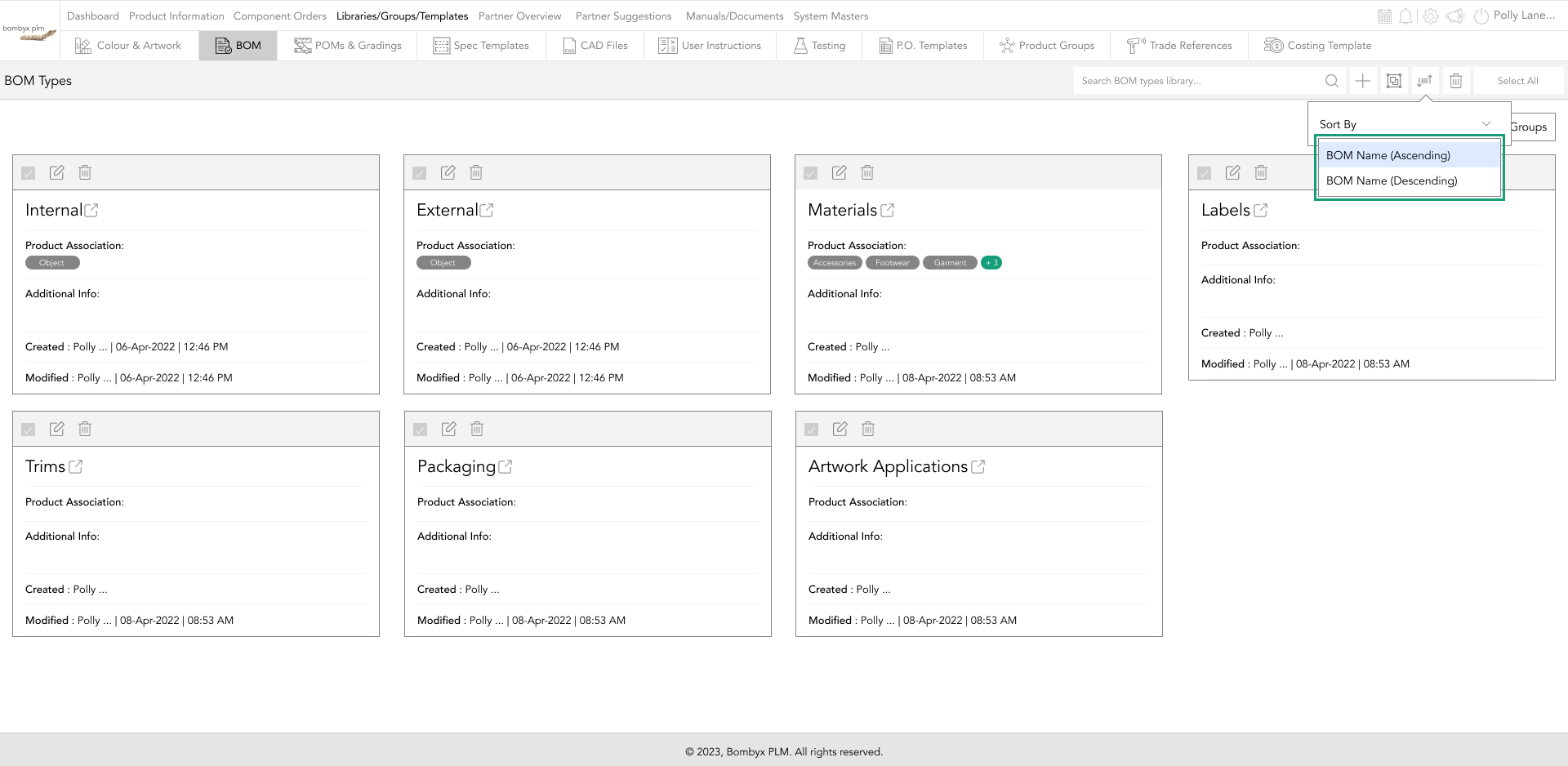
sort by bom types
Tapping the sort by icon…
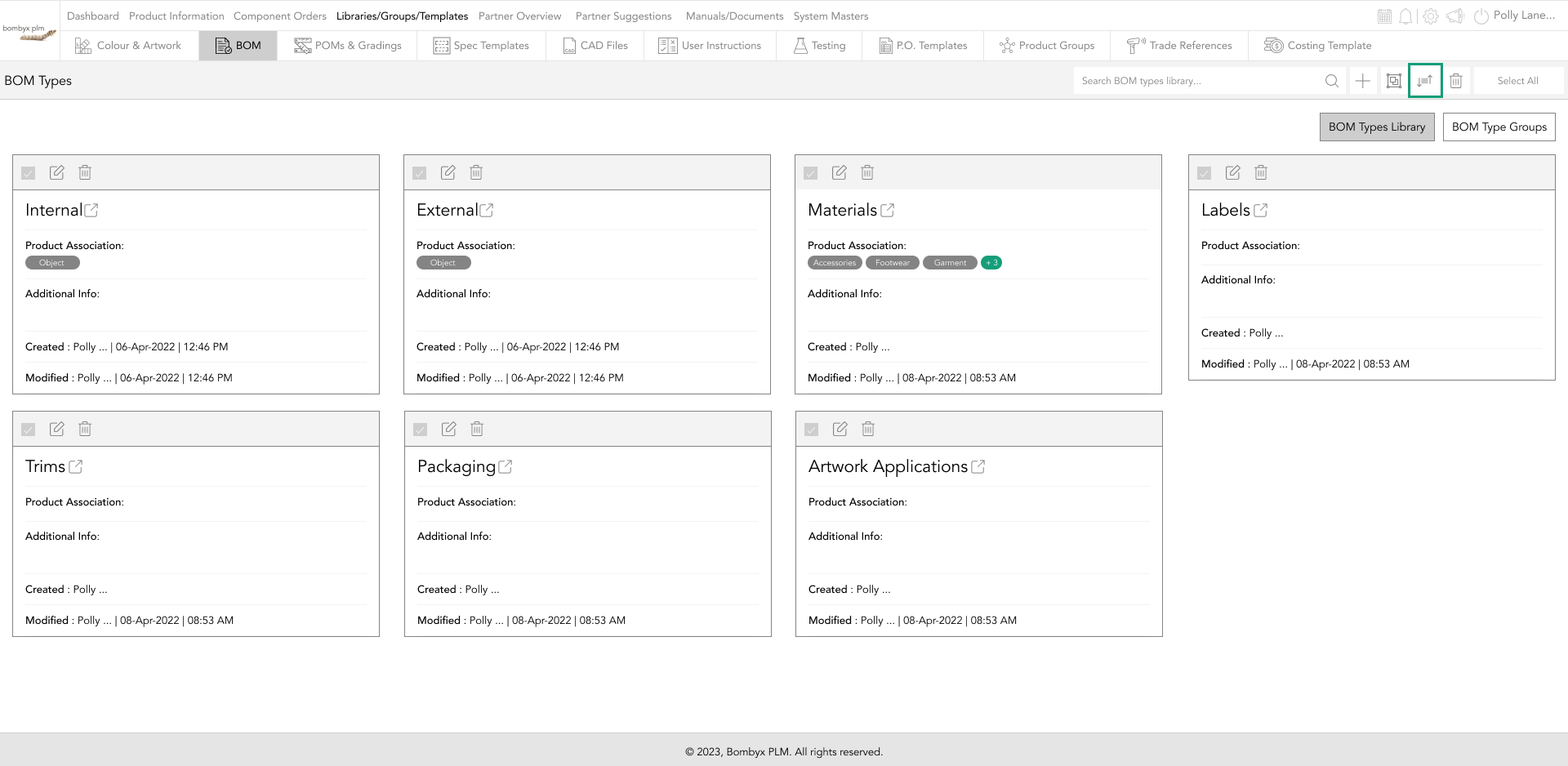
This will allow you to sort your bill of materials by name (ascending) or name (descending).
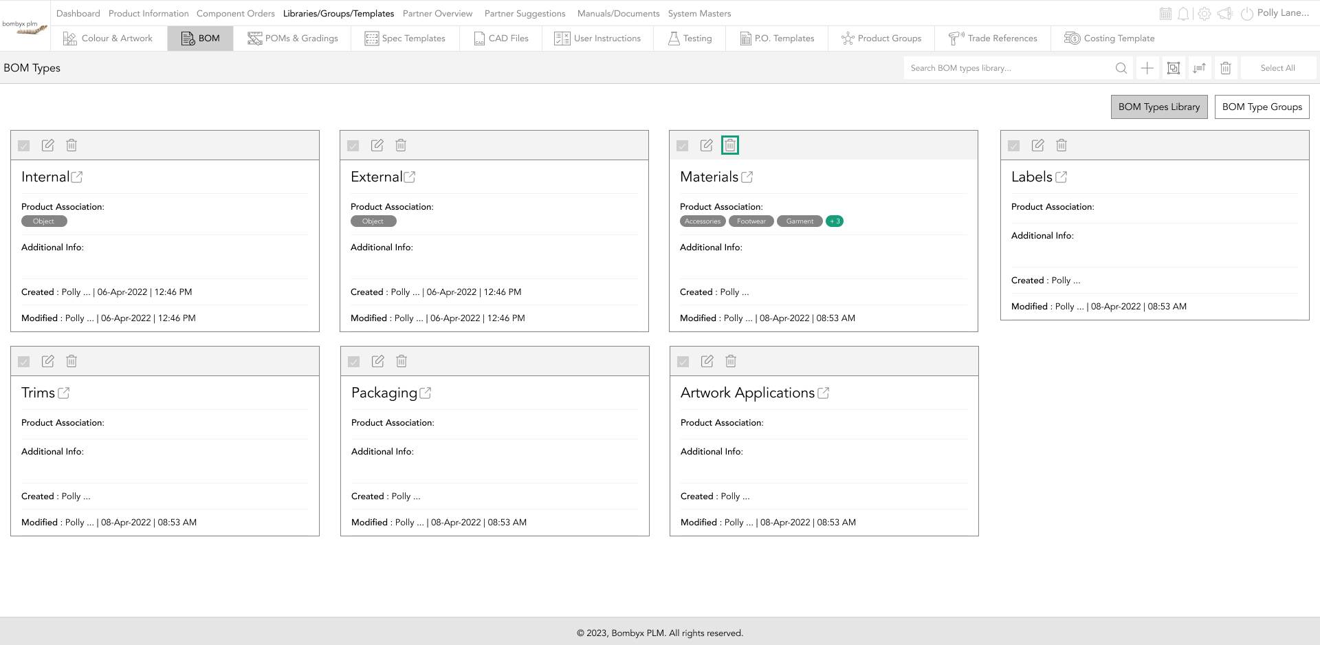
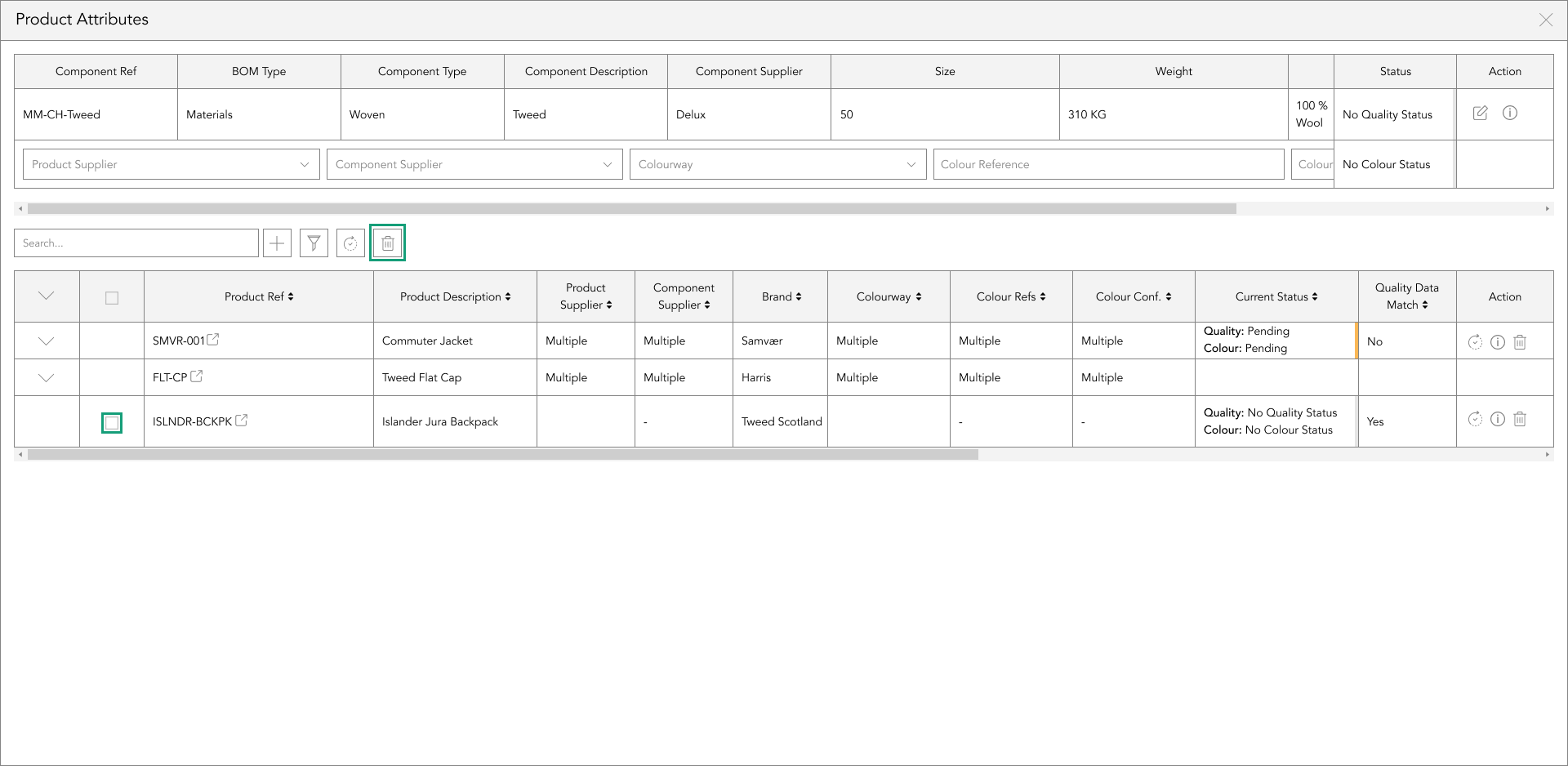
deleteing bill of materials
There are multiple ways of deleting bom types, these are single delete, multiple delete, and deleting all.
To single delete tap the bin icon that is on the grey bar of the bom types card.
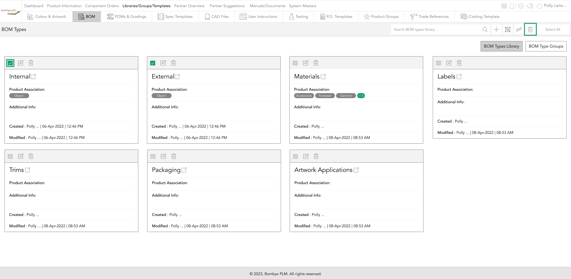
To delete multiple bill of materials tap the checkbox on each card’s grey bar, once selected the ones you want to delete, tap the delete icon next to the search bar.
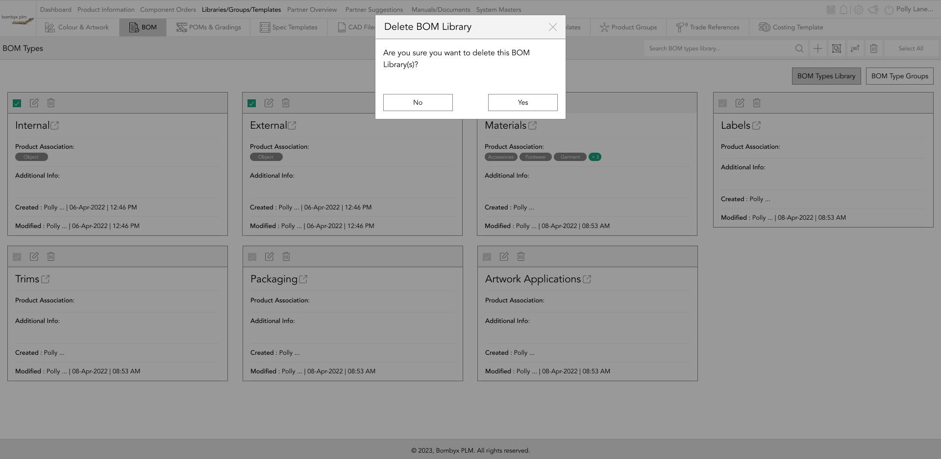
A popup will appear asking if you are sure you want to delete the bom type, tap yes to continue or no to cancel this action.
Tapping select all will mark all of your bom types checkboxes, to delete all click the bin icon next to the search bar.
Once you have selected all, you will now have the option to unselect all in the same position as the select all button.
entering the bill of material
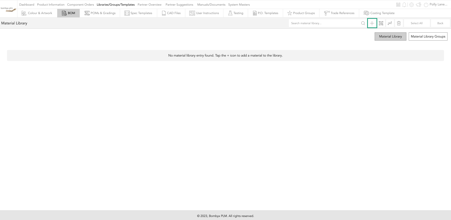
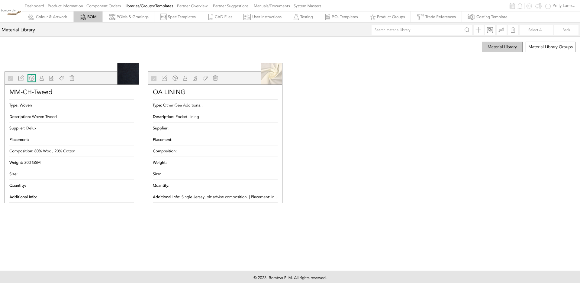
To enter the bom type, to add components, you will need to tap on the Name/icon on the bom card.
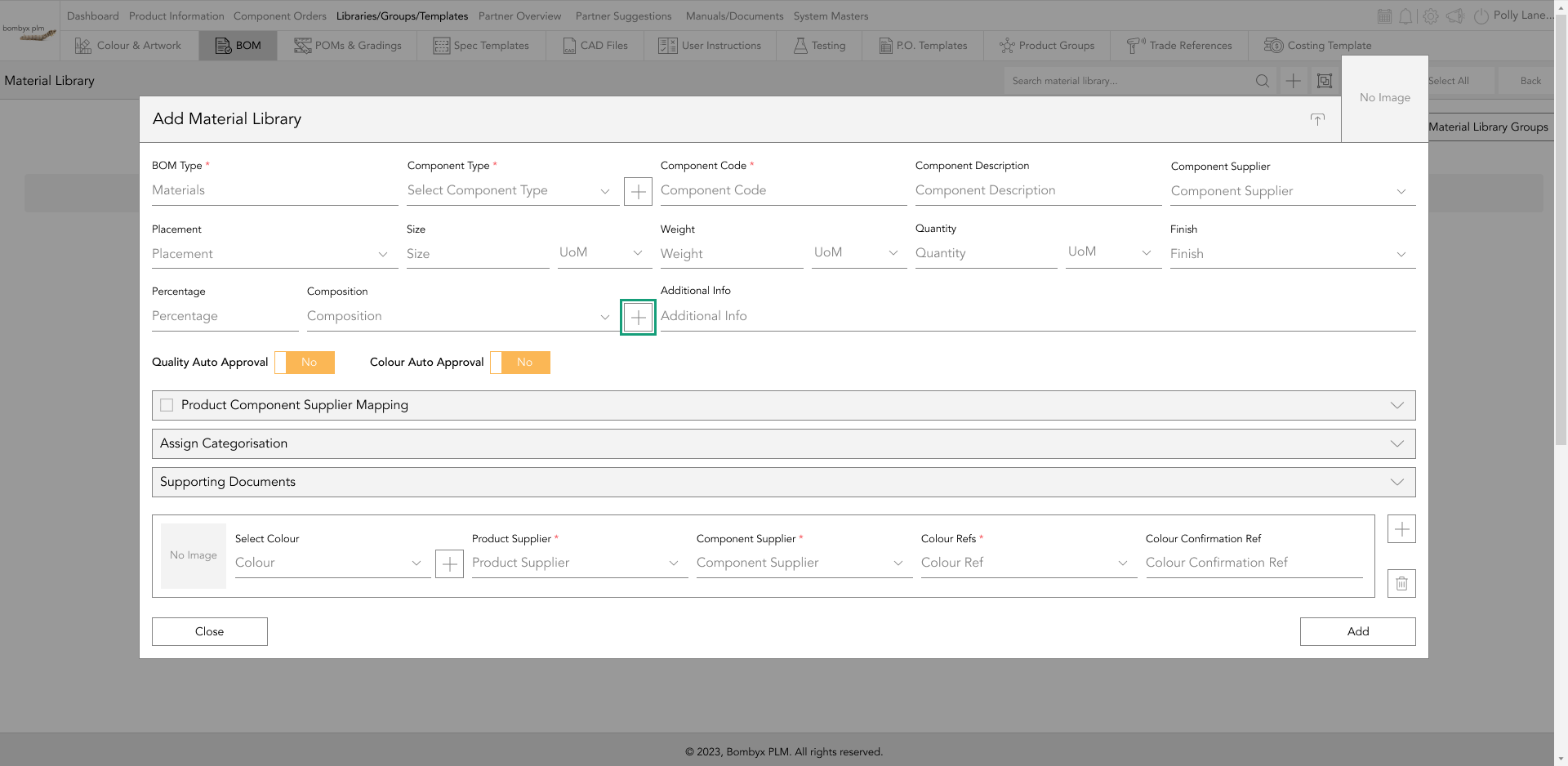
Tap the + icon and a popup will appear, in the popup, you’ll be able to enter the following information:
- Type
- Code
- Description
- Component Supplier
- Placement
- Size
- Weight
- Quantity
- Composition
- Additional Information
These are an array of dropdowns and text boxes, if it’s a dropdown these are predefined values that can be added in the system masters section, or if a plus icon is next to the field, you can add it from the popup itself, and that will automatically feed that option for reuse to the system masters section.
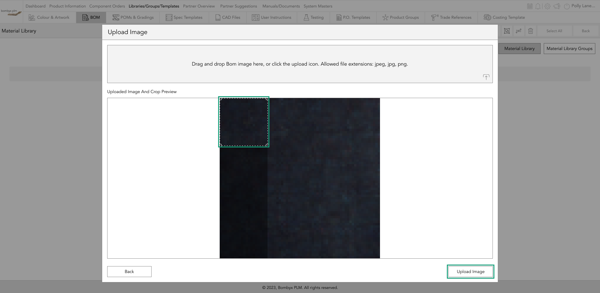
upload an image for the componenet
Tap the upload icon in the top right corner of the components card, A popup will appear in which you can drag and drop the image into the grey box, or you can tap the upload icon in the bottom right corner.
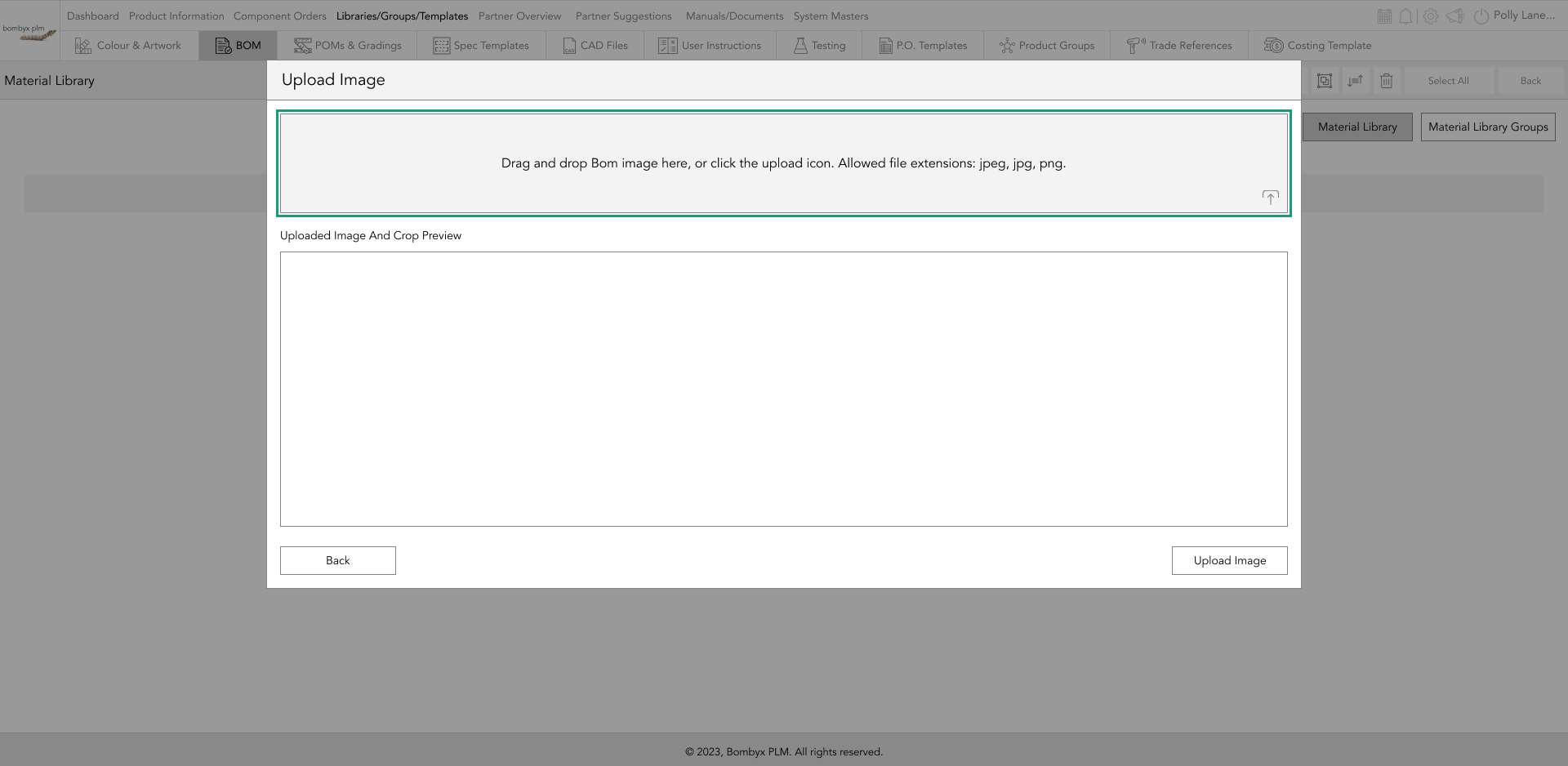
Once the image has been selected, a preview of that image will be displayed in the ‘Uploaded Image and Crop Preview’ area where you can then crop the image to focus on a preferred area by dragging one of the square crop handles in the corner.
Once you’re happy with the cropping position, tap the ‘Upload Image’ button.
adding components in the library
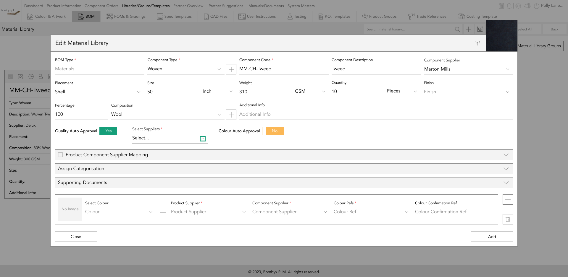
Once you have created your bom type, you can now go into that bom and add components. When you have tapped the plus icon, this will prompt a popup card for you to enter the information for a specific component.
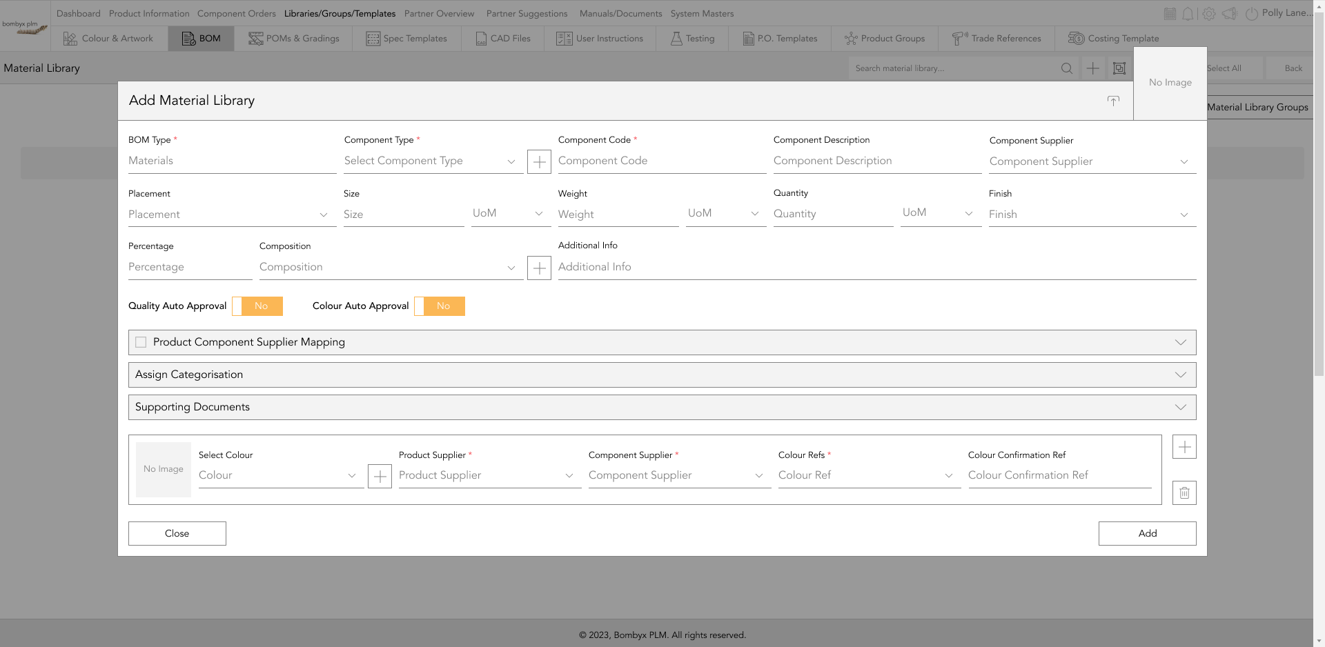
You’ll notice a red * along with the first three fields. In order to create a component card, these fields will need to be filled in before you’re able to tap on add/update.
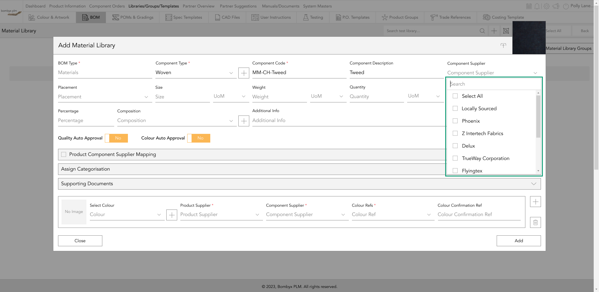
In the component supplier field, you’ll notice all of your component suppliers are listed along with an option at the top that states ‘Locally Sourced’. This is where the supplier will source the requirement instead of the company providing a source that they have nominated themselves.
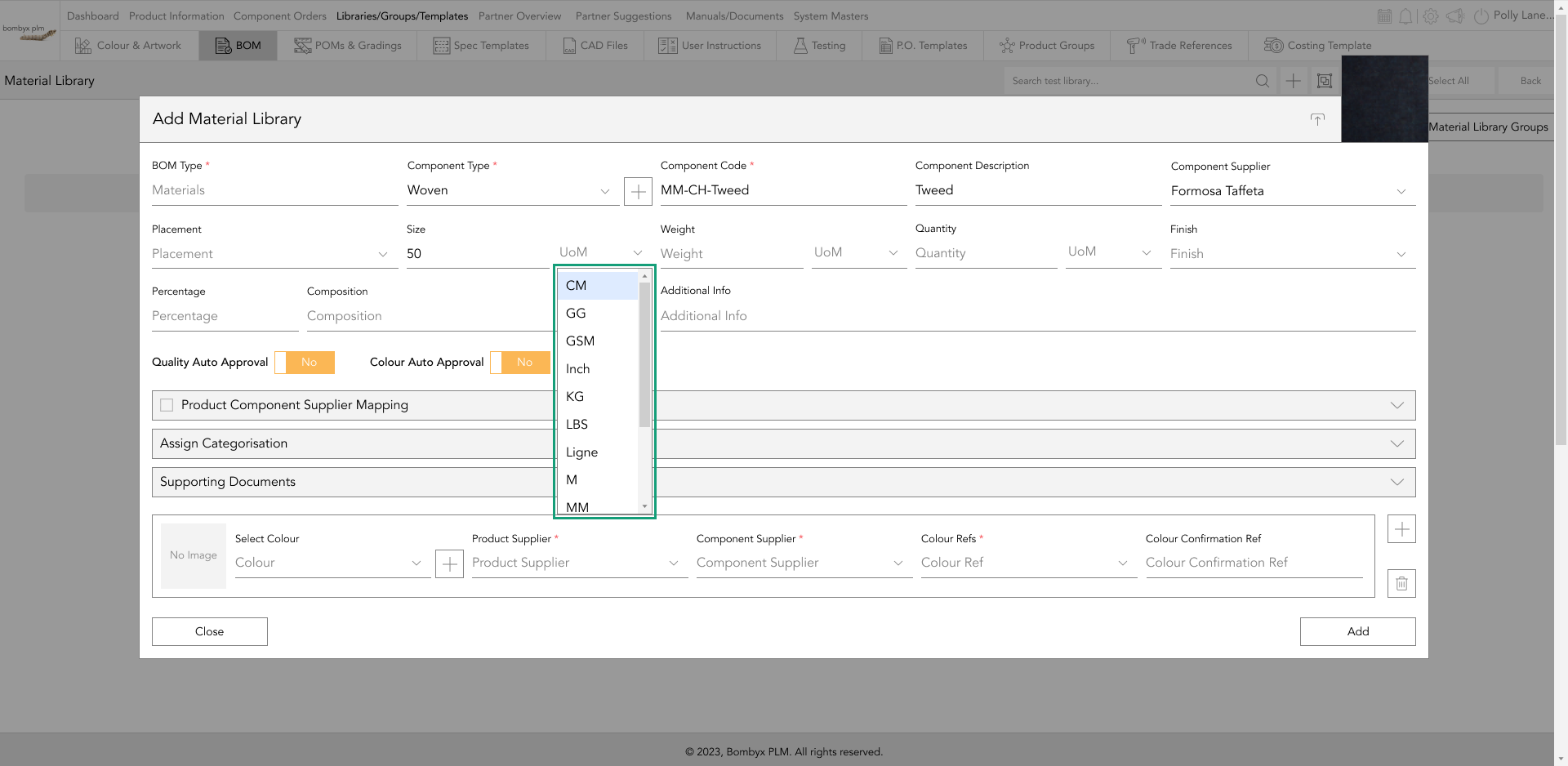
Unit of Measure (UoM) is a second field for quantity/volume and weight to identify how they will be measured. For example, it could be the weight of the material which could be in GSM or Ounces, or it could be the quantity of buttons per jacket which would be in units/pieces.
If the component has more than one composition, next to the composition fields there is a + icon as well as a trash icon. If you tap the + icon, more fields will appear for you to enter the other compositions. If you’ve made a mistake and added too many fields, you can tap the trash can and will remove the most recently added set of fields.
supporting documents
The supporting document is just that, it supports the information you’re entering in the component card. A supporting document could be a test report, or a certificate to confirm that it’s organic. It can be absolutely anything that helps support that component and be of useful reference to companies and their suppliers.
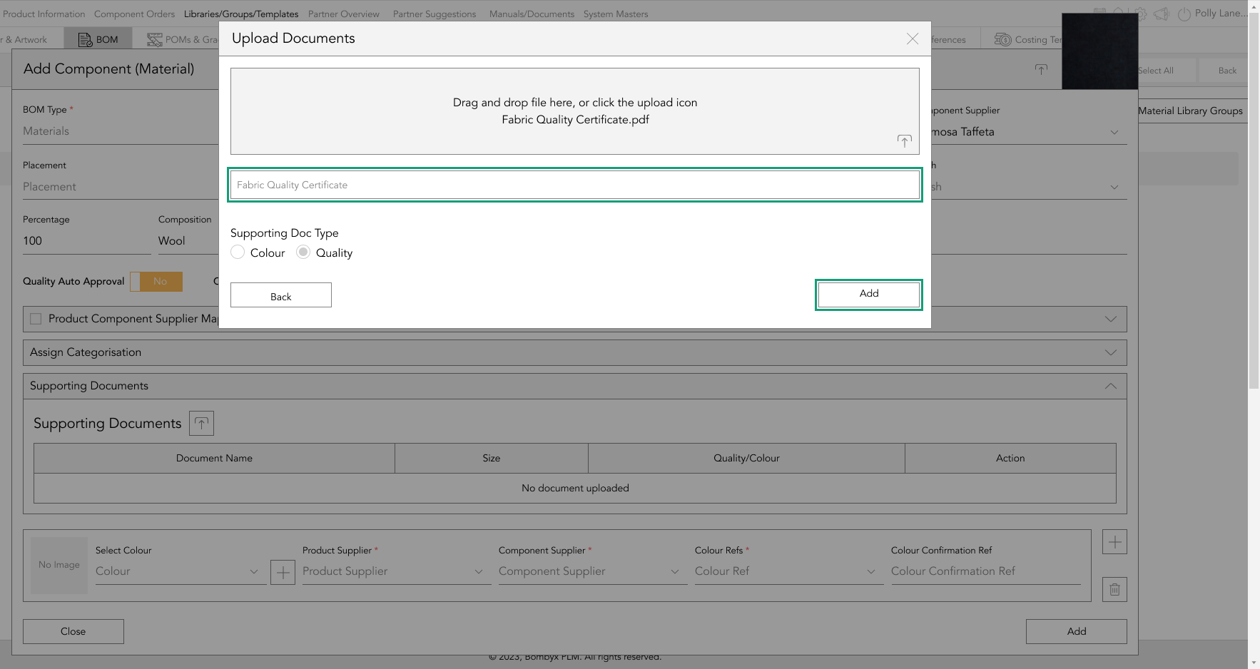
To upload an item all you have to do is tap the upload icon next to the ‘Supporting Documents’ subheading and a popup will appear.
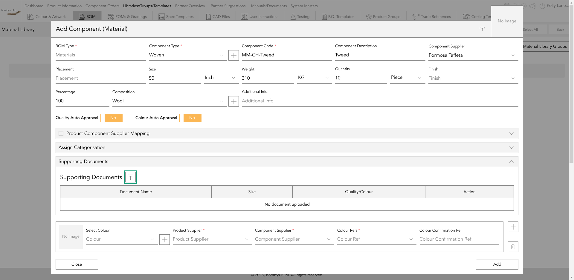
There are two ways of uploading a file, you can either drag and drop the file into the grey box or tap the upload icon at the bottom right of the grey box.
Once you’ve uploaded the file, give the document a title and tap ‘Add’.
The supporting document has 5 actions which can be seen in the action panel; edit, preview, download, bin, and the information icon.
The edit icon allows you to rename the document.

The preview icon allows the user to preview the document.

If for whatever reason you need to download a copy of the document you have uploaded to the component you can do this by tapping the download icon.
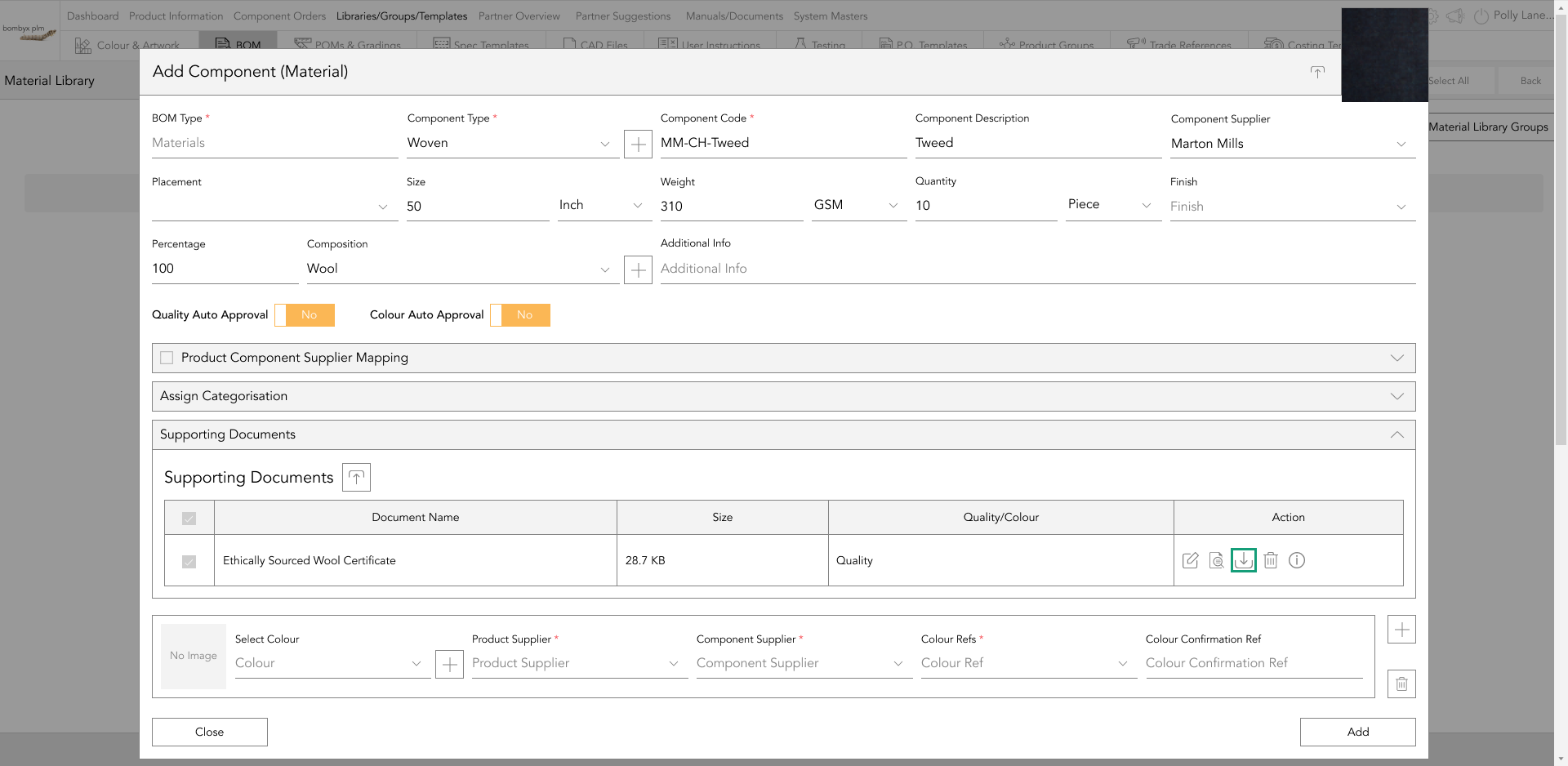
The information icon will show when the item was uploaded, and when it was last modified with a user's name, date, and time.

The delete icon is if you no longer need this supporting document, you can tap the bin icon and remove it from that BOM component.

All of the fields you’ve entered are part of the quality aspect of the component, the next section we’ll look at the colour application to the component.
quality auto-approvals
When creating a new component, the two buttons will be available for you to select if you would like to always approve the quality or the colour for that specific product or component supplier.
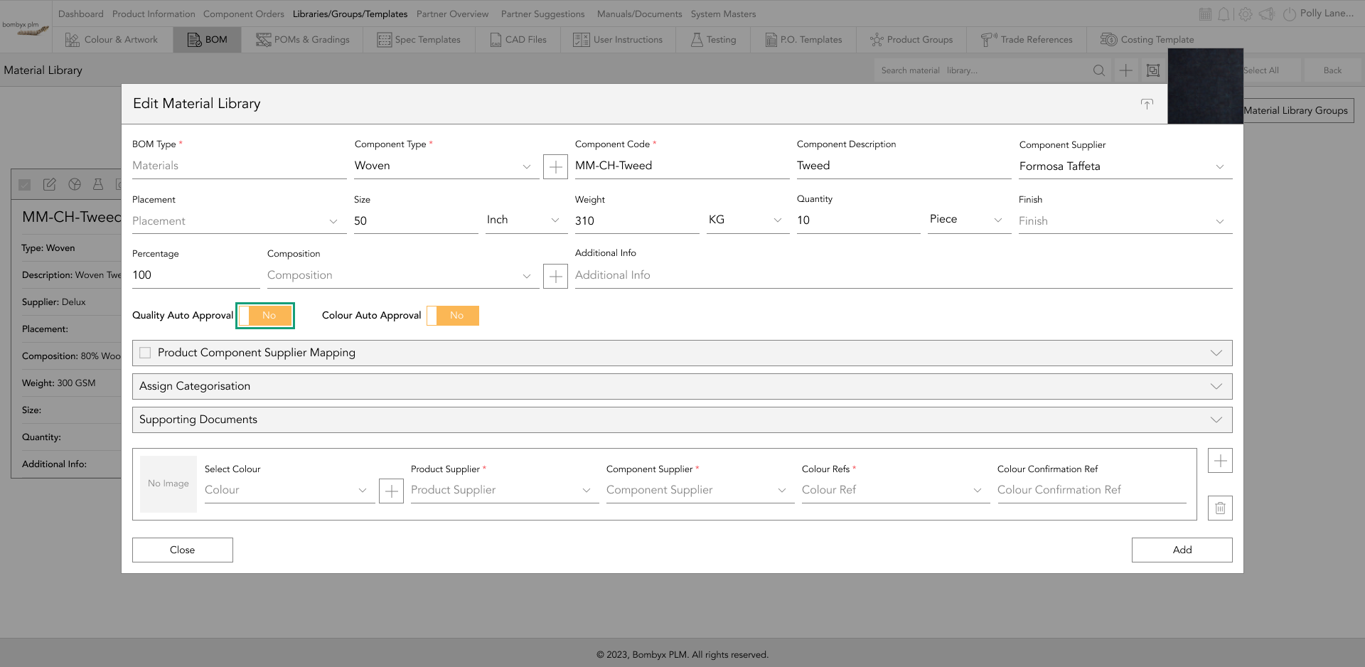
When turning the quality auto-approval on, a dropdown will appear in which you can select the supplier of the component that you’d like to always remain approved upon importing into a product.
edit components
To edit the information you’ve previously entered on a component, tap the ‘Edit’ icon on the bar of the component card.

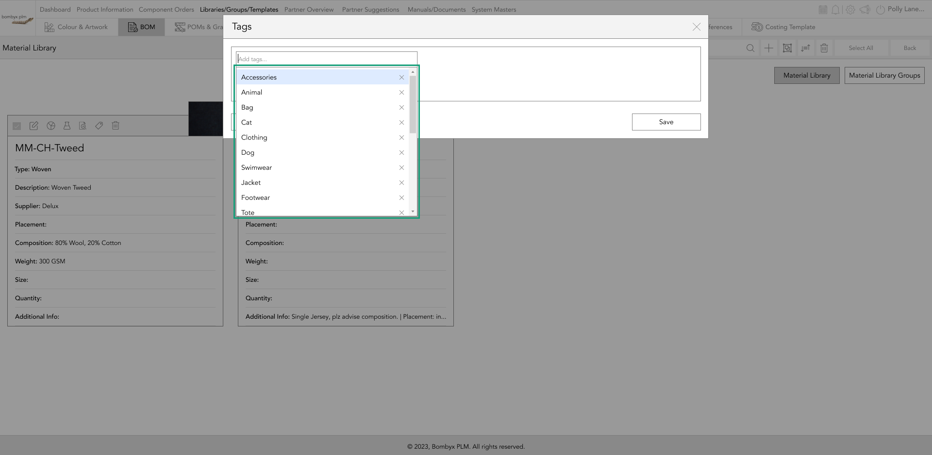
add tags to components
You can create tags for your components, by tapping on the tag icon on the component card…
Once tapped a popup will appear where you can create tags for that specific component, once you have added your tags, tap save.
To search/import a bom type through tags, navigate your way to the top right-hand side of the page, here you will see the search bar function, and a bom library dropdown menu, select a tag from the dropdown menu…
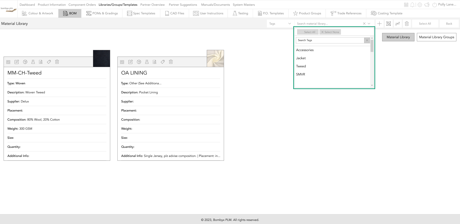
Now you can start by searching for the tag that references your bom, when you see the bill of material appear in the search bar, tap to import it.
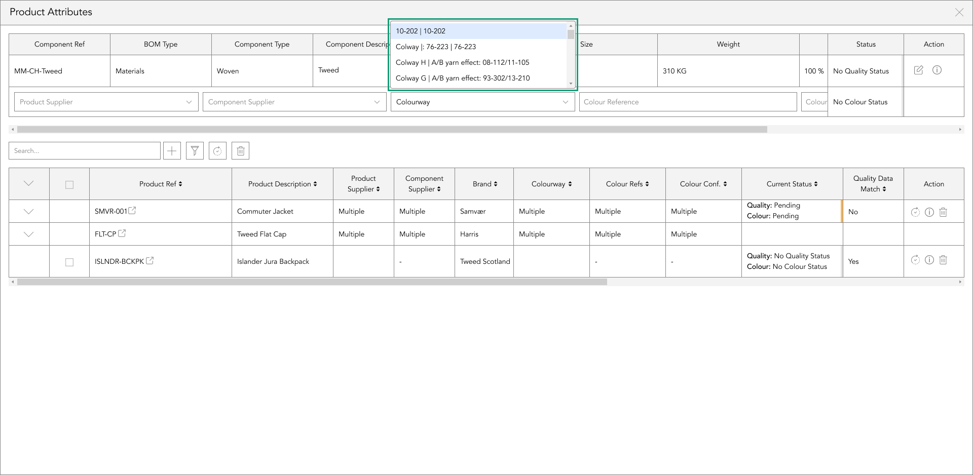
colourway
A colourway is a design that is created in an alternate colour palette to the original design. For example, this product has two colourways, Midnight Ocean, and Charcoal.
The colourway selection within a BOM component is a dropdown of colours attributed to the product when you first create the product in the product information.
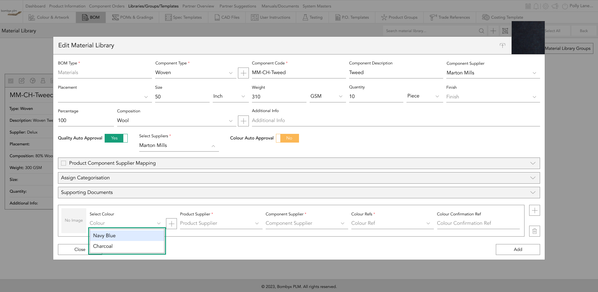
If the colour you require isn’t available in the drop-down it’s because it hasn’t been added to the core product information, and will need adding in order for it to appear in the dropdown listing.
You can add this by going into the Colour & Artwork library within Libraries/Groups/Templates in the main menu bar.
colour reference
The colour reference is the colour you would like that BOM component to be for a specific colourway.
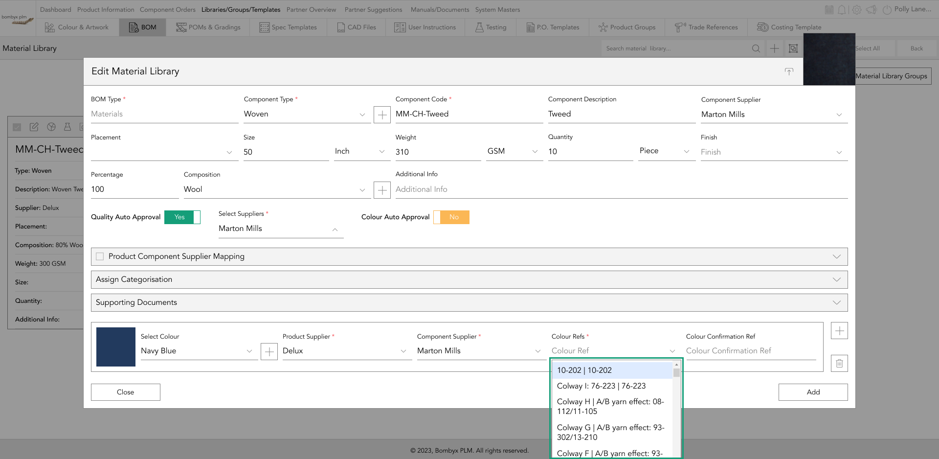
For example, if the Artwork application is a piece of embroidery, and the colour of the embroidery for the Midnight Ocean colour is Turquoise, but Yellow for the charcoal, in the dropdown of the colour reference you’d select Turquoise for the Midnight Ocean colourway option.
colour confirmation reference
The colour confirmation ref is if your supplier has sent several colour variations of the same colour reference for you to pick from. As this example is a piece of apparel, in that industry it would be called a ‘lab dip’.
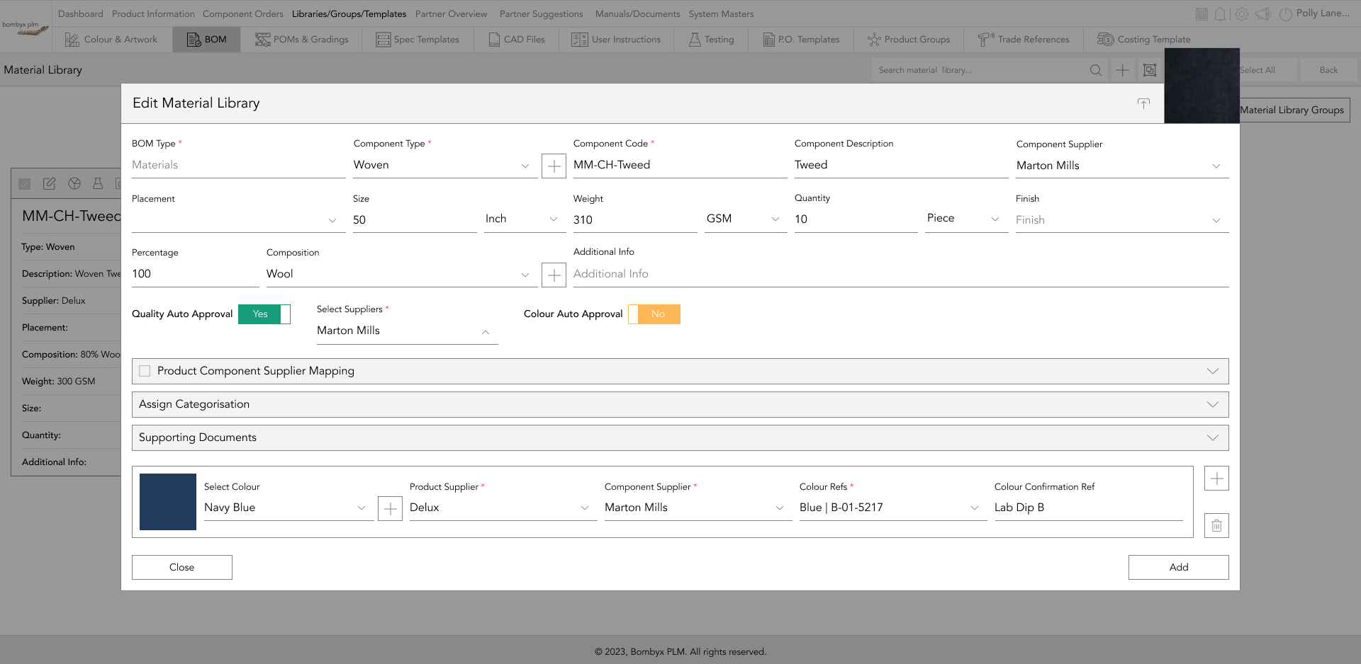
A lab dip is a dyed fabric sample made to meet the colour standards of a designer. It is generally developed by a dye house or a colour lab. The purpose of a lab dip is to give a designer an idea of what the fabric colour will look like for manufacturing. More often than not a supplier will provide several options that are as close as they could get to the requested colour and they will be labelled as A, B, C, D, or 1, 2, 3, etc. If you pick C, in the confirmation ref field you would potentially put ‘Option C, or ‘Lab Dip C’.
colour auto-approvals
When turning the colour auto-approval on, a further toggle button will appear to the right of each colour reference and colour confirmation line.
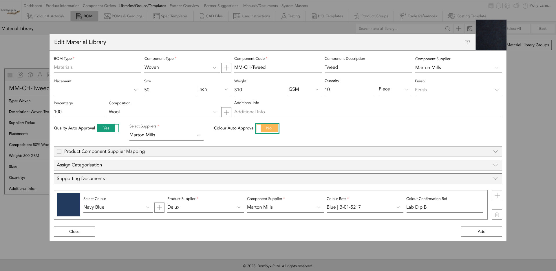
Tap the toggle buttons for the colour references that you’d like to always remain approved by that specific component supplier upon importing into a product.
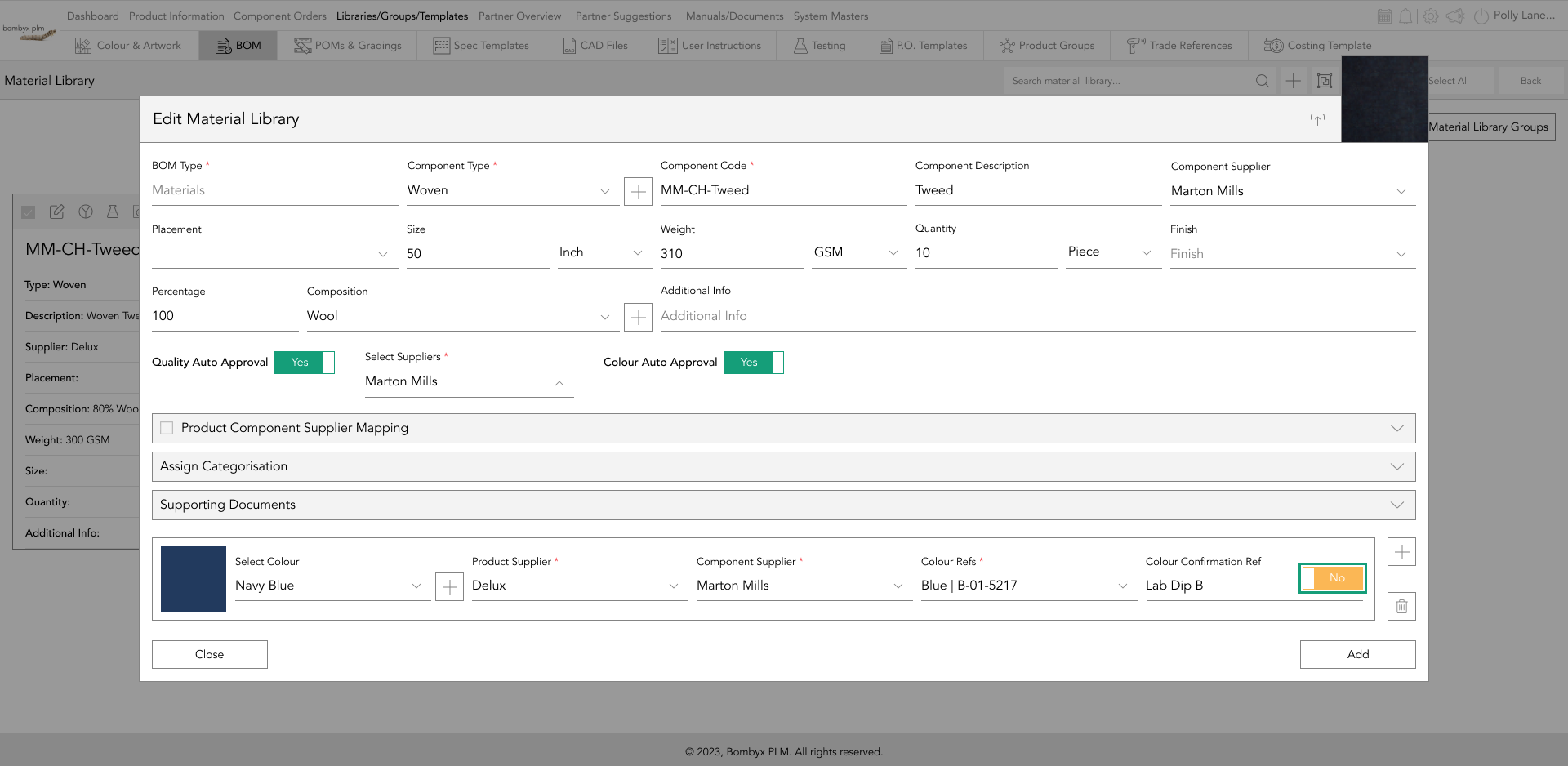
Note: When adding a new component to a product, before the colour auto-approval function can be enabled and selected in another product, you will need to tap the ‘add to library’ icon in the header of the component card.
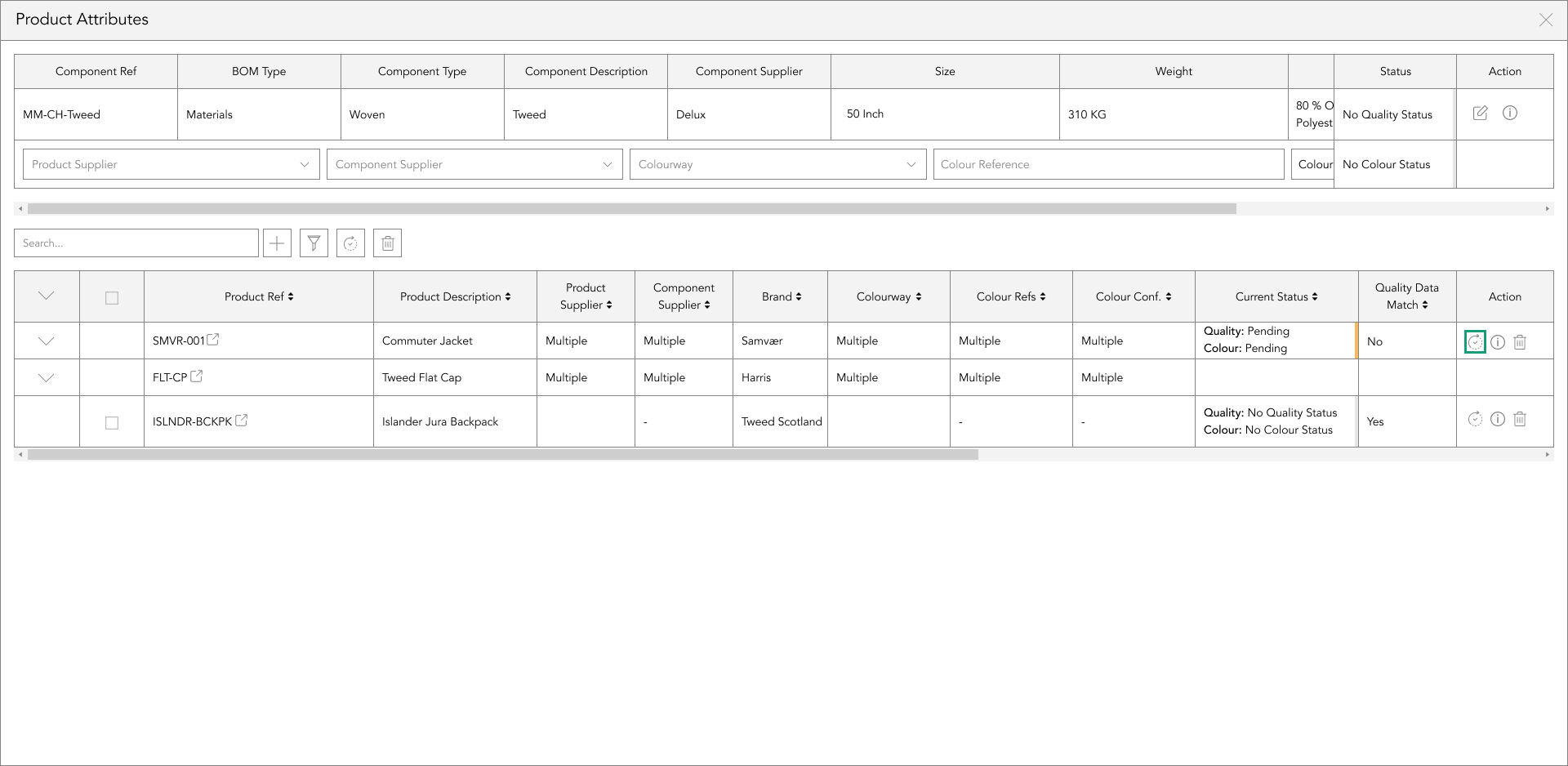
bom usage
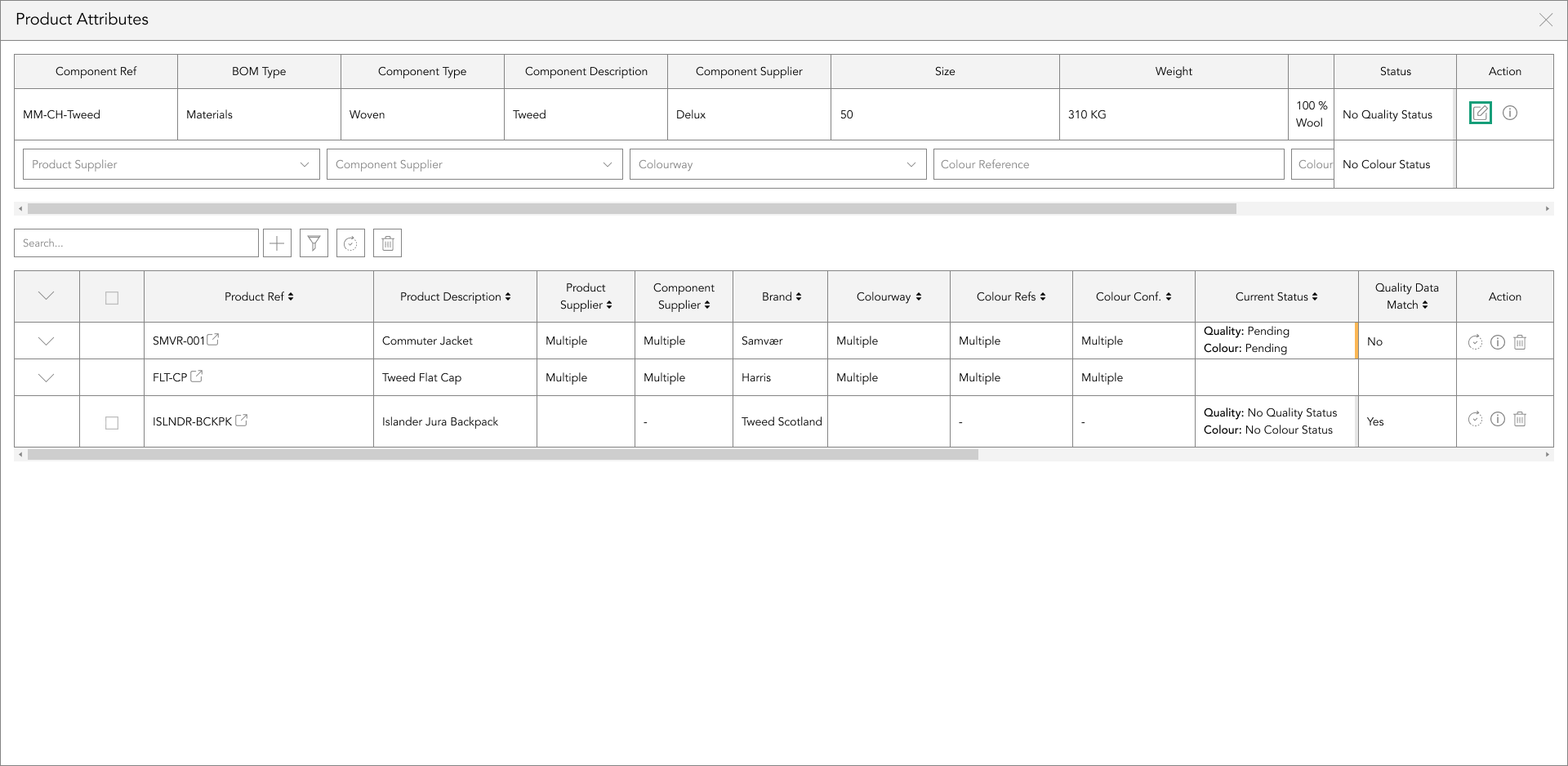
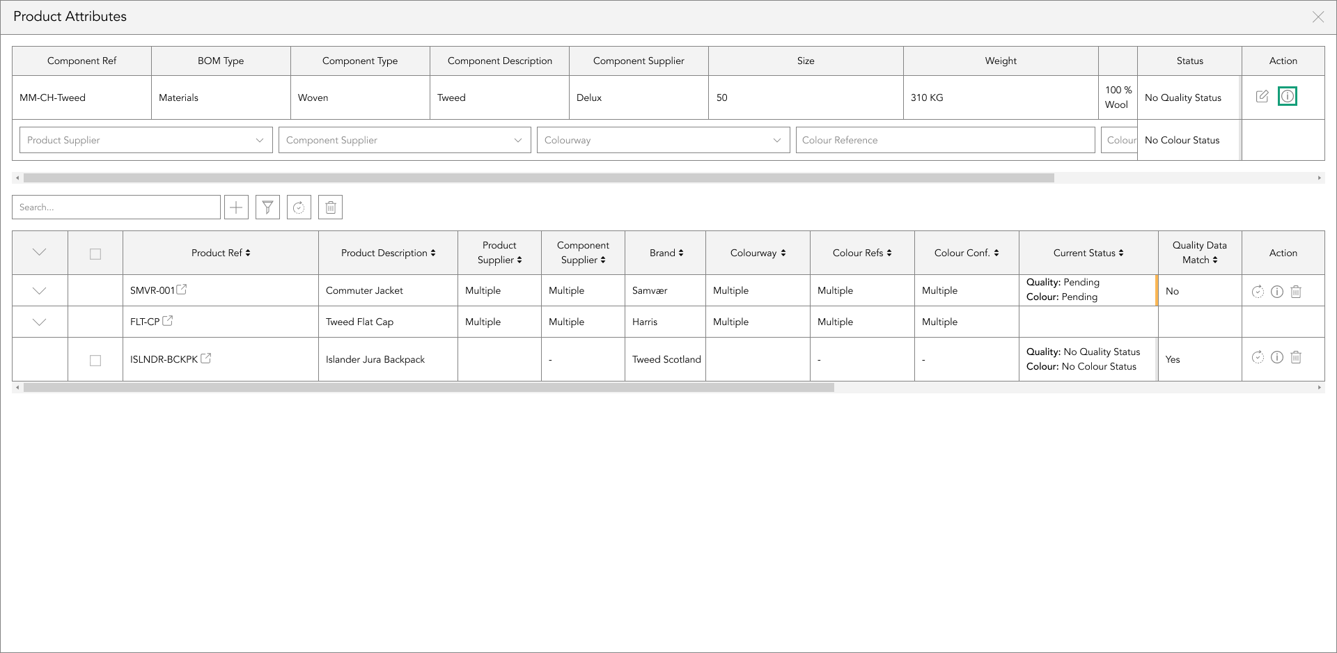
BOM Usage is a function that gives you the ability to see where that component is being used on other products.
It’s useful when you’ve amended a BOM item and need to flush through those changes to the other items within other products, as opposed to individually going into each one and amending manually.
To enter the bom usage, tap the icon on the header bar of the component card.
edit
To edit the information in the Bill of Materials, you don’t have to leave the usage popup, you can edit the information within the component card and push those changes through.
To edit the information you’ve previously entered on a component, tap the ‘Edit’ icon in the ‘action’ column, and start editing.
created and modified information
To see who uploaded or modified the BOM component, hover over the information icon in the Action column, and it’ll show the details of when the component was uploaded, by who, as well as the date and time.
It’ll also show when it was last modified, and by who, along with the date and time.
component filtering
If you’re wanting to view information across multiple products, for a specific product supplier, component supplier, colourway, or colour reference.
Select options from the dropdown menus in the top table that is displaying the usage of the BOM component you selected.
searching products
Below the top table is a search bar that allows users to filter the bottom table results by typing in the product number or description.
When one of these is typed into the search bar, the bottom table will only show results relating to the typed search and hide the view of any other product numbers or descriptions that don’t relate to the search.
adding bom components to other products
To add the BOM component in the top table to a product that doesn’t have that BOM component in it, tap the + icon to the right of the search bar function.
This will enable a table below, where you will select from the dropdown the product reference.
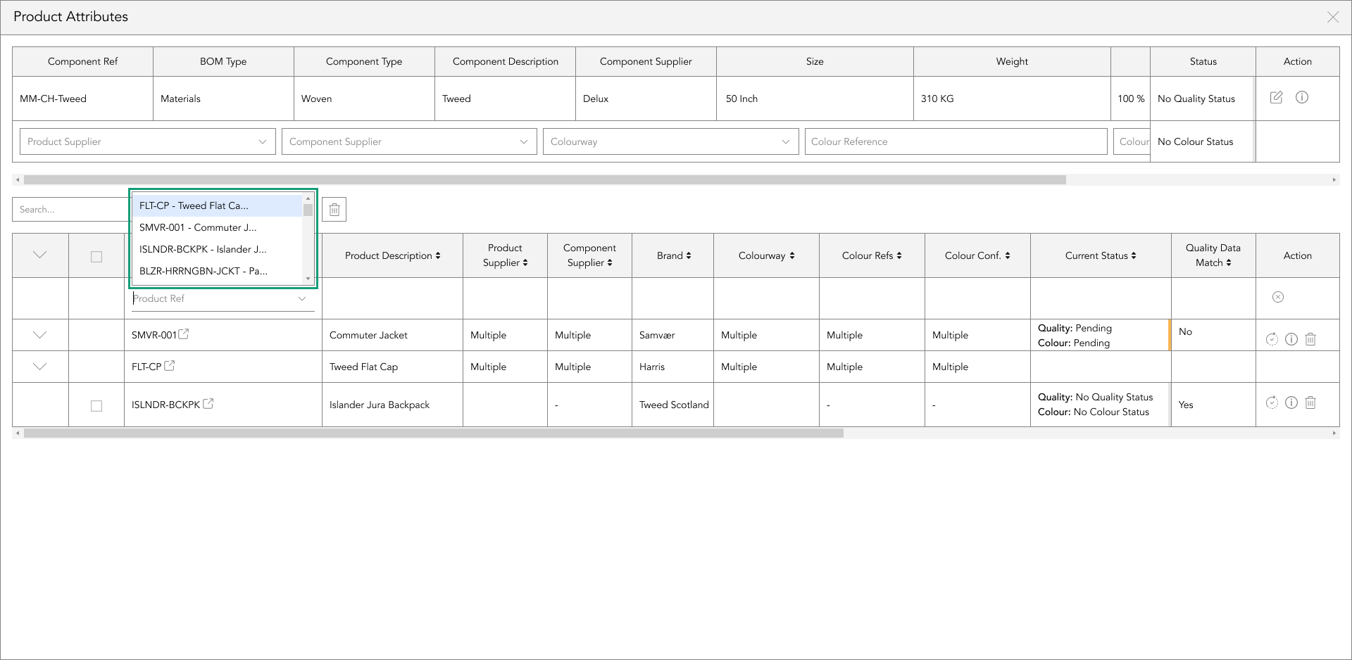
Once you have selected a product from the dropdown, this will automatically save into the table.
product syncing
There are two ways you can sync your product data, these are single and multiple syncing.
To sync a single product, on the right-hand side of the table, in the action panel column, tap the sync icon to apply the component data from the top table, including the selected product's status.

If you want to sync the component data, including the status from the top table to multiple products in the bottom table at once, select the checkboxes down the left side of the bottom table, and tap the sync button positioned to the right of the search bar function.
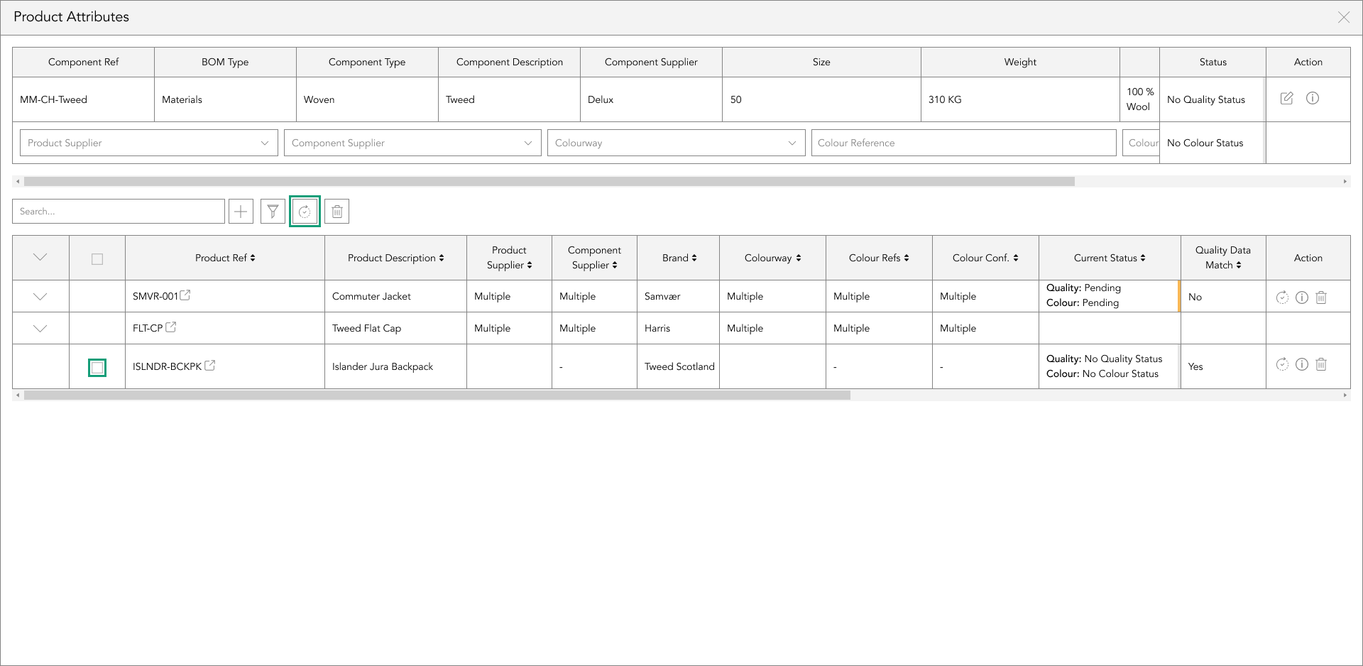
A popup will appear asking you if you’re sure you’d like to sync the component data from the top table to the selected products in the bottom table. If you select ‘Yes’, those rows will be updated with the component data in the top table including the status. if you select ‘No’, they will remain as they were previous to tapping the sync button.
deleting components from another product in usage
To single delete a component, on the right-hand side of the table, in the action panel column, tap the delete icon to remove the BOM component displayed in the top table from the selected row in the bottom table.
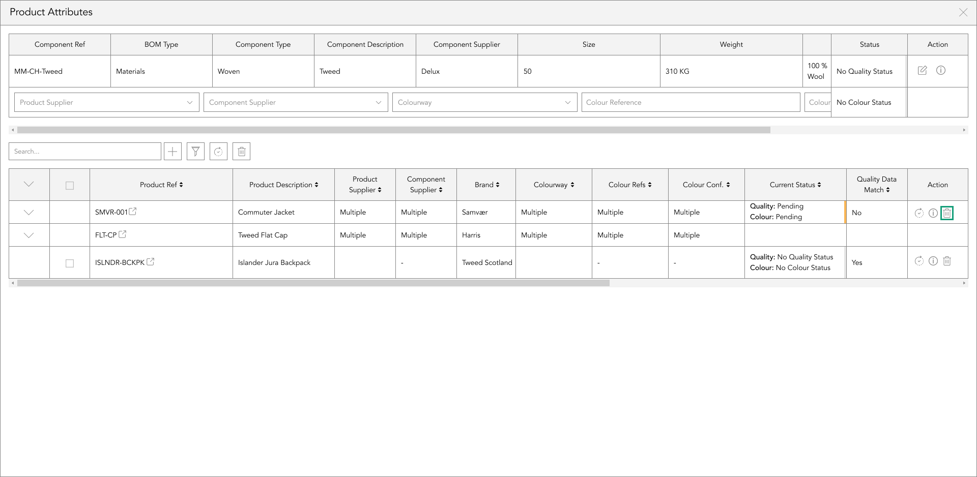
If you want to delete the BOM component displayed in the top table from multiple products at once in the bottom table, select the checkboxes down the left side of the bottom table, and tap the ‘delete’ button, positioned to the right of the search bar function.
A popup will appear asking you if you’re sure you’d like to delete the selected BOM component from this product.
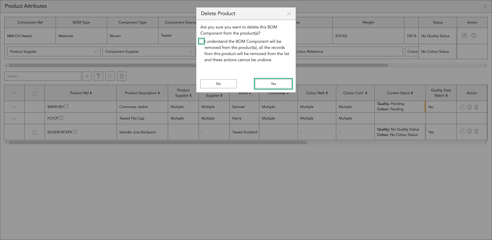
Once you are sure tap the checkbox in the popup confirming you understand what changes will happen, or to cancel this action tap no
current status
The cell in the bottom table titled ‘Current Status’ shows the status of that Bill of Material component within that product.
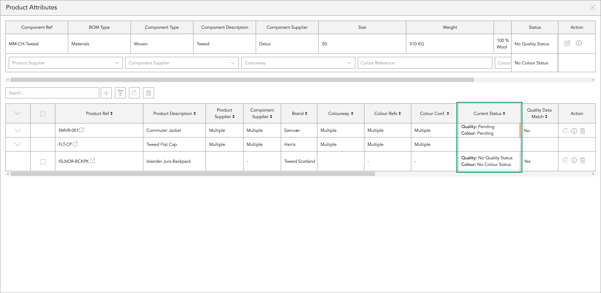
This allows you to identify if you need to update that product when syncing the data from the top table including the status through to the same component within the BOM of the products in the bottom table.
testing requirements
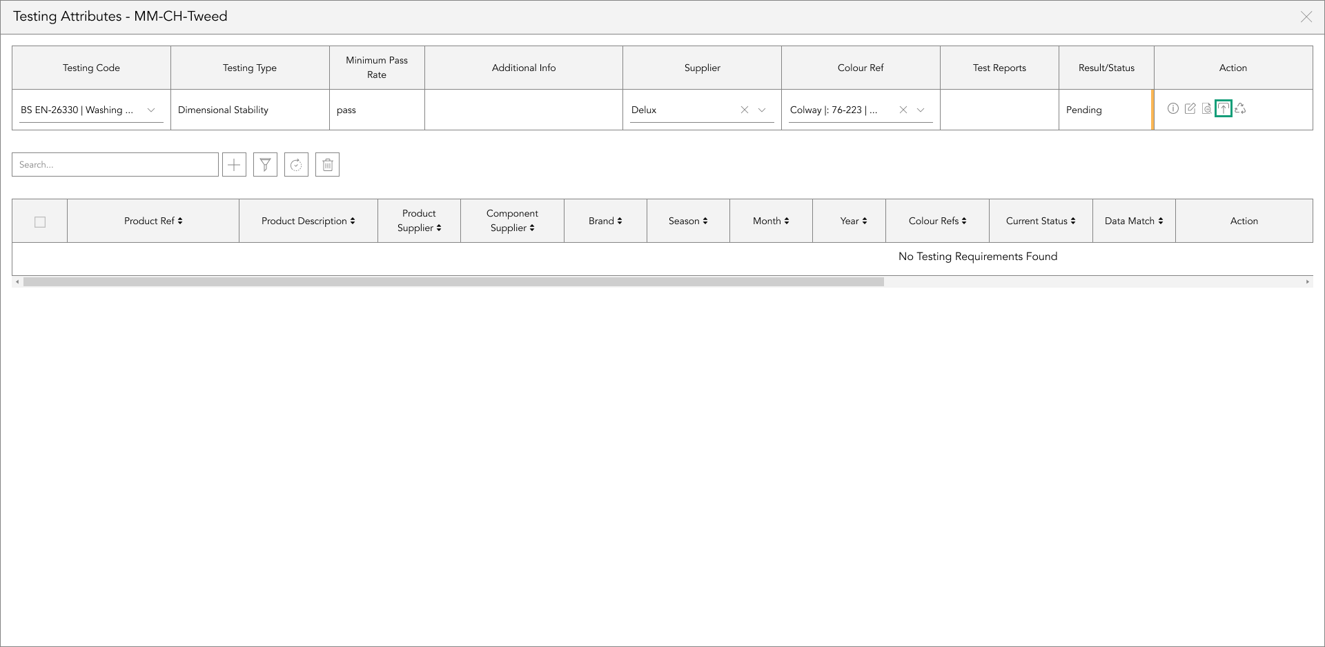
For a more automated module, testing requirements and reports within a BOM component allow you to add any test reports to the component with its approvals and its expiration dates to then be notified of whether it’s in date, or close to needing to be retested. You can also specify further by applying the supplier, and colour references for cross-referencing this test for another product in the future. This information will also be automatically visible within the product testing module.

To access the testing section of a component within the BOM, locate the component and tap the testing icon. With the testing icon you’re able to assign testing requirements and reports to specific suppliers, components, and colour reference combinations.
add a test requirement
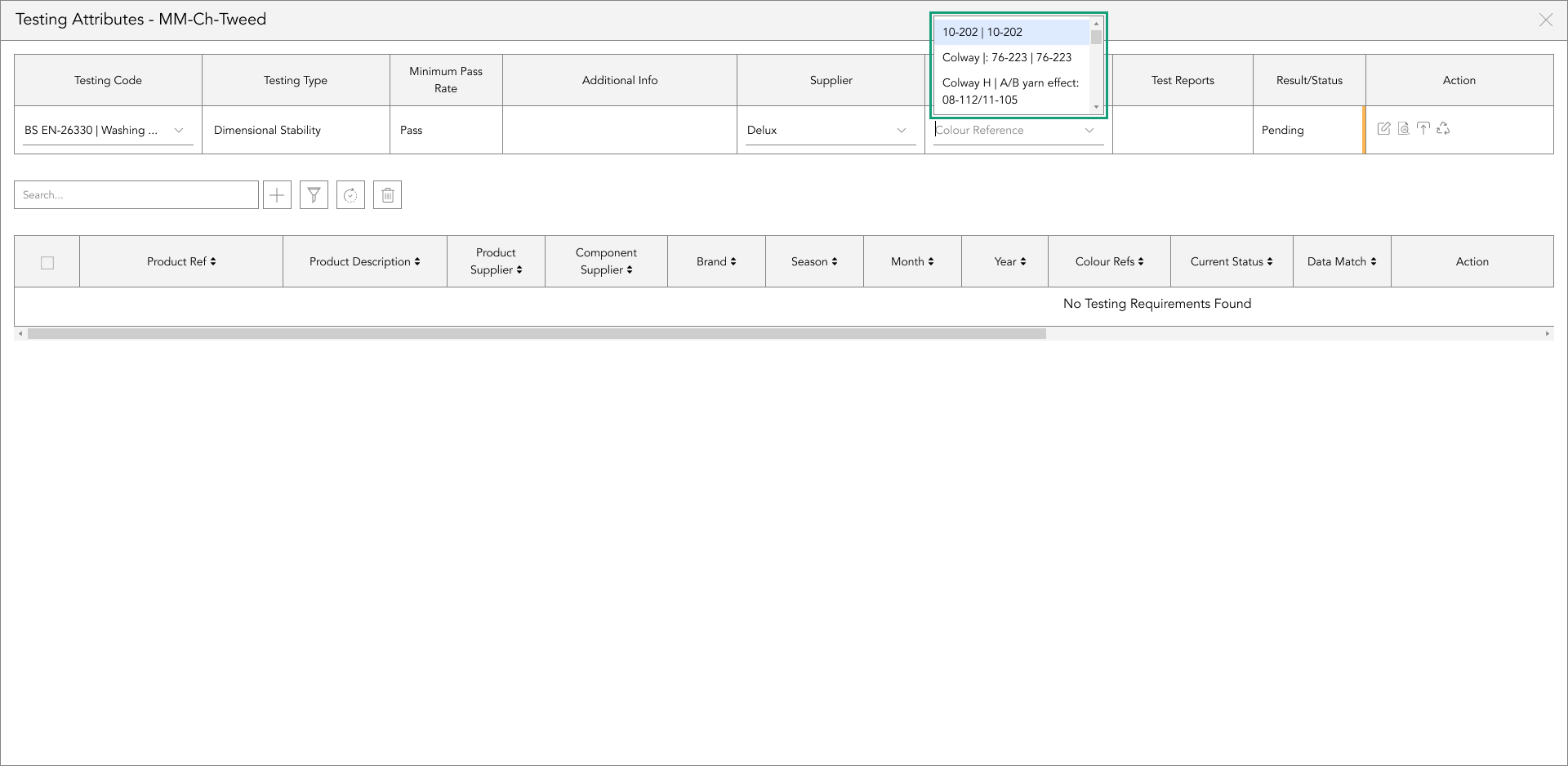
To add a testing requirement, start by typing in the test code for the component...
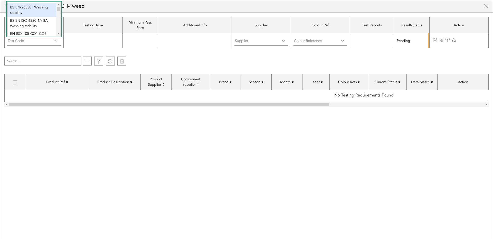
And select from the dropdowns the code, the same for the supplier and colour reference.
edit testing requirements
If you want to add to the data within the component's testing requirements/reports or amend/update the testing data, tap the edit icon in the action panel on the right-hand side of the table.

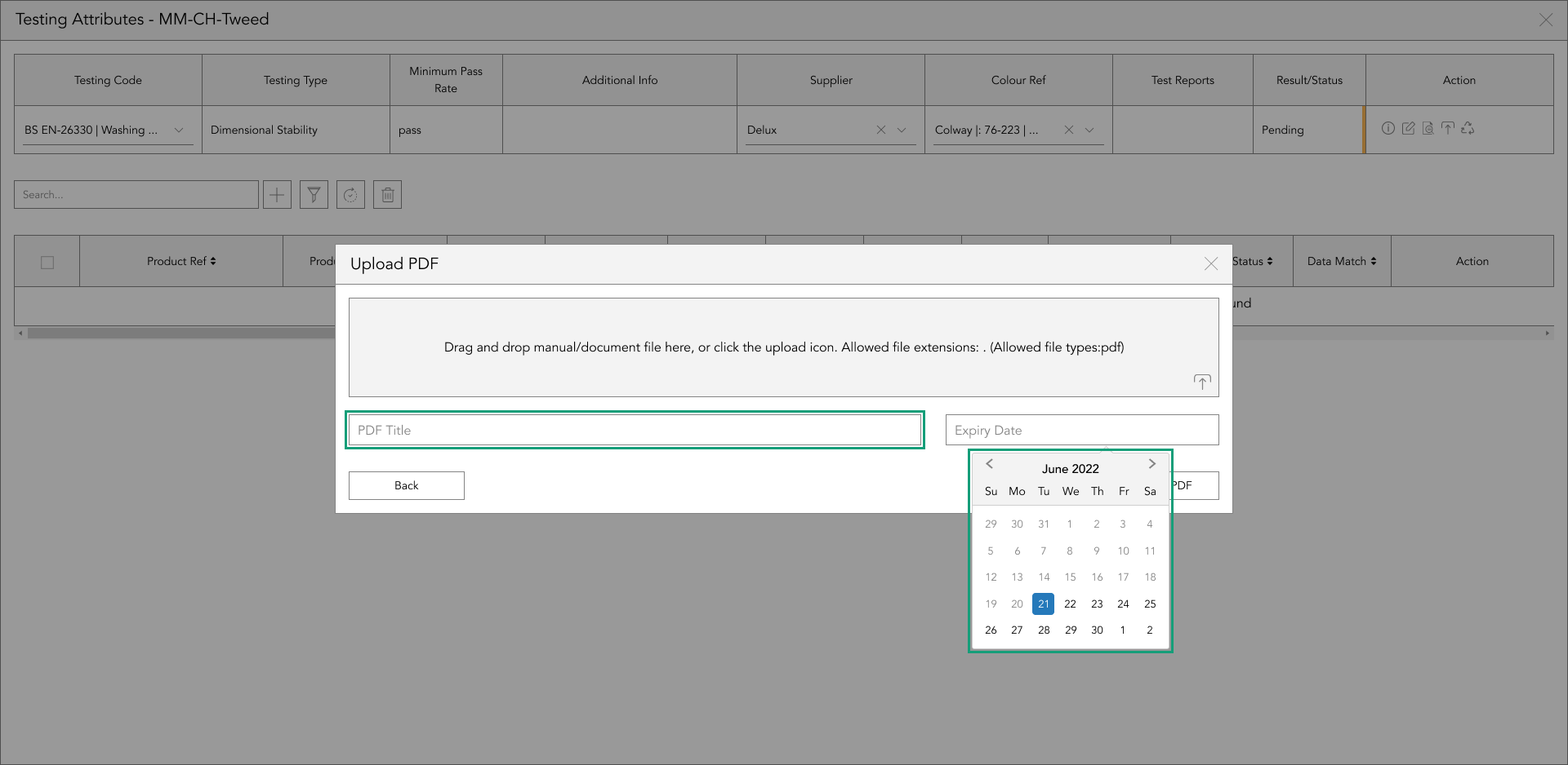
upload a test report
To upload a test report, tap the upload icon in the action panel, and a popup will appear.
There are two ways of uploading a test report, you can either drag and drop the file into the grey box or tap the upload icon at the bottom right of the grey box.
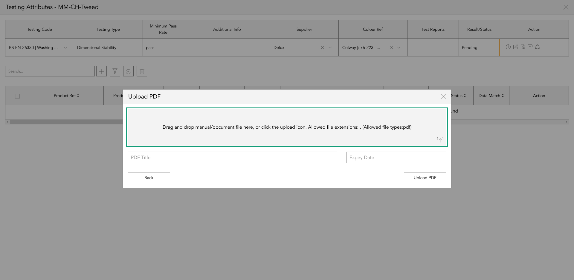
Once you’ve uploaded the report, the file name will automatically be used as the name. If you want to change the name, overwrite this in the document name text box.
If the report has an expiration date, add this in the field next to the document name field, and tap ‘Add’.
preview a test reports
The preview icon allows you to view the uploaded test report. To view the document, tap the preview icon in the action panel.

renewing a test report
To renew a test report, tap the renew icon in the action panel, and a popup will appear. There are two ways of renewing a test report, you can either drag and drop the file into the grey box or tap the upload icon at the bottom right of the grey box.

Once you’ve uploaded the new report, the file name will automatically be used as the name. If you want to change the name, overwrite this in the document name text box.
If the report has an expiration date, add this in the field next to the document name field, and tap ‘Add’.
add product references
There are two ways you can sync your product data, these are single and multiple syncing.
To sync a single product, on the right-hand side of the table, in the action panel column, tap the sync icon to apply the component data from the top table, including the selected product's status.
If you want to sync the component data, including the status from the top table to multiple products in the bottom table at once, select the checkboxes down the left side of the bottom table, and tap the sync button positioned to the right of the search bar function.
A popup will appear asking you if you’re sure you’d like to sync the component data from the top table to the selected products in the bottom table. If you select ‘Yes’, those rows will be updated with the component data in the top table including the status. if you select ‘No’, they will remain as they were previous to tapping the sync button.
deleting components from another product in usage
To single delete a component, on the right-hand side of the table, in the action panel column, tap the delete icon to remove the BOM component displayed in the top table from the selected row in the bottom table.
If you want to delete the BOM component displayed in the top table from multiple products at once in the bottom table, select the checkboxes down the left side of the bottom table, and tap the ‘delete’ button, positioned to the right of the search bar function.
A popup will appear asking you if you’re sure you’d like to delete the selected BOM component from this product.
Once you are sure tap the checkbox in the popup confirming you understand what changes will happen, or to cancel this action tap no
current status
The cell in the bottom table titled ‘Current Status’ shows the status of that Bill of Material component within that product.
This allows you to identify if you need to update that product when syncing the data from the top table including the status through to the same component within the BOM of the products in the bottom table.
single test requirement/report syncing
On the right-hand side of the table, in the action panel column, tap the sync icon to apply the testing data from the top table, including the selected product's status.

Beyond the Label: Diving into the Sustainable Story with Digital Product Passports
Consumers today are increasingly concerned about the environmental and social impact of their purchases. From the food they eat.

Bombyx’s AI Integration: Advancing Business Excellence in PLM, PIM, and DAM Systems
Let's delve into the exciting realm of Artificial Intelligence (AI) undergoing a transformative evolution. As we Enter the year 2024.

Beyond Baubles: A Stylish Dive into Christmas Fashion Trends.
e explore the latest Christmas fashion trends, with a focus on achieving a harmonious balance between sophistication and comfort. From luxurious velvets to cosy knits

Streamlining Winter Fashion with PLM: Managing Seasonal Changes
Winter fashion production demands meticulous planning and execution. PLM serves as a guiding force in production management, aiding in resource allocation, scheduling

Christmas Experience through Digital Transformation
During the Autumn/Winter months in Europe and the USA, are marked by heightened activity. The festive season introduces an atmosphere of joy and unity. Amidst the era of digital in
Demanding Trends & The Transformative Power of Product Lifecycle Management
Explore how strategic Product Lifecycle Management (PLM) empowers fashion to navigate trends sustainably. This post delves into the symbiosis of trends and sustainability,

The Power of Product Information Management (PIM) With a PLM System.
In today's fast-paced business environment, effective product information management is crucial for success. Product Information Management (PIM) is a powerful tool.

Fashion and the Power of Product Lifecycle Management
In recent years, the fashion industry has witnessed a surge in fashion, a phenomenon characterised by the rapid production and consumption of inexpensive clothing... and a whole l

Supply Chain Management has Forever Changed
Brands make use of product lifecycle data analysis to help them work out price points, marketing and advertising strategies, packaging, growth and expansion… and a whole lot more