
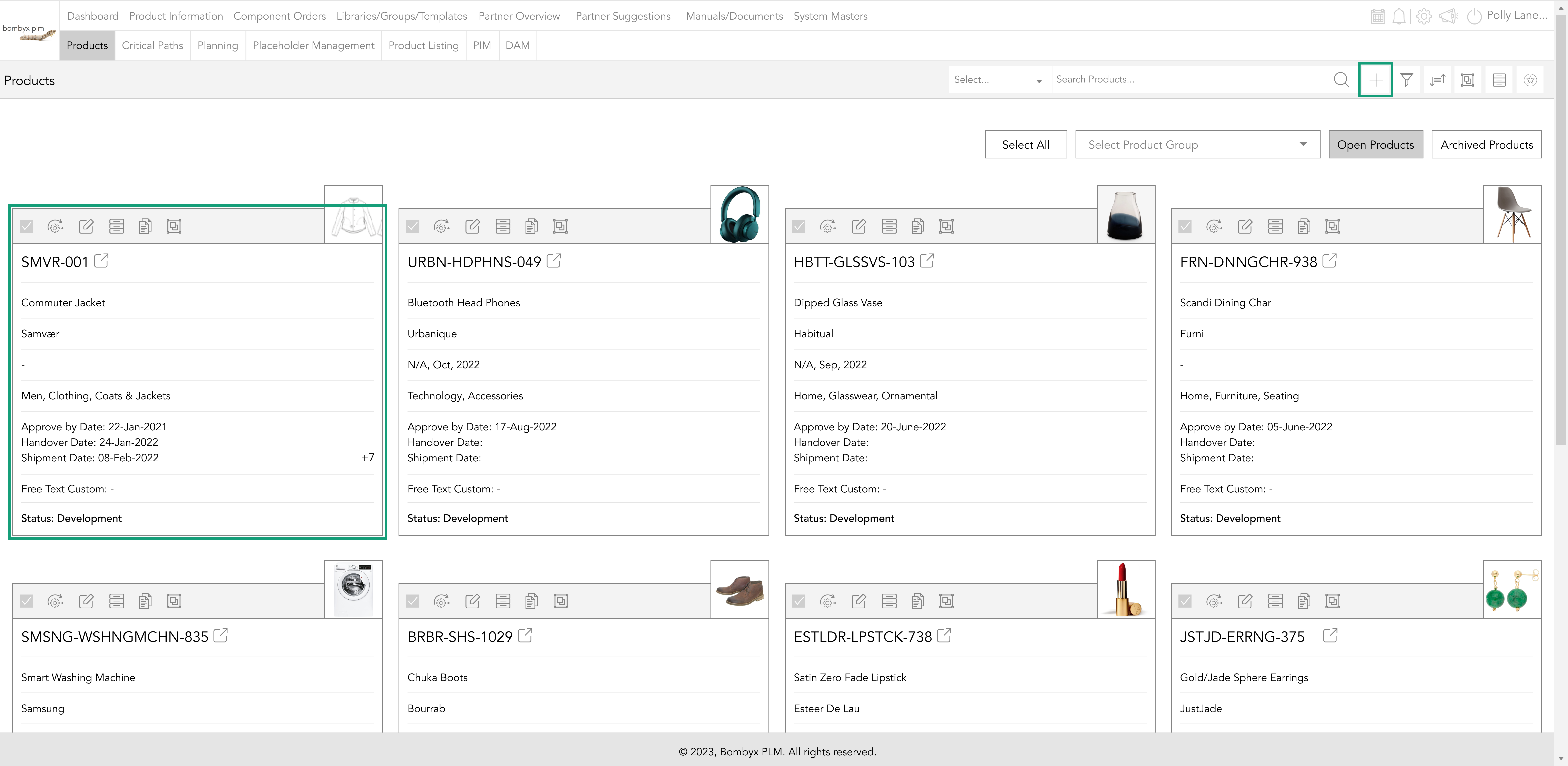
navigating to the product
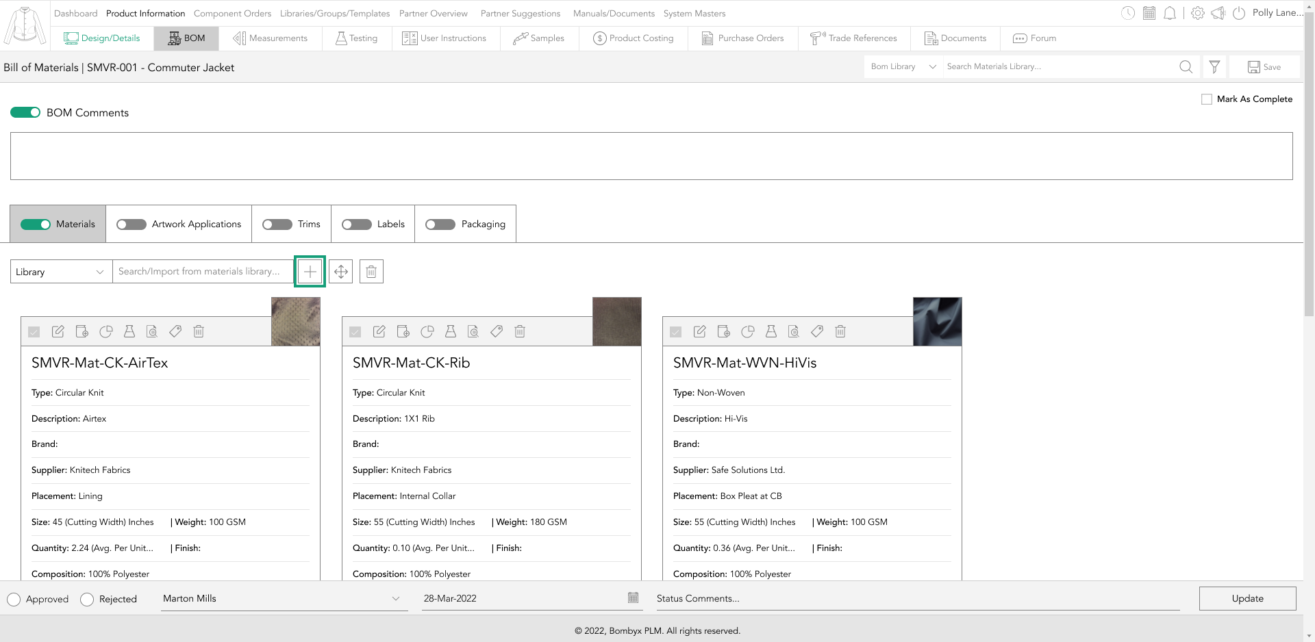
Accessing the Bill of Materials section in Bombyx requires a few steps. Firstly, tap on 'Product Information in the top menu bar, to locate the product either by scrolling or using the search bar function.
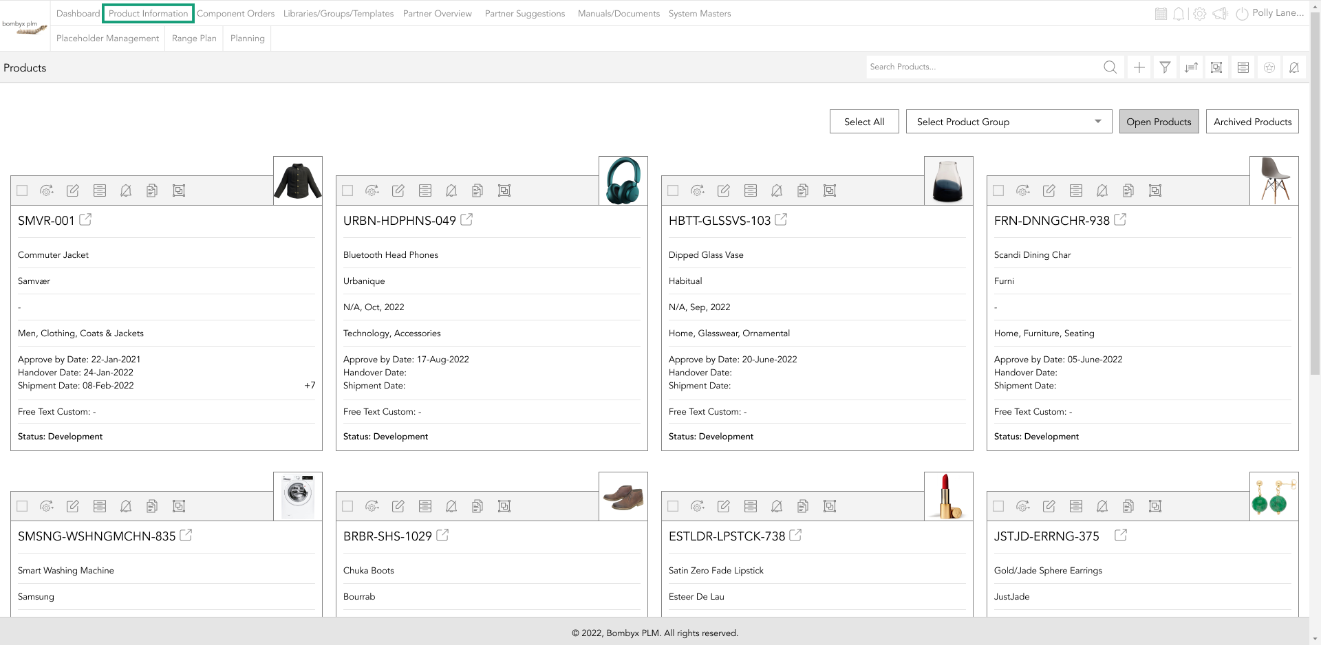
For new products, tap on the '+' icon, enter the required information, and press the 'Add' button. Then, click on the 'BOM' button in the product menu bar to access the BOM section.
Once you're in the product, you can access the BOM section by clicking on the 'BOM' button in the product menu bar.
toggles
Toggles are tablets with the function to conceal work from external stakeholders or suppliers.
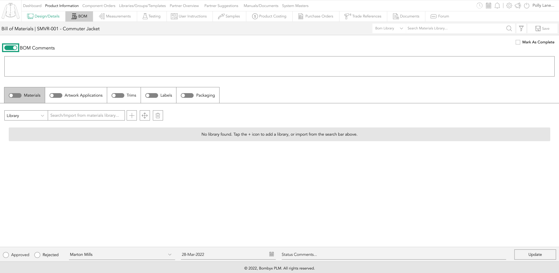
You can display the upload on the Bombyx platform and include it in the PDF file by turning on the toggle.
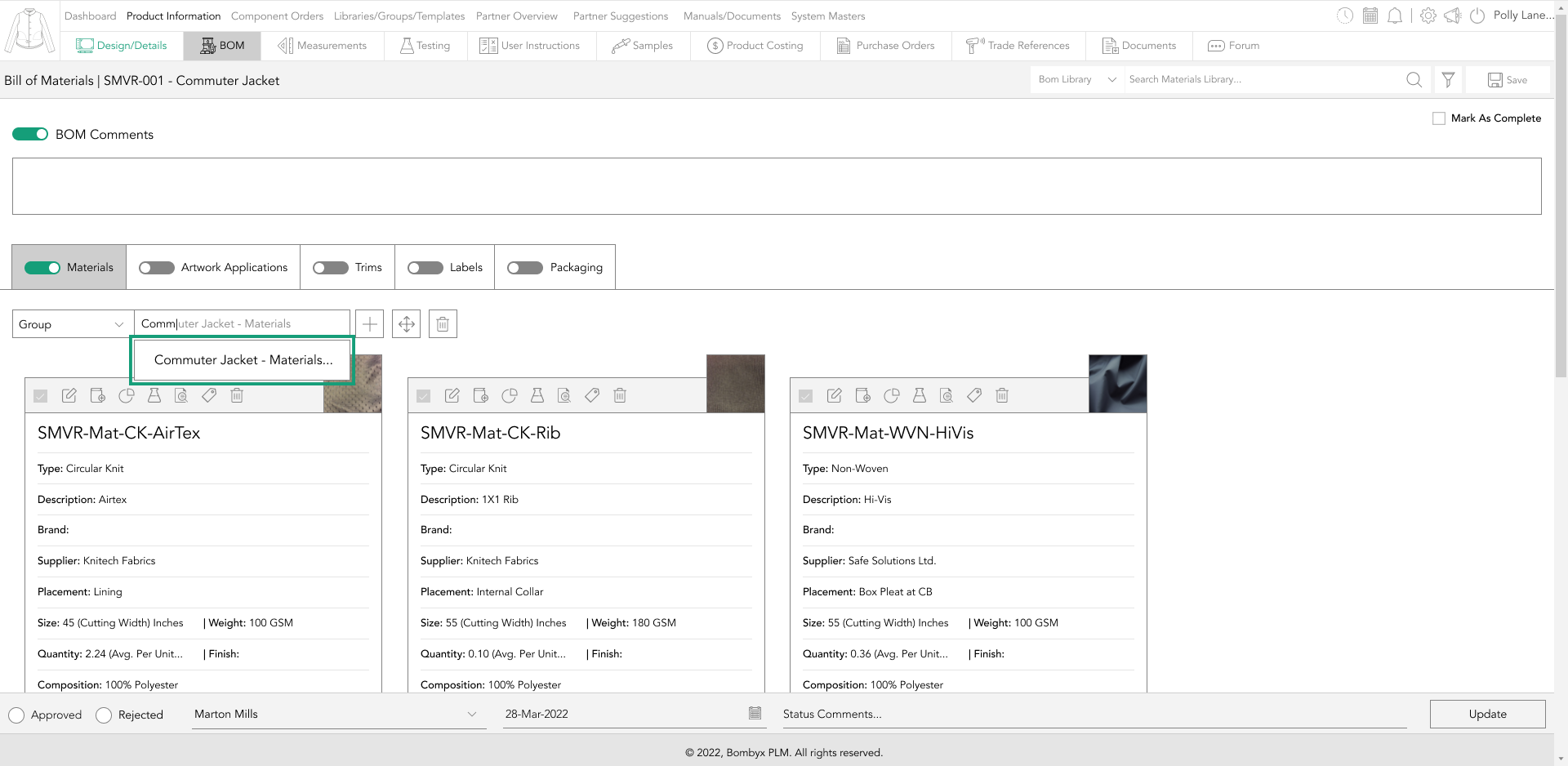
import from library
The 'import from library' function lets you import reusable component data from your BOM libraries.
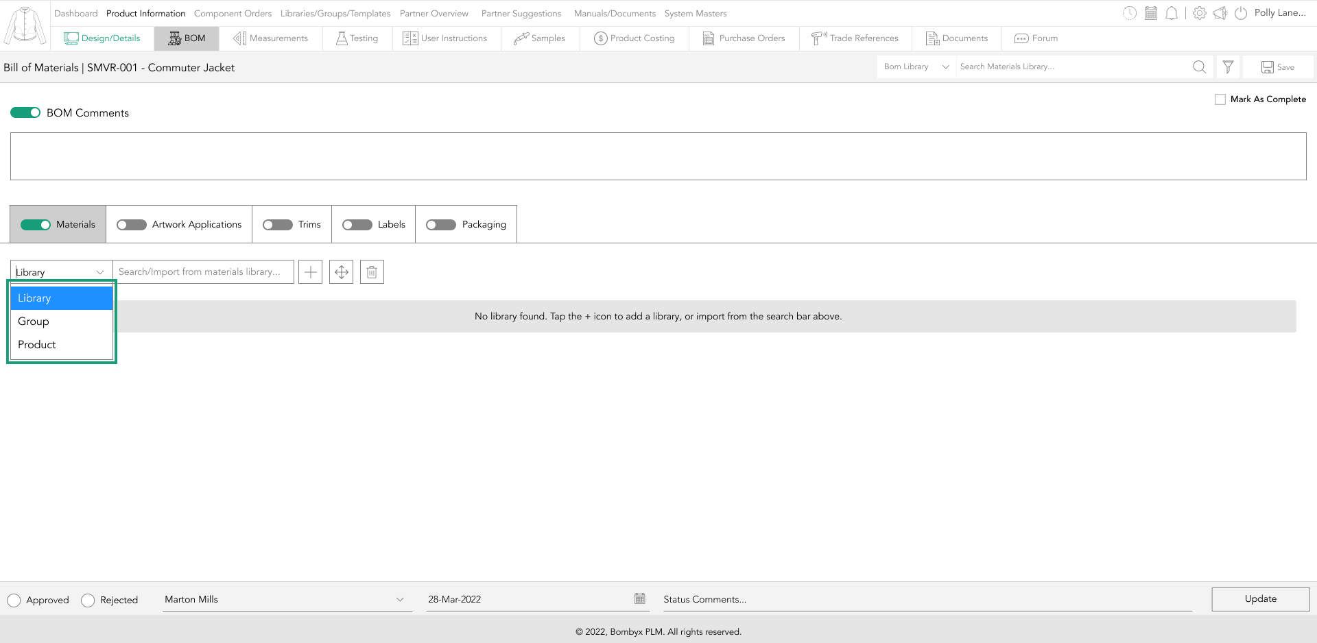
To do this, type the BOM reference number and/or description you want to import into the search bar. The dropdown will display filtered results based on your search, and you can select the desired component from the list.
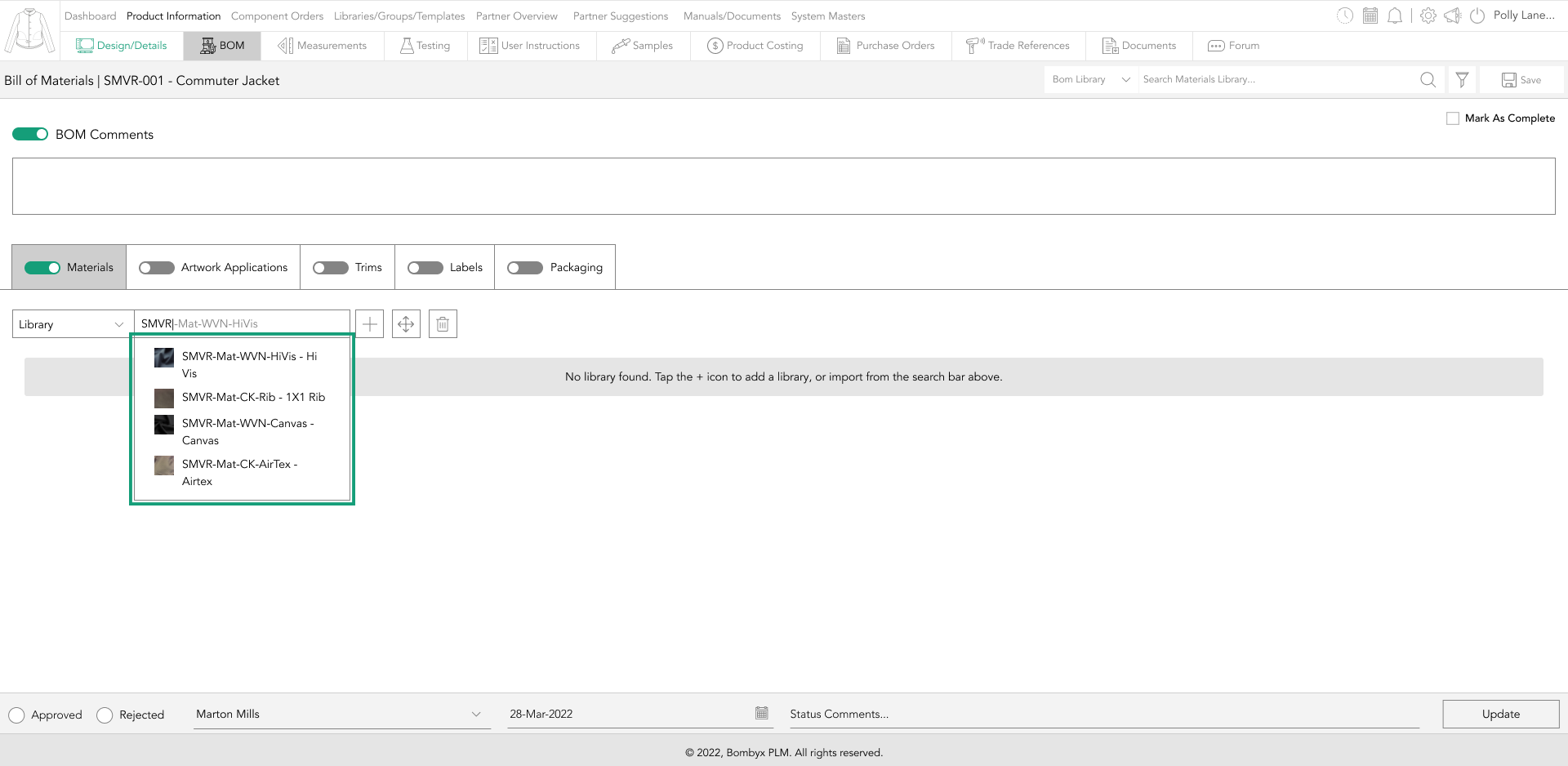
Once you've located the required component, tap on it to import it into the product BOM.
import from a group
To import a set of components that are typically used together, change the dropdown to the left of the search bar from 'Library' to 'Group'.
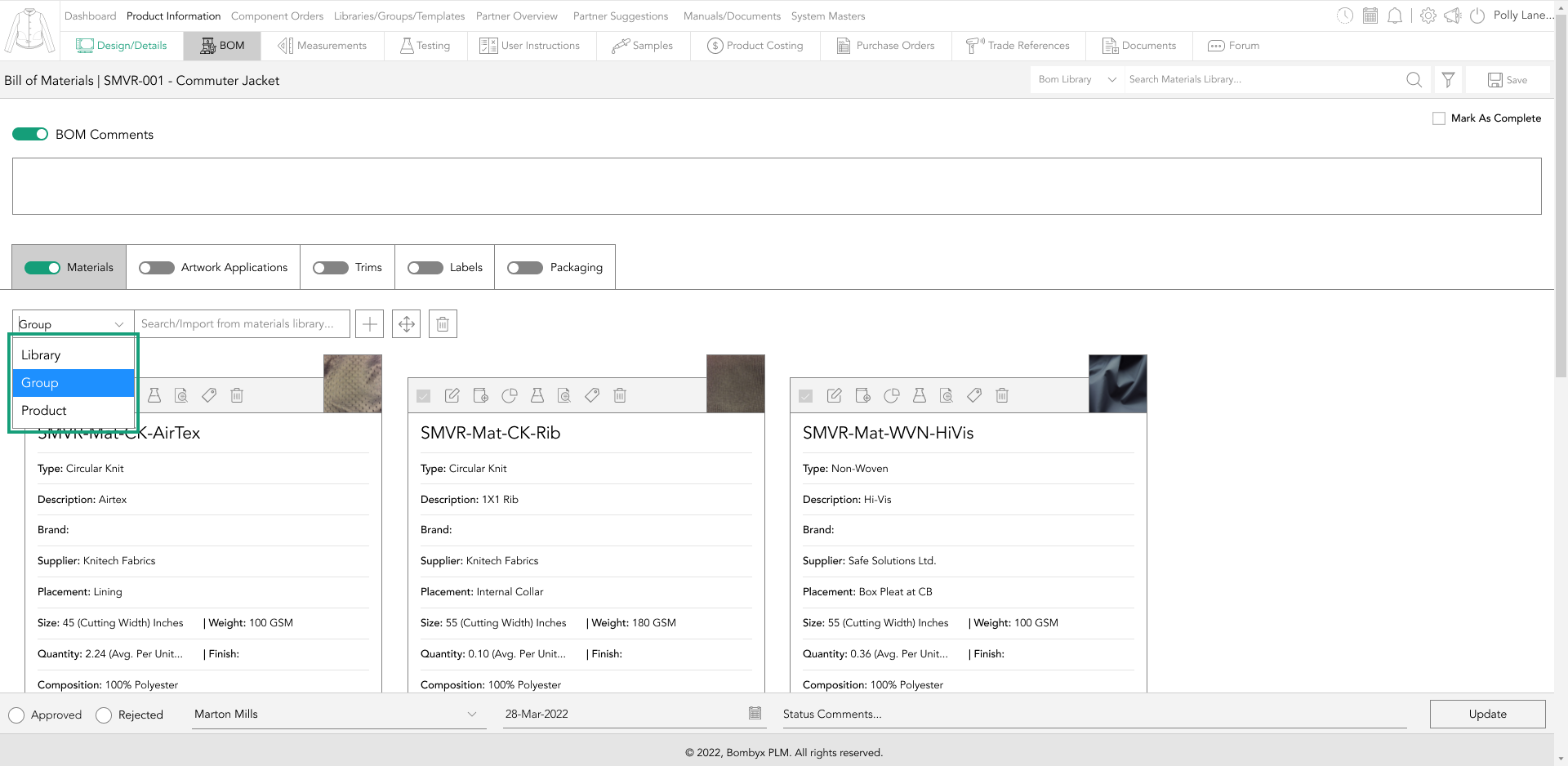
Type the name of the BOM group you want to import into the search bar and select it from the filtered results that appear.
Then, tap on the necessary group in the search results dropdown, and all of the components for that BOM type within that group will be automatically imported into the product BOM.
import from a product
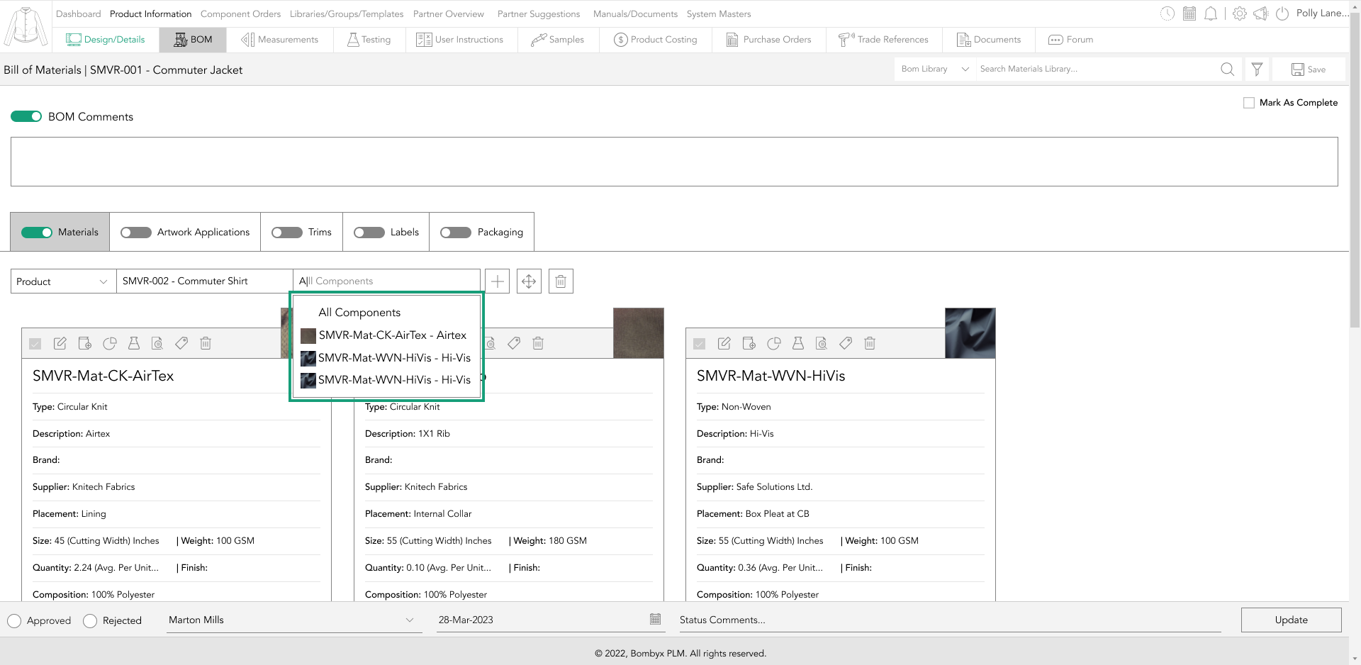
To reuse BOM components, you can import data from a previously created product. Select the dropdown menu to the left of the search bar, and change it to 'Product'.
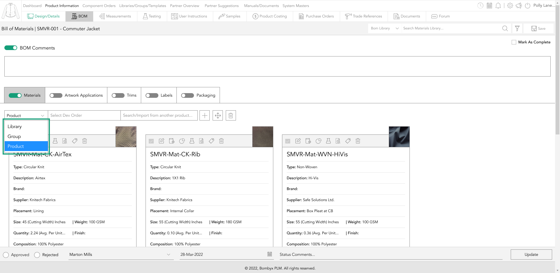
And type in the name of the product you want to import from.
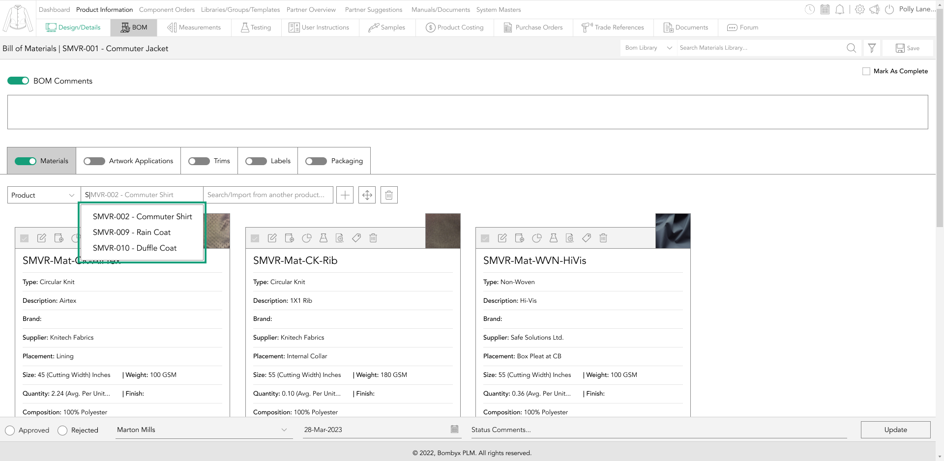
Select the product from the filtered results and tap on it to automatically import all of the BOM components for that type.
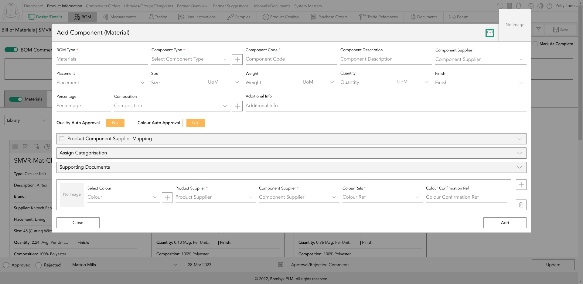
adding a new bom component
Tapping the + icon.
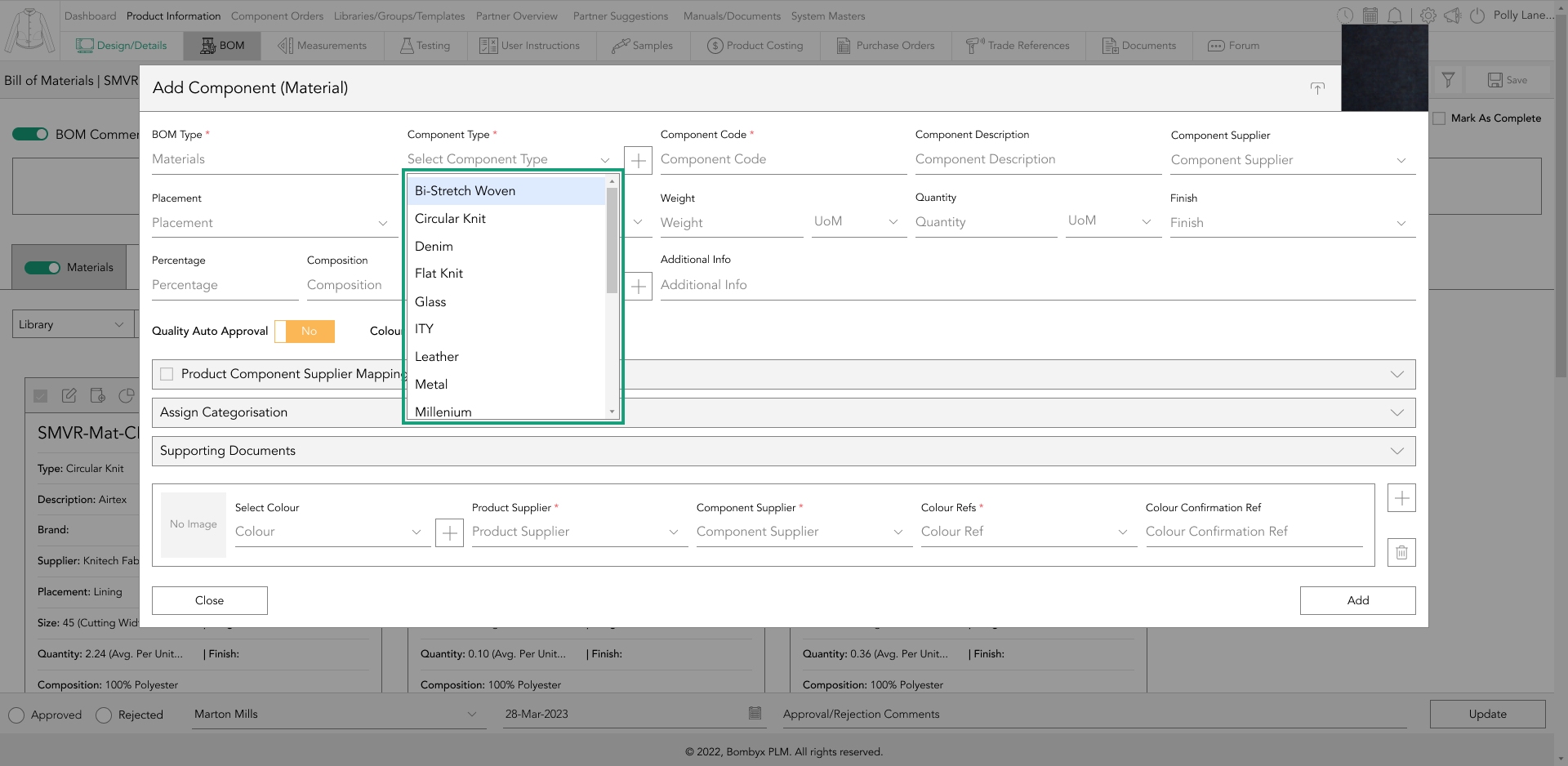
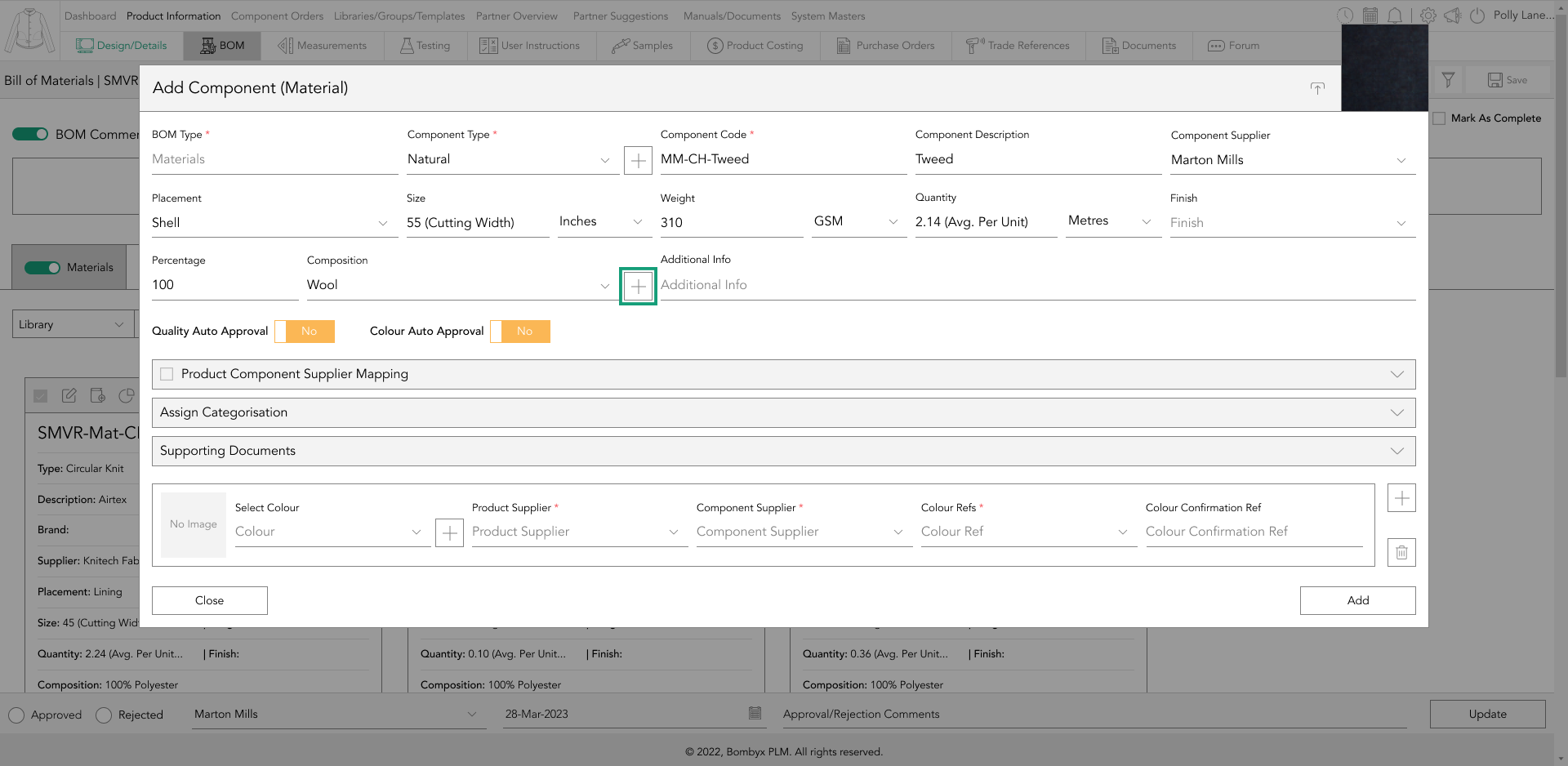
This brings up a popup for entering various information, such as dropdowns and text boxes.
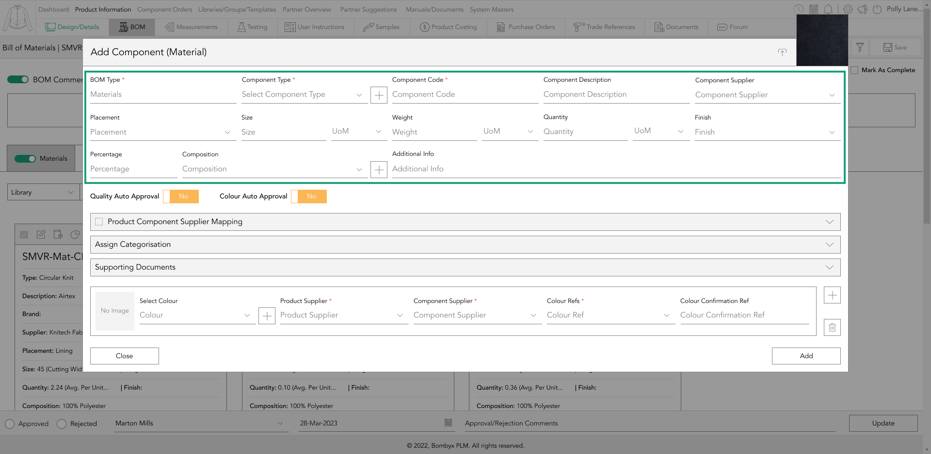
If the input field is a dropdown, it contains predefined values that can be added in the system masters section.
Alternatively, if there's a plus icon next to the field, the value can be added directly from the popup, and it will be saved in the system masters section for reuse.
upload an image
Tap the upload icon in the top right corner of the material card to upload an image.
You can drag your imagery into the upload space or select files to upload from your device by tapping the upload icon on the bottom right-hand side of the upload space.
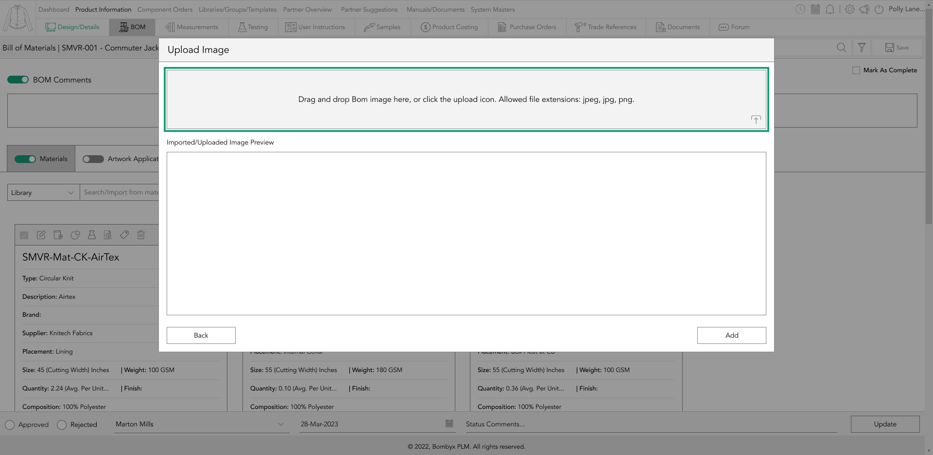
After selecting your image, crop it by dragging the corner of the crop area and resizing it to your requirements.
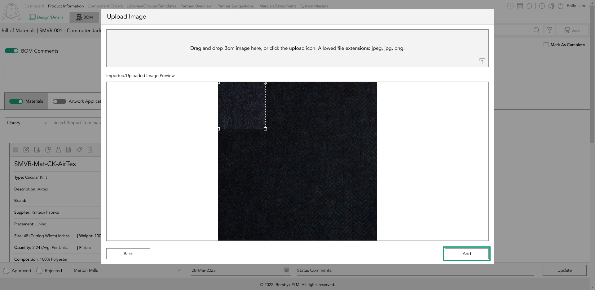
Finally, tap the ‘Add’ button to add the designs to the products’ design area.
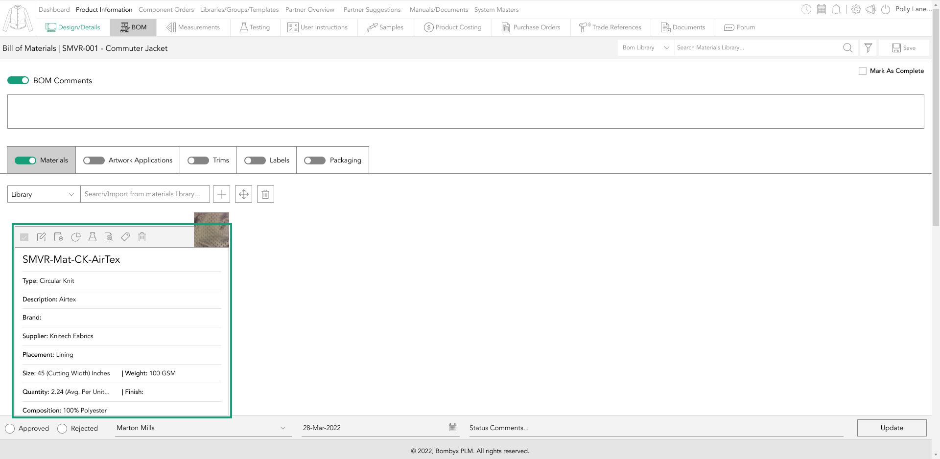
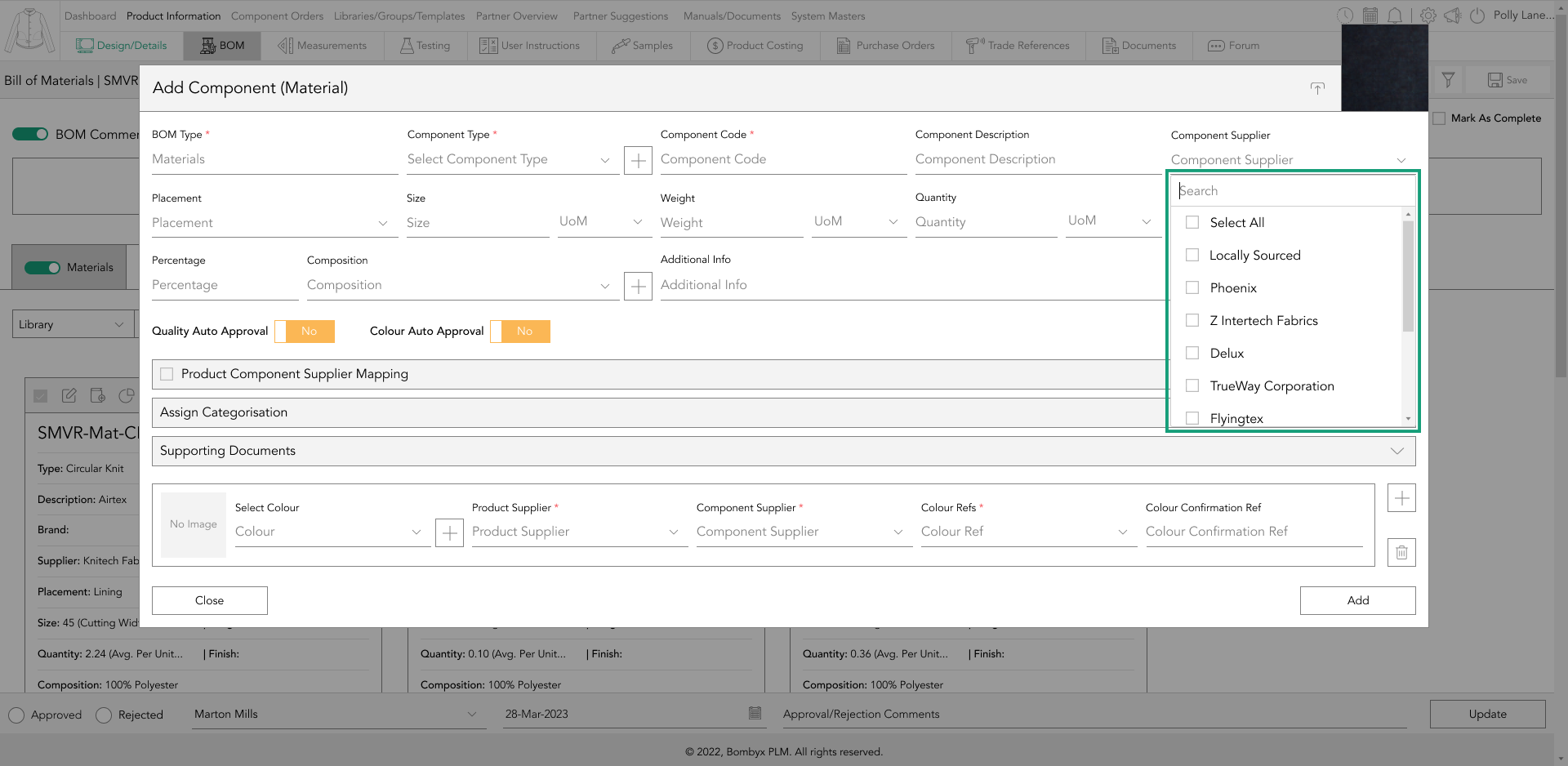
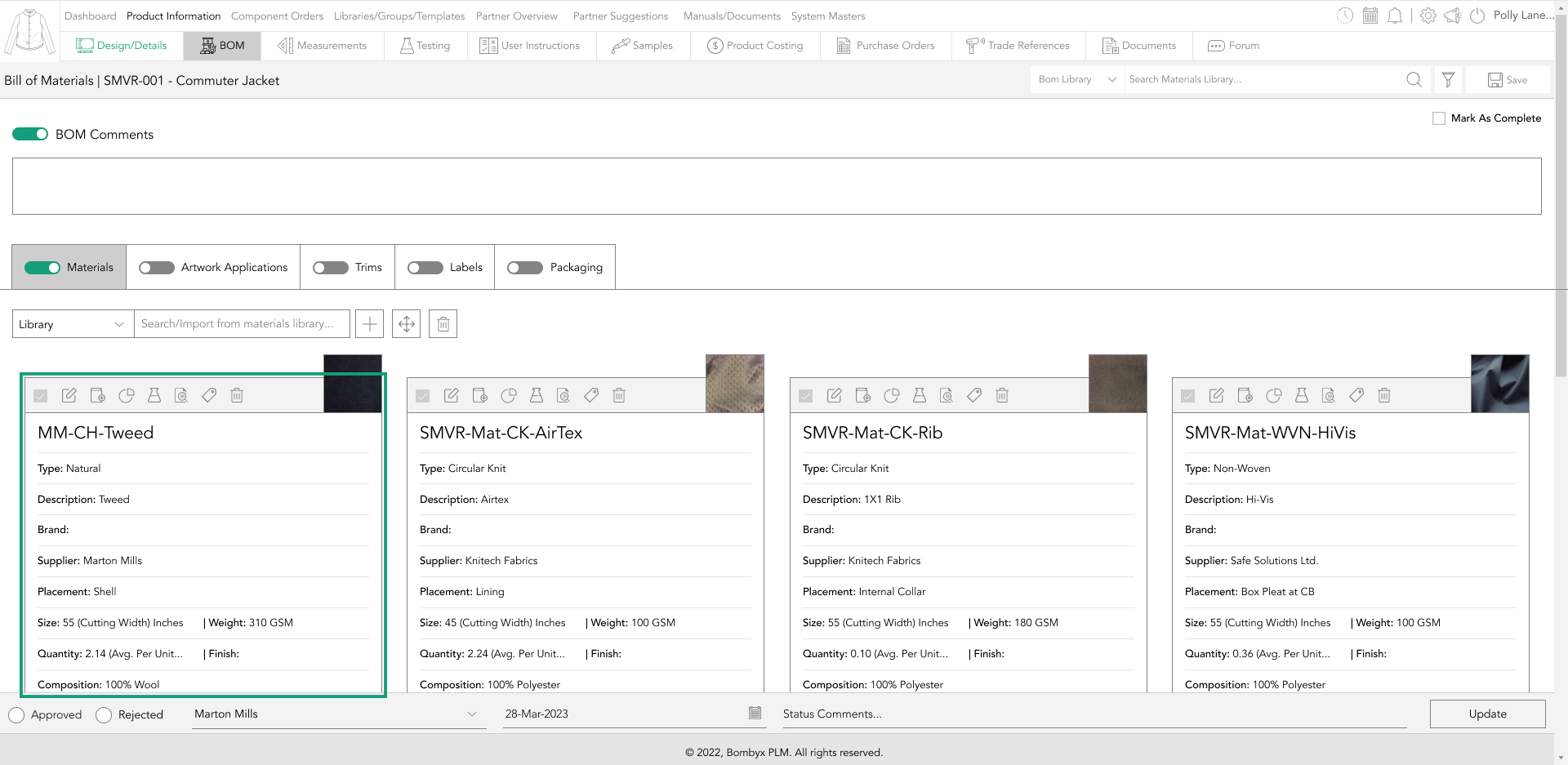
adding components
In component information, you'll see the supplier field which lists suppliers.
And a Unit of Measure (UoM) field to measure quantity/volume and weight.
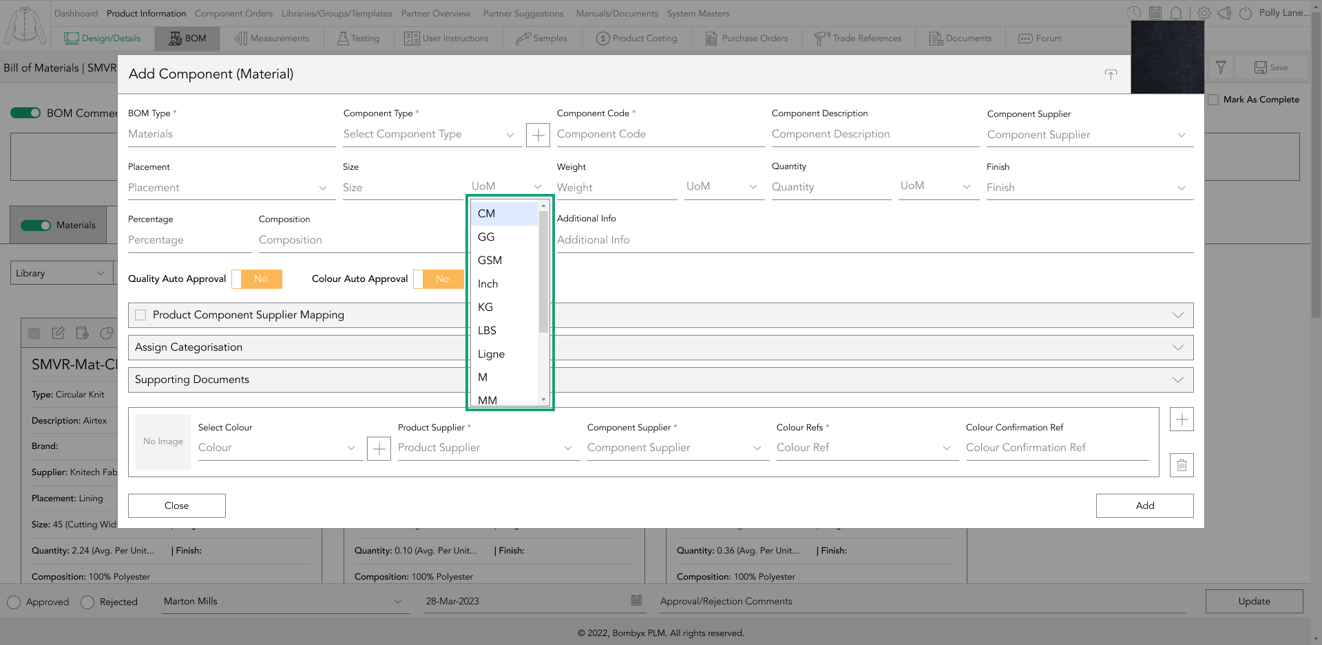
If the component has multiple compositions, then you can add multiple compositions by tapping the + icon, or remove the most recent fields with the trash can icon.
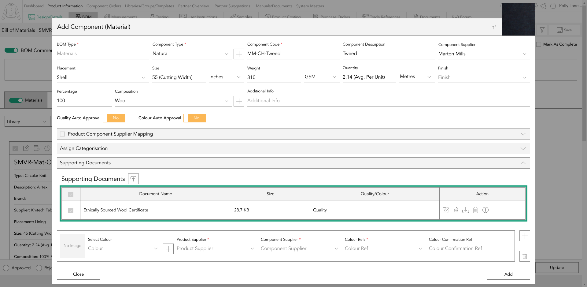
supporting documents
The quality section of the component has a supporting document area that backs up the information entered in the component card. Supporting documents may be test reports or certificates confirming the organic status of the component, for instance.
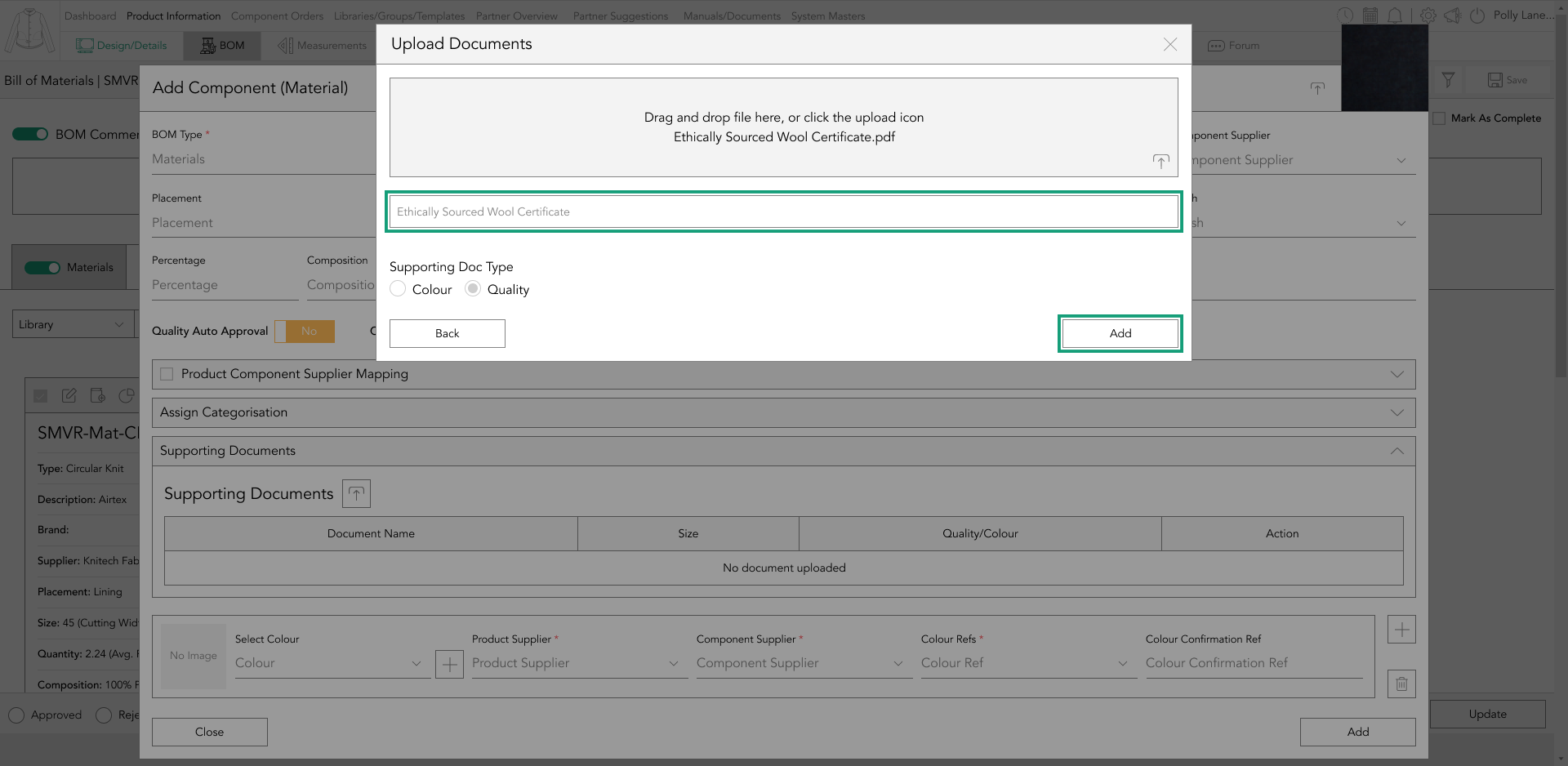
To upload a supporting document, open the dropdown and tap the upload icon.

Tap the upload icon next to the ‘Supporting Documents’ subheading and a popup will appear.

There are two ways of uploading a file, you can either drag and drop the file into the grey box or tap the upload icon. After uploading the file, give it a title and tap ‘Add’.
The supporting document has four actions available in the action panel: edit, preview, information, and bin.
editing components
If you need to make changes to the information you’ve previously entered on a component, you can easily do so by tapping the ‘Edit’ icon located on the bar of the component card.

add/update bom components library
You can sync any changes you’ve made to a BOM component in a product to the BOM library for future use in newly added products by tapping the ‘Add to Library’ icon located at the top of the BOM component card.
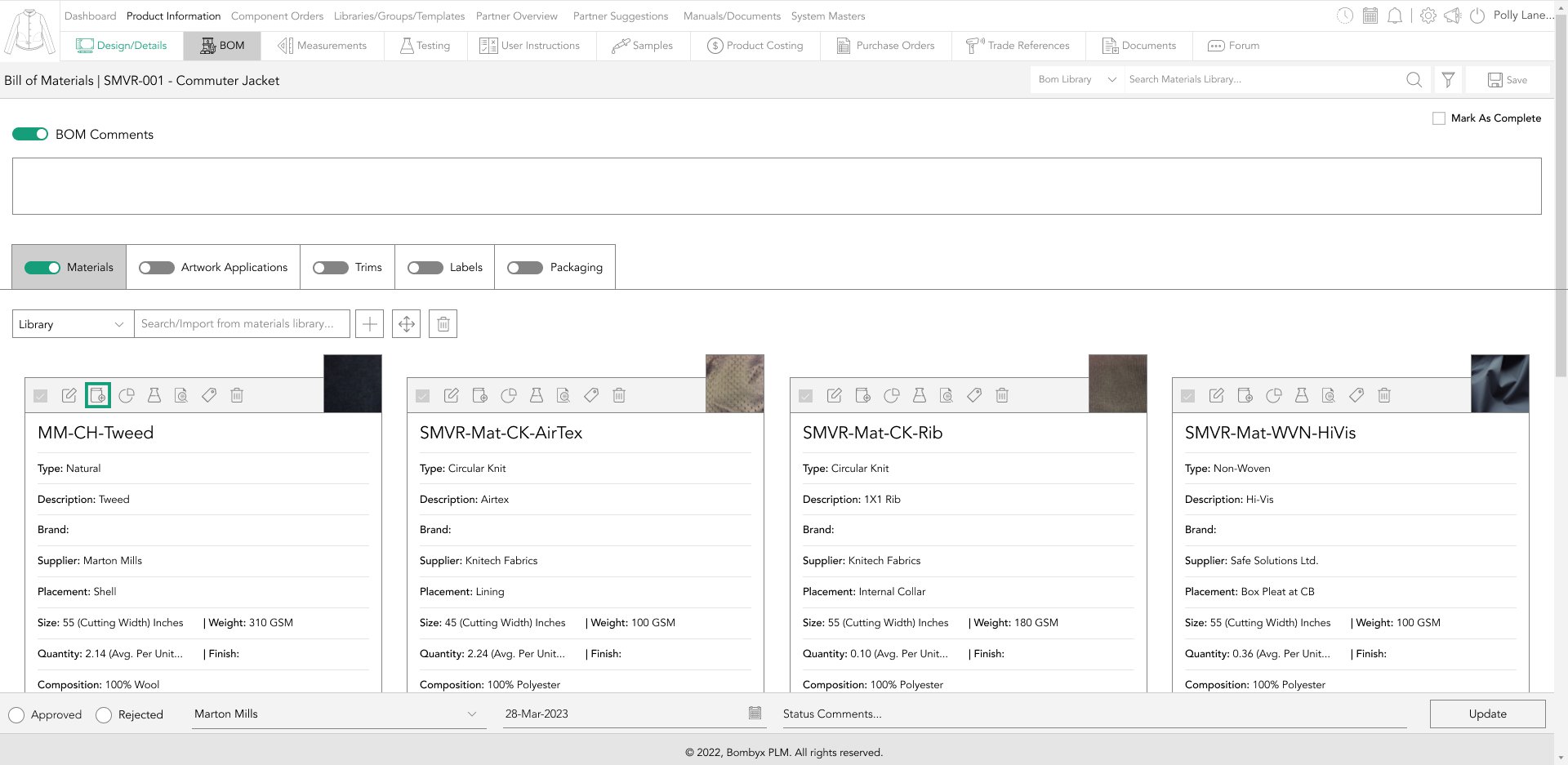
A popup window will appear with the BOM reference number already filled in. If you want to proceed with the update, simply tap the 'update' button to apply the details to the library.
However, if you want to copy the details with a different reference number, edit the pre-filled text and then tap the 'update' button.
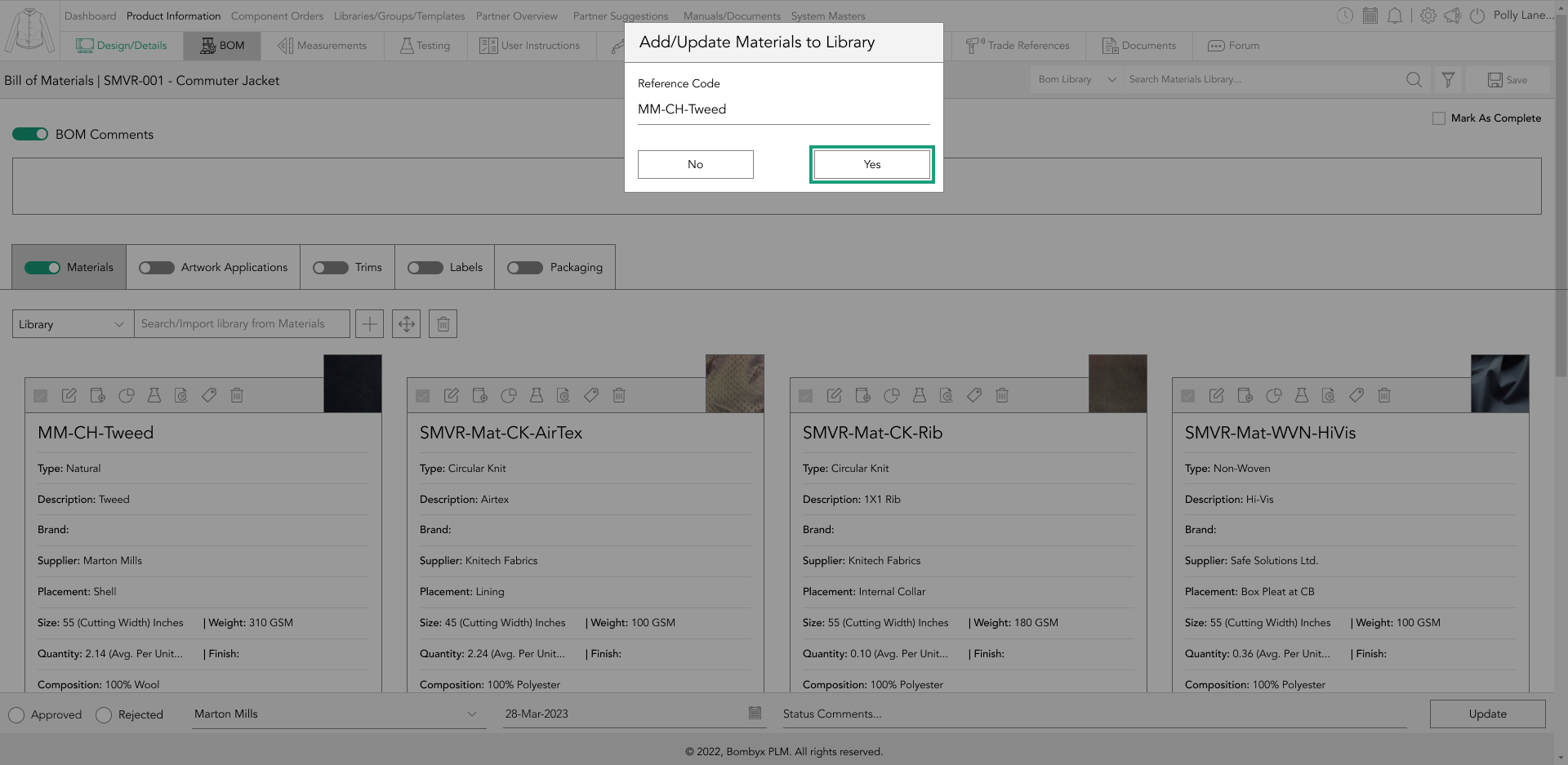
If you change your mind and decide not to proceed with the action, tap the 'cancel' button, and the changes will not be applied to the library.
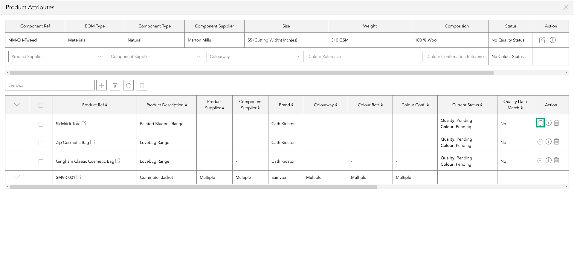
deleting components
Deleting a single component from the BOM will not delete it from the library. However, you can remove the item you no longer need by tapping the bin icon.

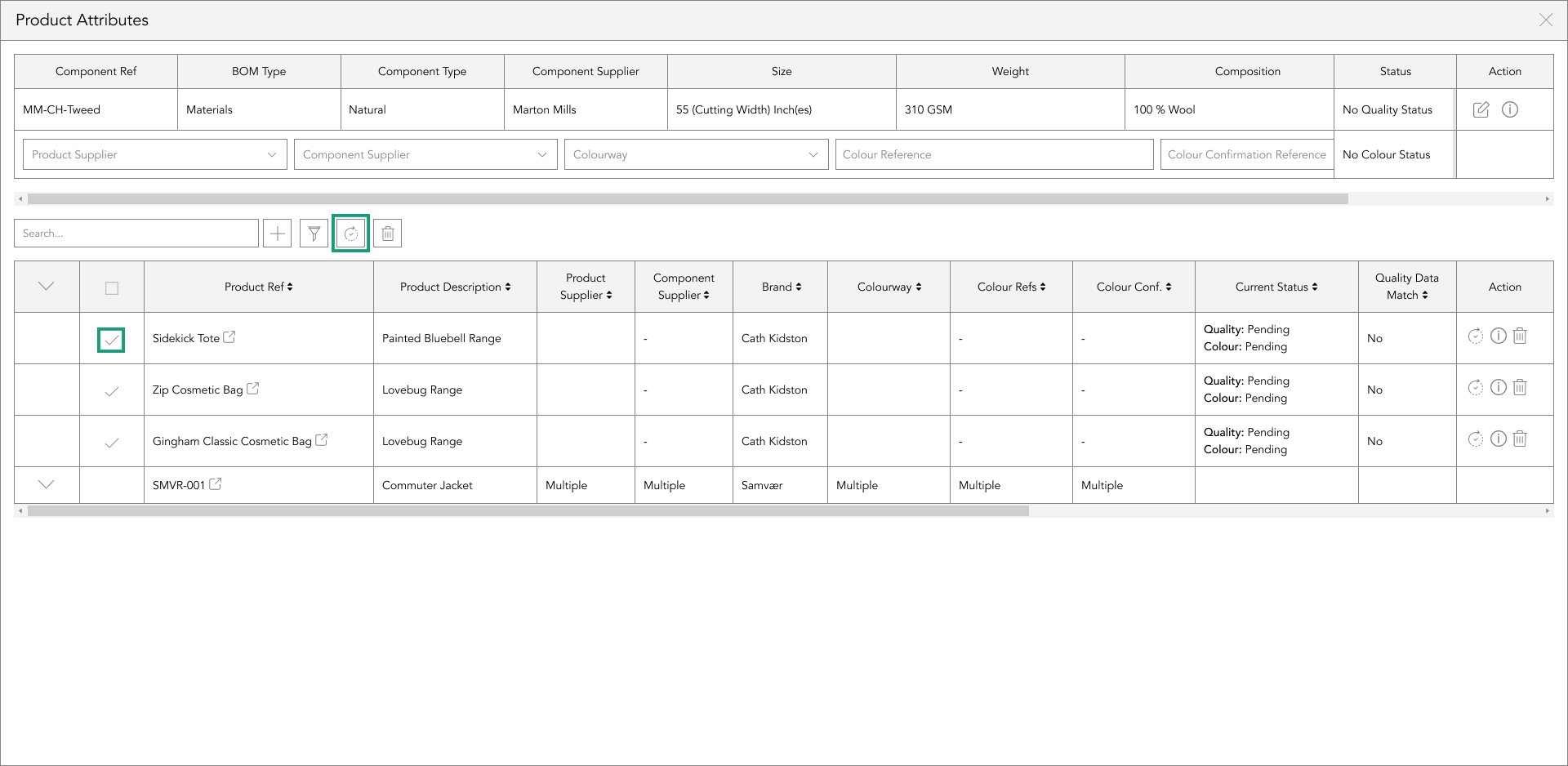
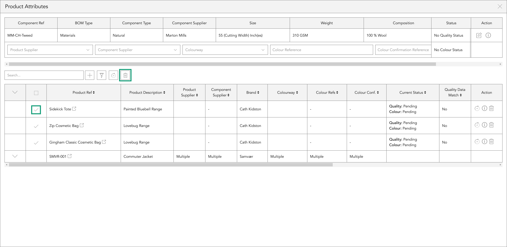
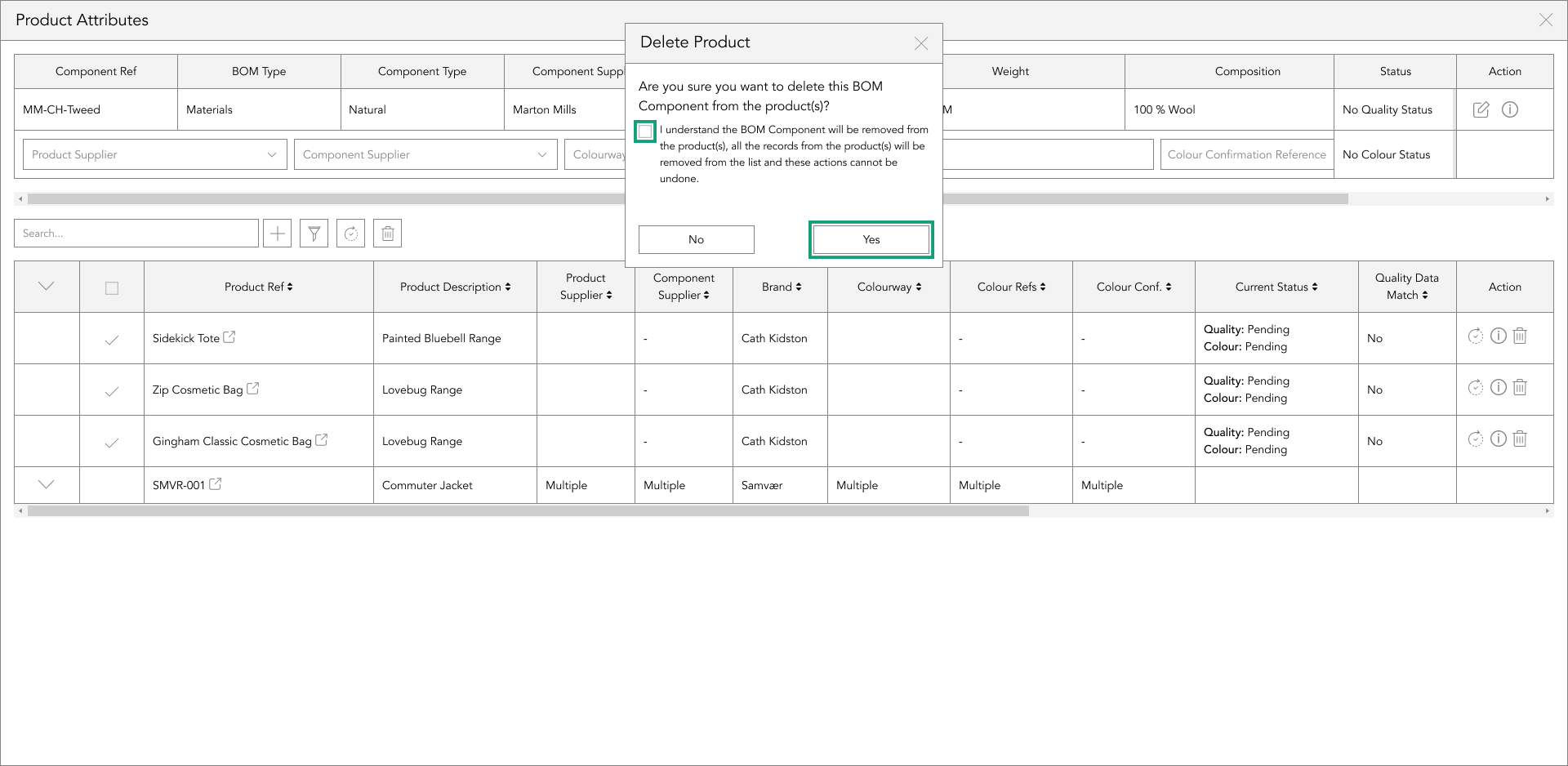
On the other hand, if you want to delete multiple components, you can tap on the checkbox of each component you wish to delete. This will mark it as a tick. Then, click the delete icon next to the search bar. This action will bring up a popup.
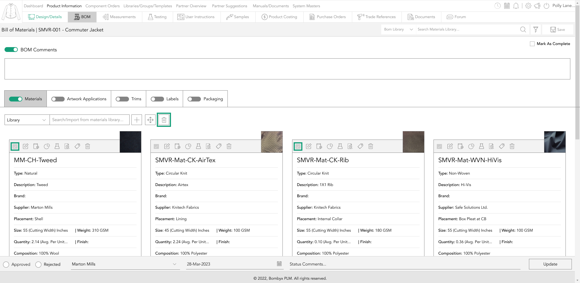
If you are sure you want to delete the selected components, click yes. Alternatively, click no to cancel this action.

rearranging components
If you want to change the order of the BOM components, you can easily do so by tapping the rearrange button.
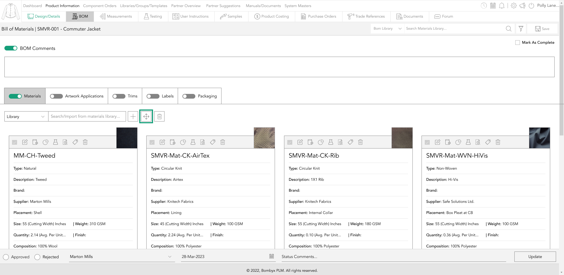
After that, a panel will appear on the right-hand side with a list of all the components included in the BOM.
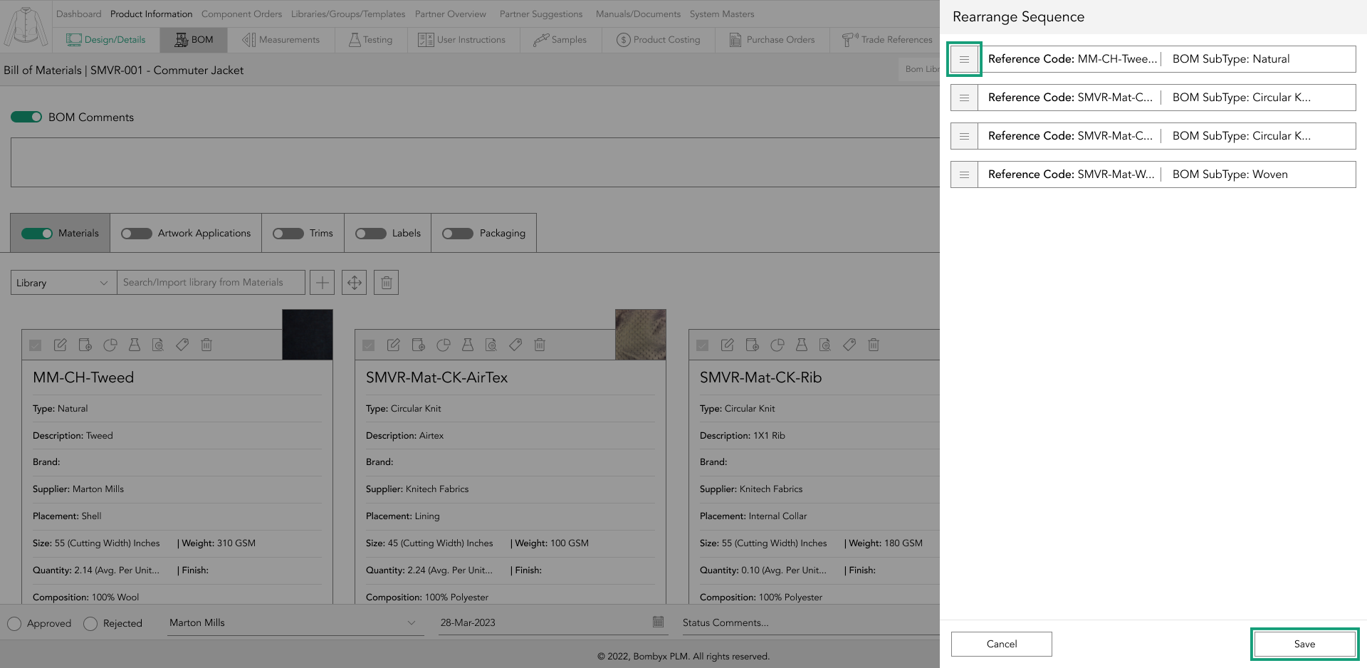
From there, you can drag and drop the items to the order that suits you.
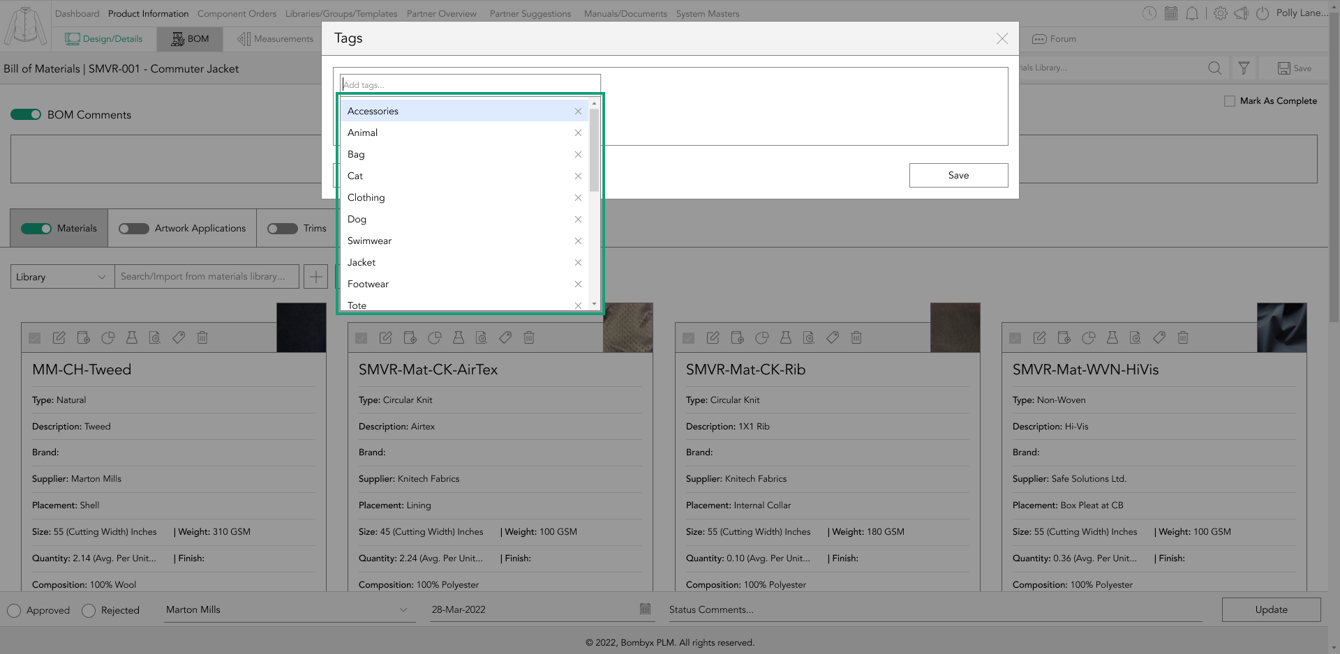
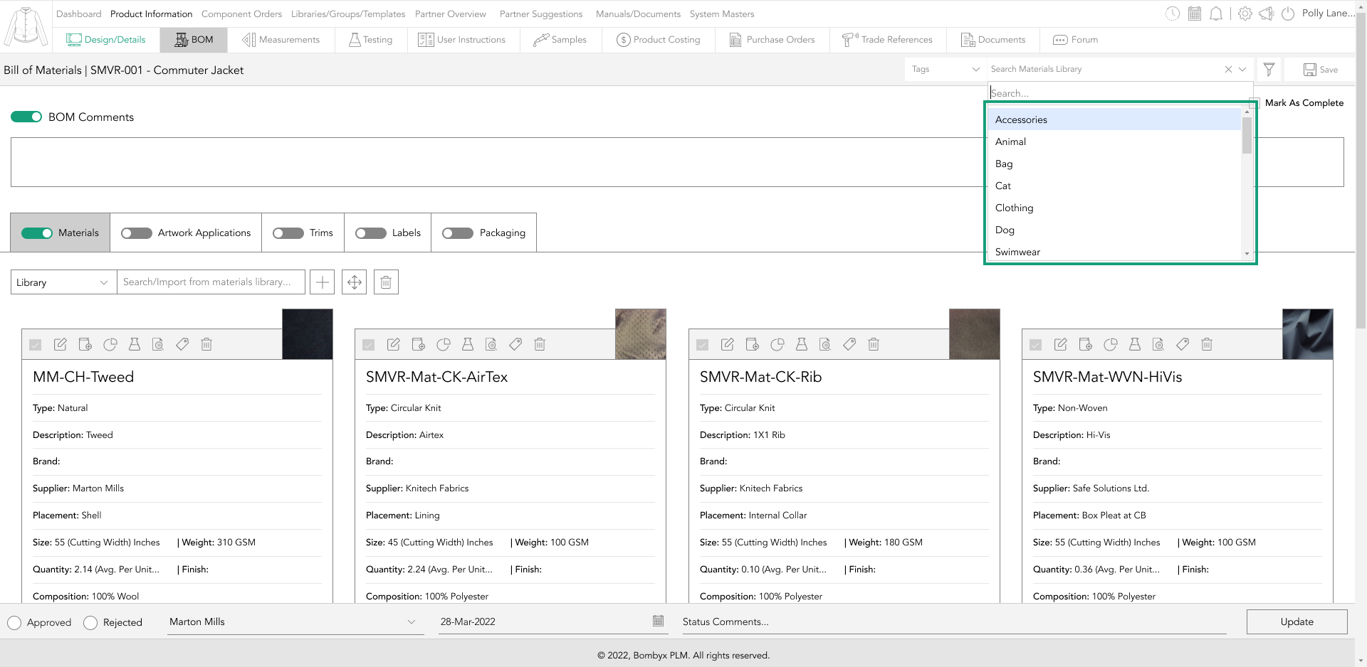
add tags to components
You can create tags for your bill of materials, which can be useful for organizing and searching for specific components. To create tags for a component, simply tap on the tag icon on the component card.
This will open a popup where you can create tags specific to that component. Once you have added your tags, click the save button.
To search for or import a bill of material using tags, go to the top right-hand side of the page and find the search bar and the bom library dropdown menu. Select "tag" from the dropdown menu, and you can start searching for the tag that references your bom.
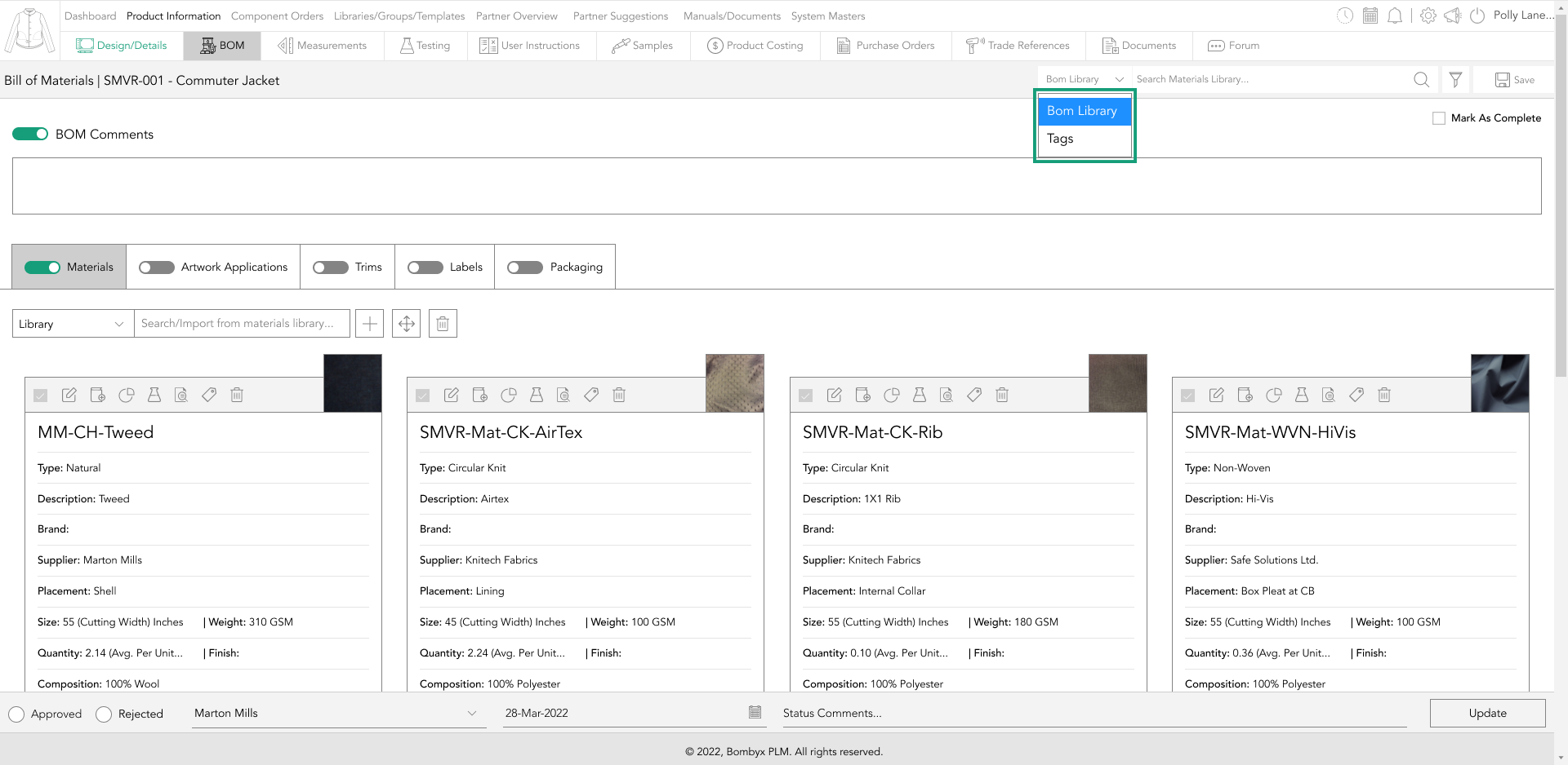
When the bill of material appears in the search bar, you can tap to import it.
approve/reject quality
To approve or reject BOM components, you need to follow a few steps. Firstly, select the checkbox located at the top left of the BOM component card, which will activate the status bar above the footer.
This status bar allows you to approve or reject the quality information of the components. After checking the BOM component checkboxes, navigate to the status bar and choose the approve option.
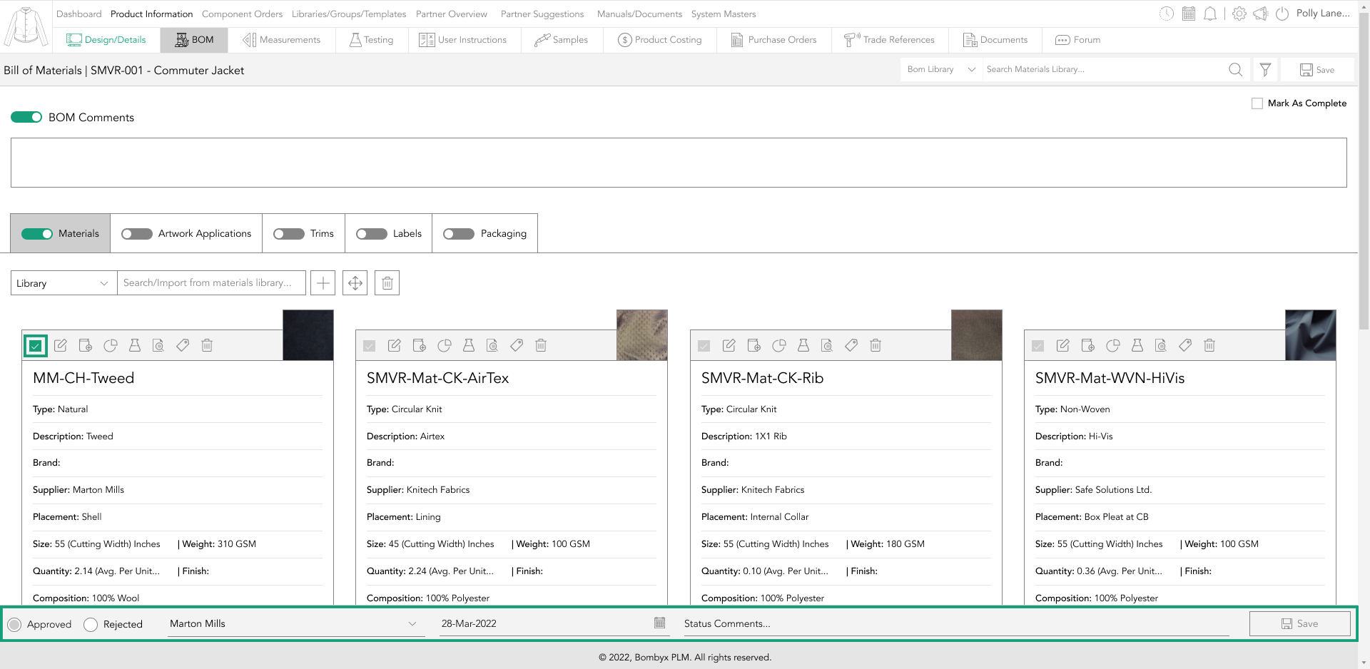
Then, you can add the approval date and the result, and optionally, you can make a comment for your suppliers and team to see.
Once you have entered all the required information, tap the update button. Finally, tap the update icon on the right-hand side of the footer bar to see how your component card status bars change color to indicate the new status.
mark as complete
You can mark a product as complete by simply checking the ‘Mark as Complete’ checkbox, which provides an updated progress report of your product.
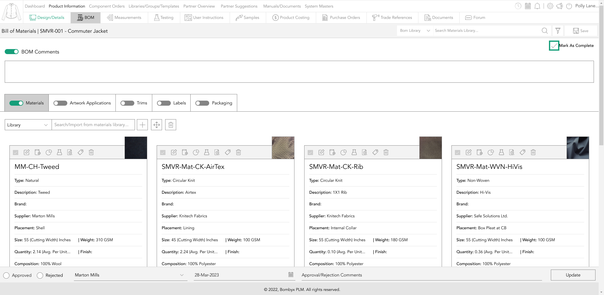
This helps you and your team to easily track your product's lifecycle and identify areas that require further action.
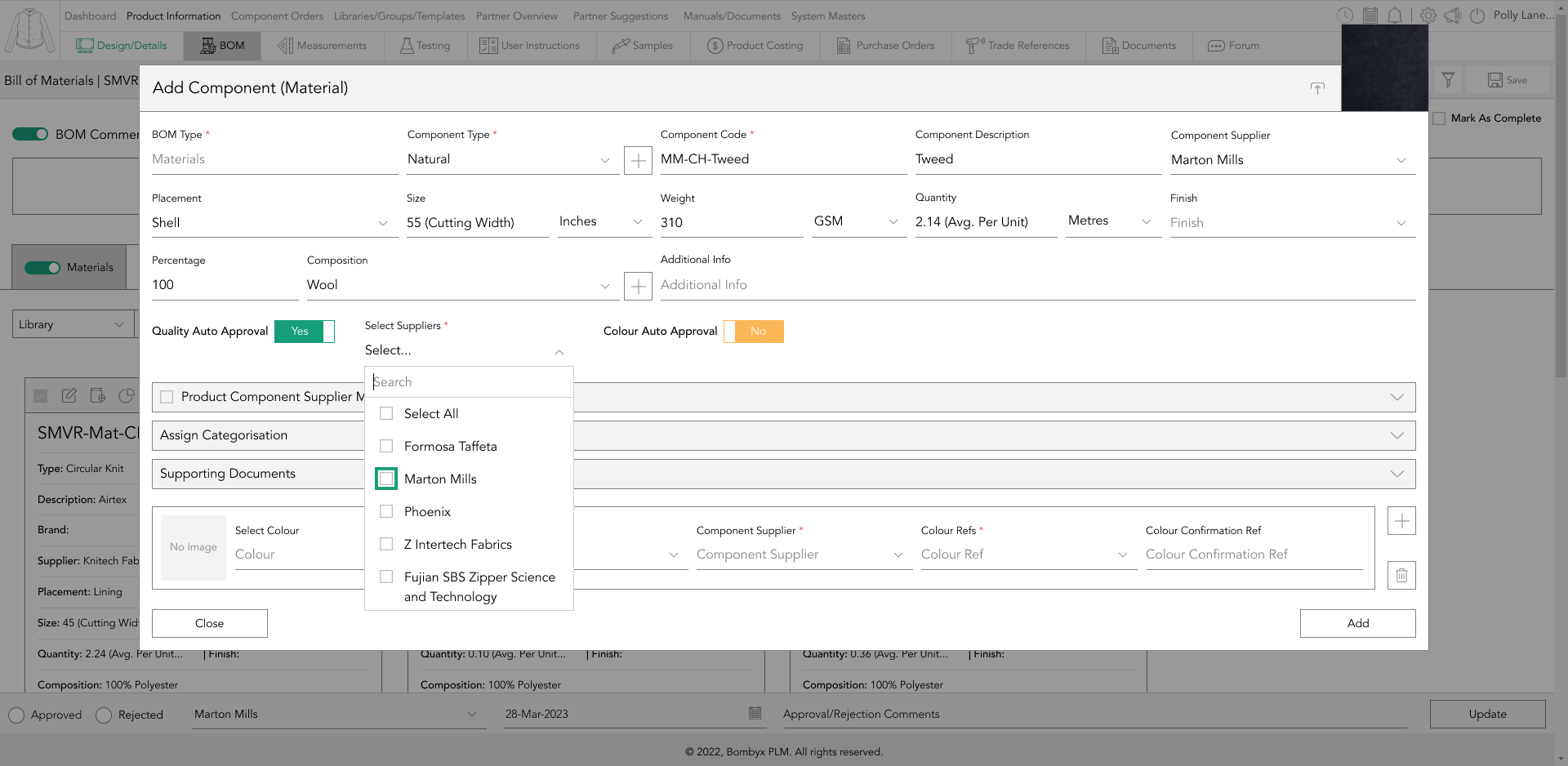
quality auto approvals
After turning on the quality auto-approval, a dropdown will appear.
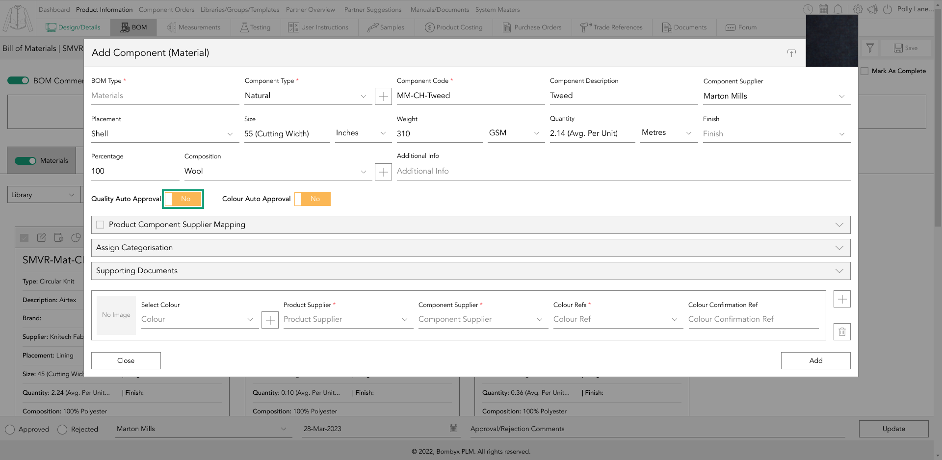
This dropdown will allow you to select the supplier of the component you'd like to remain approved when imported into a product.
product and component supplier
To select from multiple product suppliers that were added to a product, tap the checkbox of the product component supplier mapping field. This action will make a table visible for you to choose from the product supplier dropdown list.
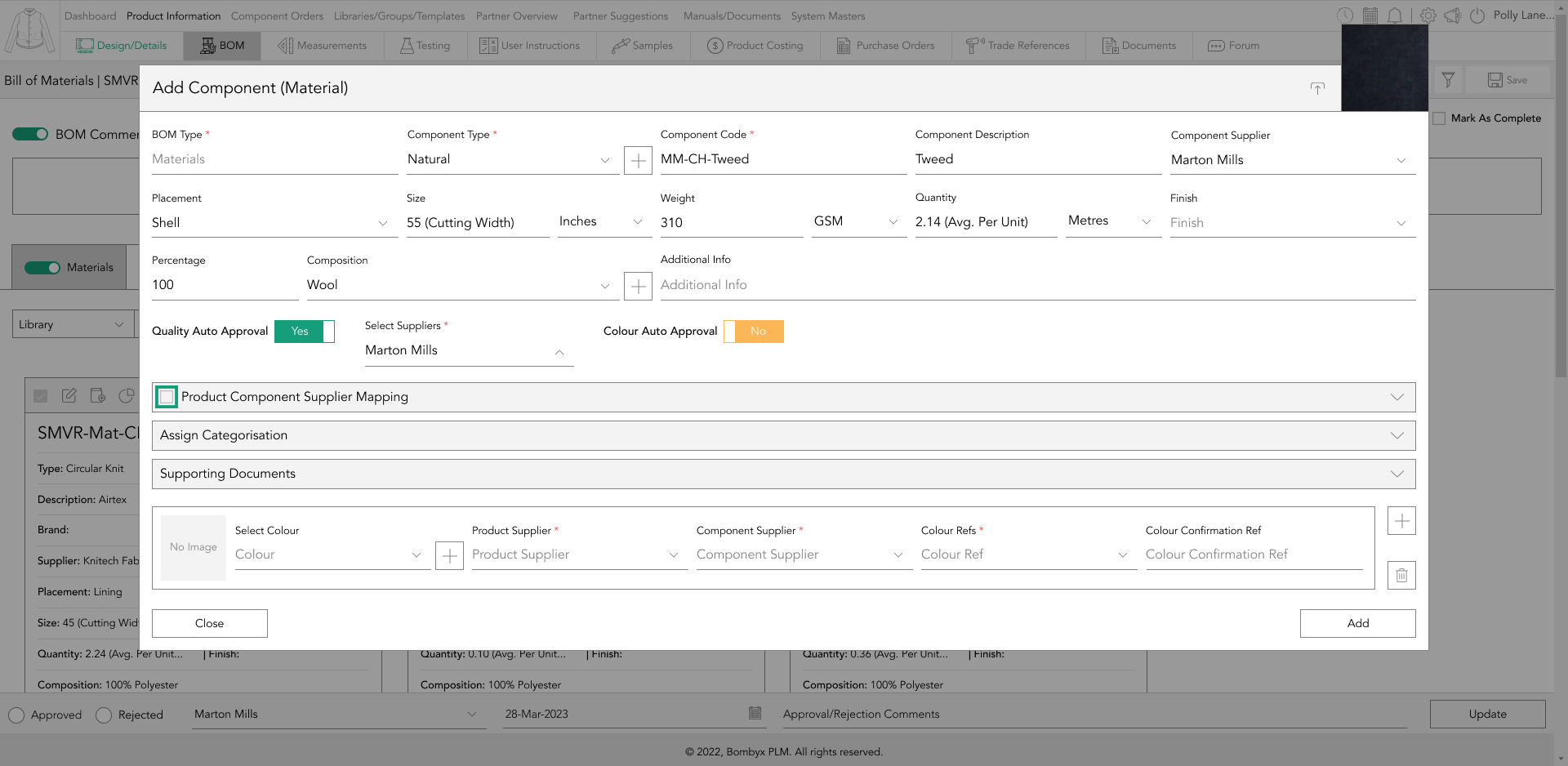
Similarly, to select from multiple component suppliers that were added to a component in the quality information, tap the checkbox of the component supplier dropdown field. This action will display a list of all the component suppliers assigned to that product in the component supplier dropdown.
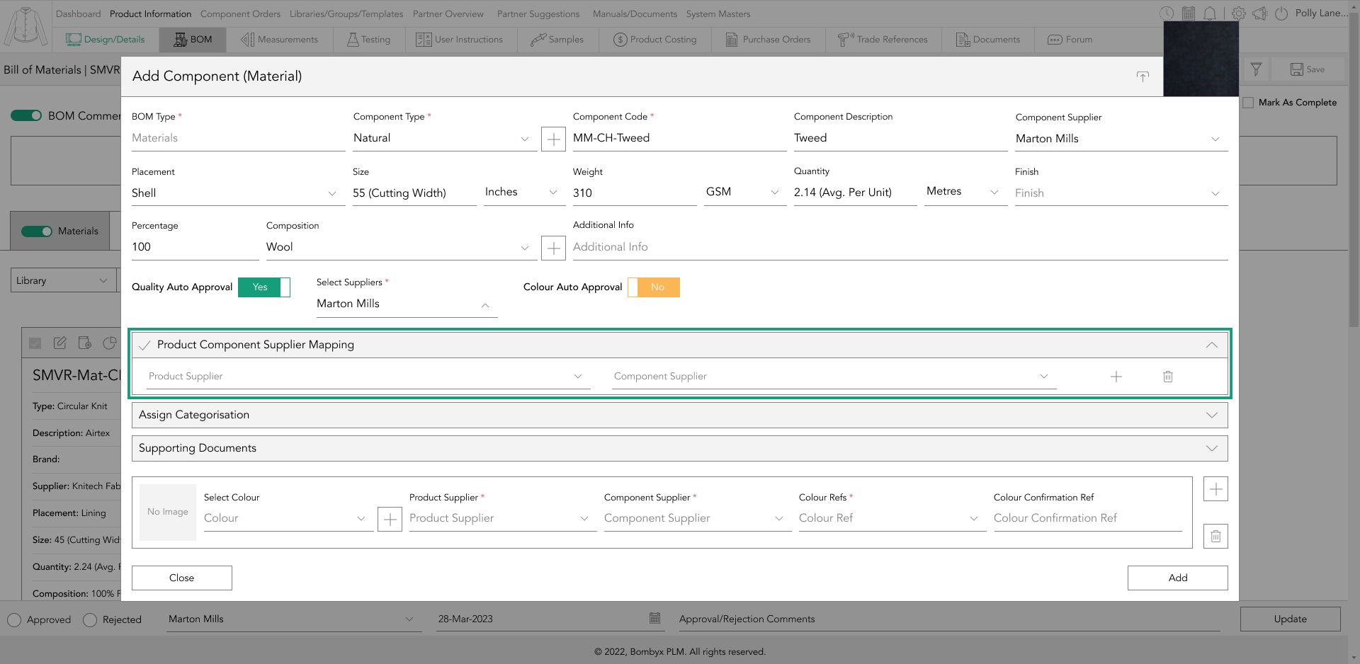
It is possible to have multiple suppliers for a single product or component, for example, if you're manufacturing in different locations or countries. This information is valuable to Bombyx because it helps to identify unique information related to a specific supplier.
select categories
By tapping on the categorisation dropdown, you can assign a component to its own category if it is specific to a product such as kids or homeware.

You can select the brand and multiple categories for the component, making it easier to find when searching or filtering through the system.

adding colourways
The colourway selection within a BOM component is linked to the colours that were initially assigned to the product during its creation in the product information. This means that a dropdown menu of colour options will be available for you to select from.
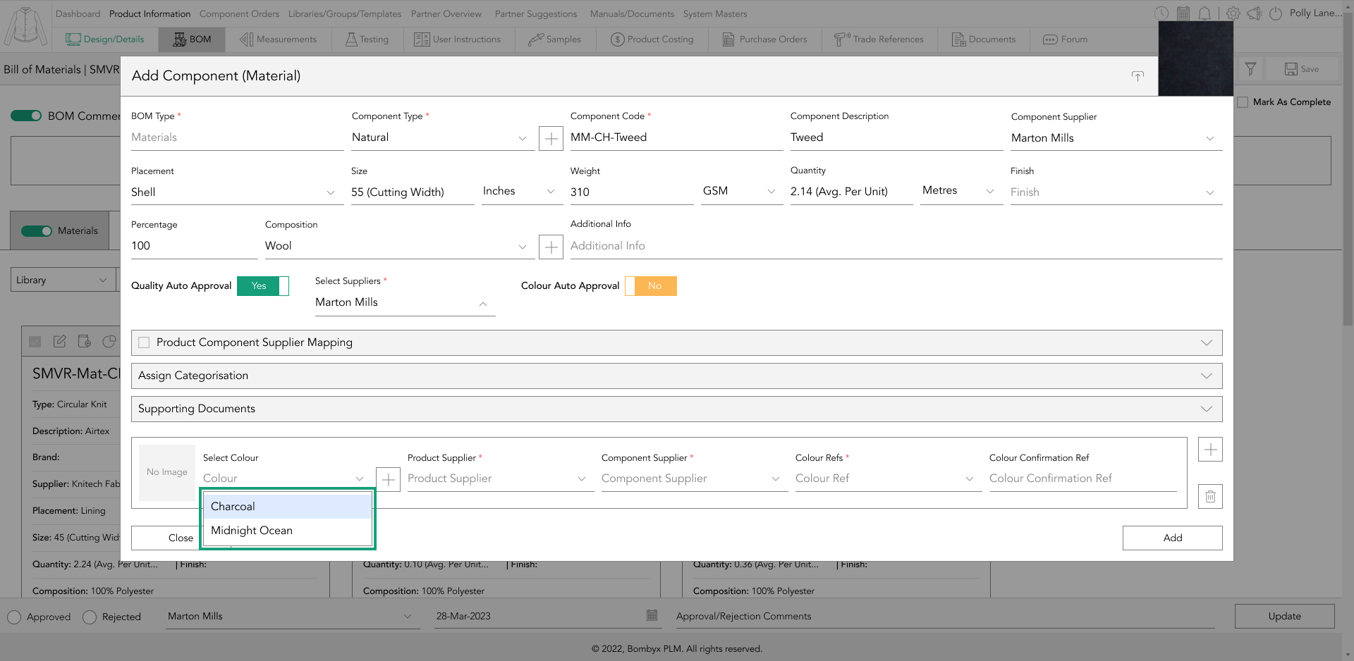
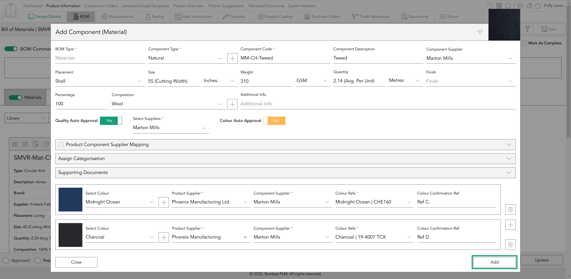
A colourway refers to a design that has been created in a different colour scheme than the original design. For instance, if a product has two colourways, namely Midnight Ocean and Charcoal, this indicates that there are two different colour options available for that particular product.
colour reference
When selecting a color for a specific colorway of a BOM component, the color reference refers to the desired color for that component in that particular colorway.
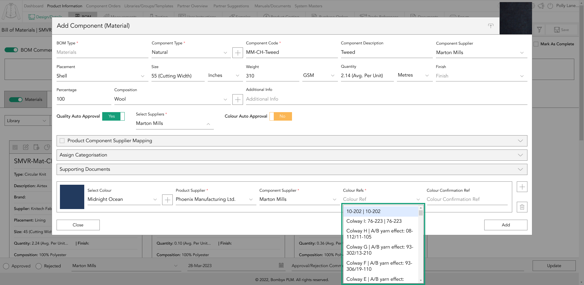
For instance, if the artwork application for a product is embroidery and the color of the embroidery for the Midnight Ocean colorway is turquoise. At the same time, it is yellow for the charcoal colorway, you should choose turquoise from the color reference dropdown for the Midnight Ocean colorway option.
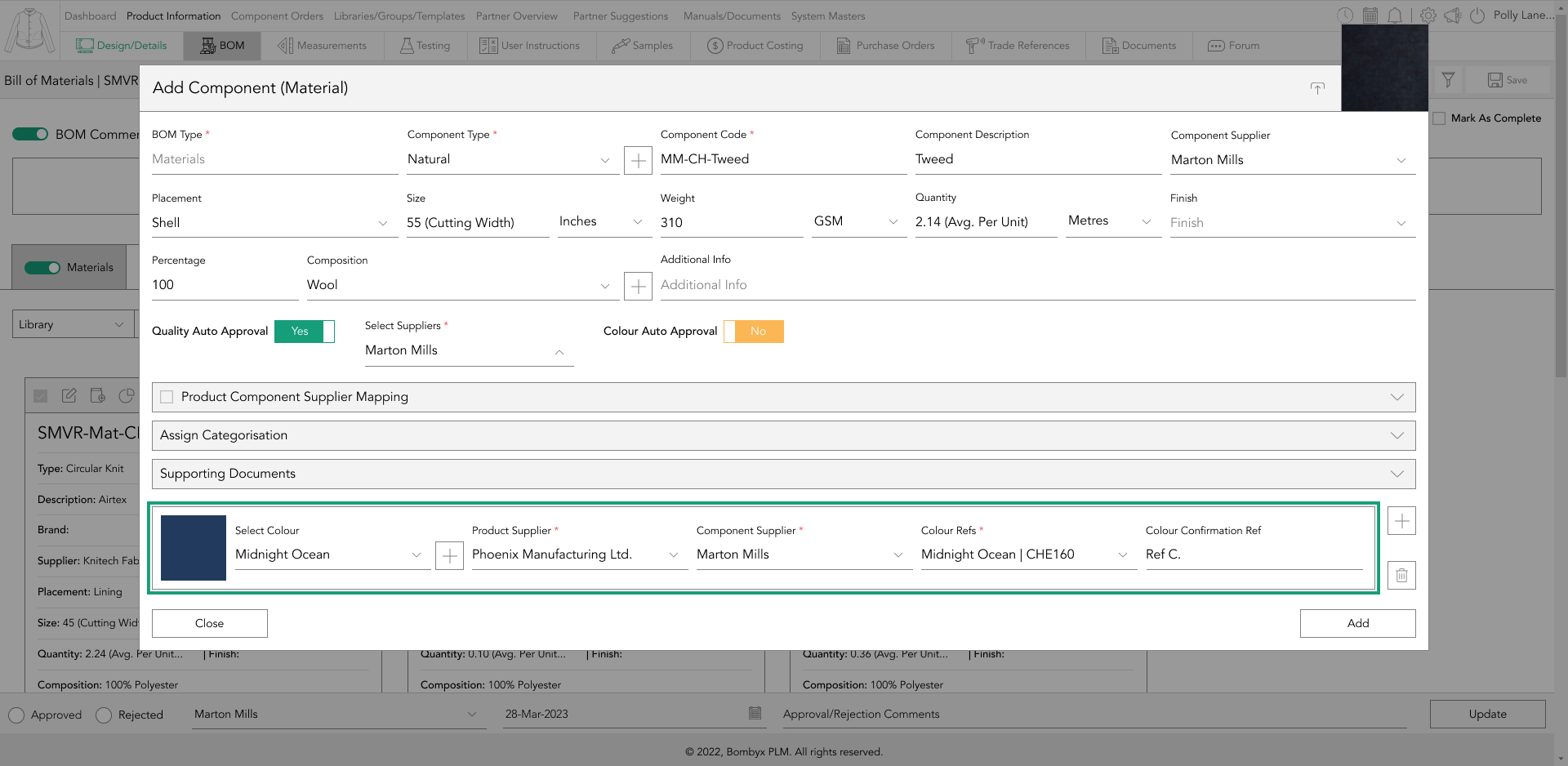
colour confirmation reference
The color confirmation ref comes into play when the supplier has provided multiple color variations for the same color reference, which is commonly known as a 'lab dip' in the apparel industry.
A lab dip is essentially a dyed fabric sample created to meet the color standards of a designer, typically produced by a dye house or color lab. Its purpose is to provide the designer with an idea of what the fabric color will look like during manufacturing.
Typically, a supplier will offer several options, labeled as A, B, C, D, or 1, 2, 3, etc., which are as close as possible to the requested color.
adding multiple colourways
To add multiple colours, you can tap the add icon located on the right side of the colour table.
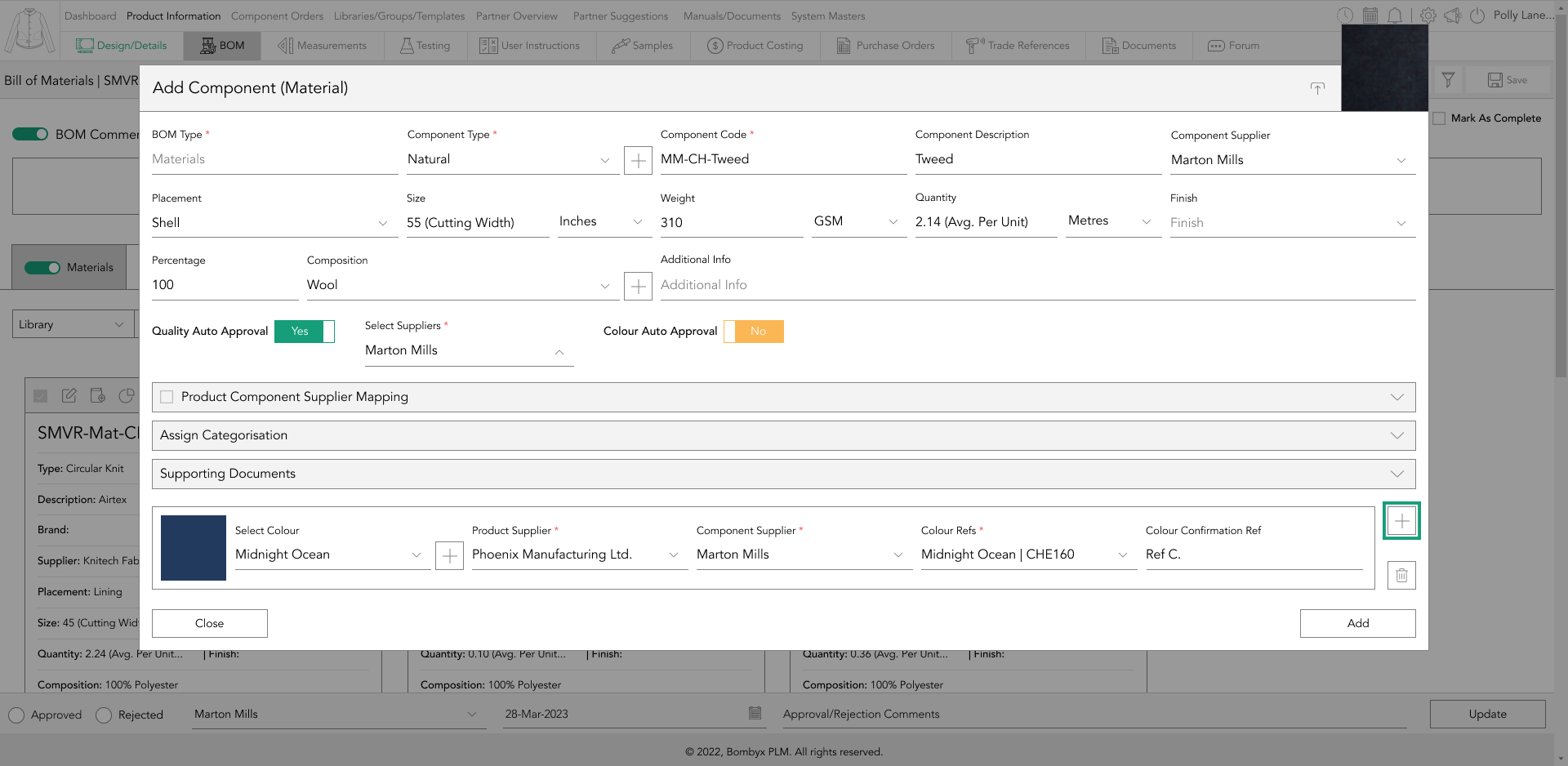
Once clicked, a new table will appear for you to input your secondary colour information.
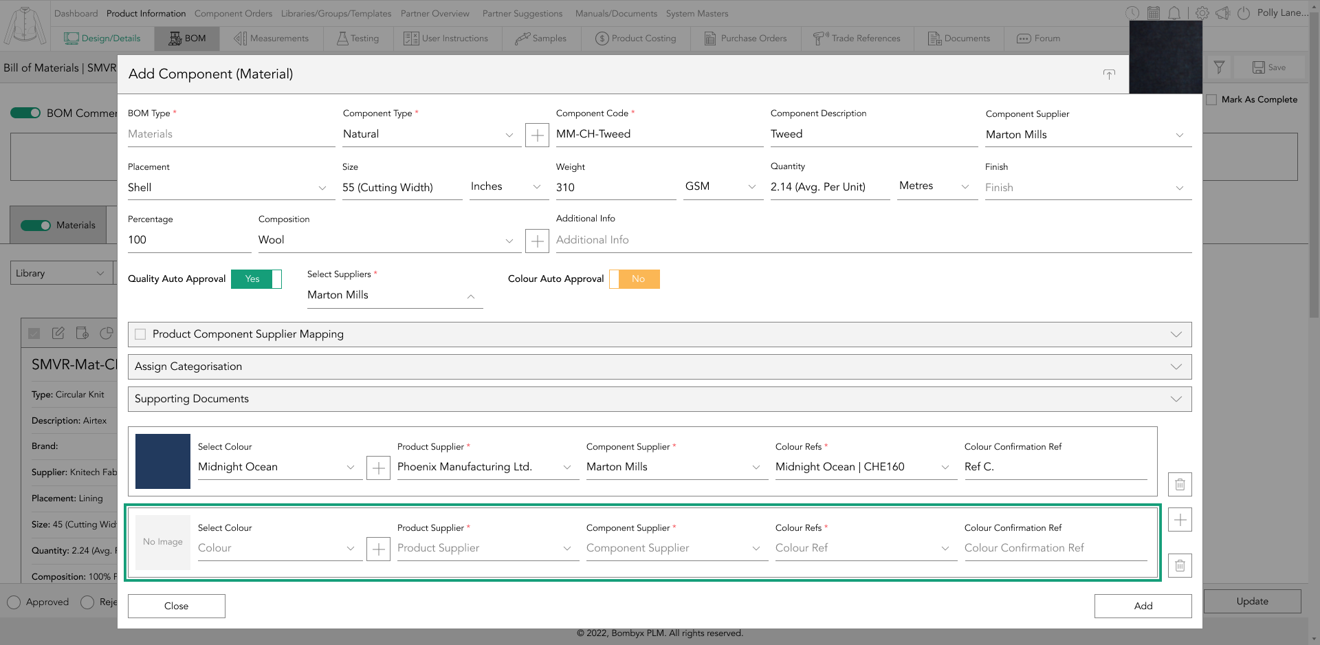
Once you have completed this step, simply tap the add button to save the information.
creating a colour
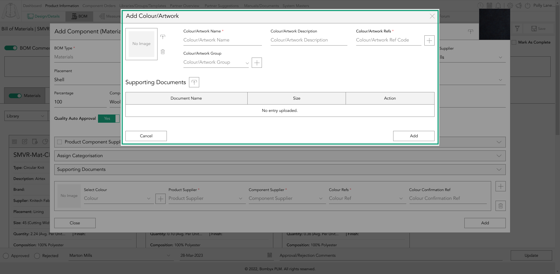
If you are wanting to add a colour to your material that has not yet been created in the library, you can do so by creating a new colour. Firstly, tap the plus icon next to the colour dropdown, and a popup will appear.
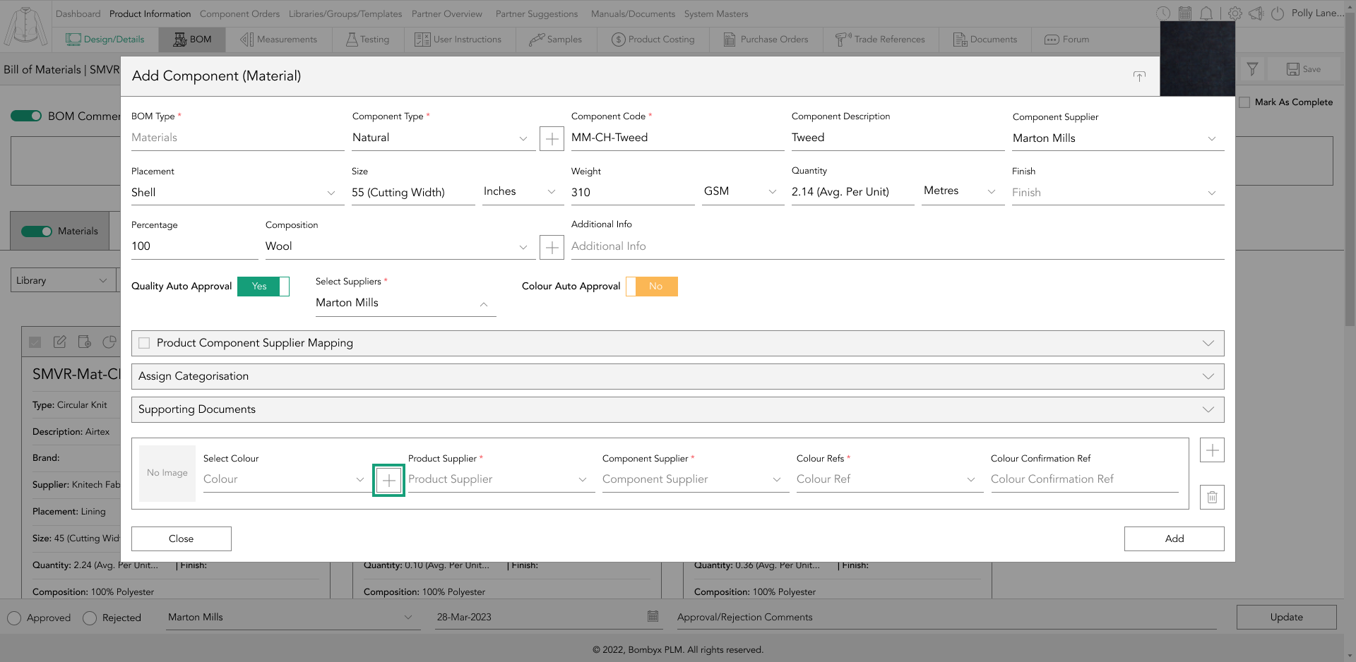
In this popup, you can add all the necessary information related to your colour or artwork, such as colour names, descriptions, and colour references, as well as groups, images, and supporting documents.
deleting colours
To delete a colour, simply tap on the bin icon located to the right of the colour table. This action will delete the selected colour immediately.
However, if you have accidentally deleted a colour, you will need to add it back in again.
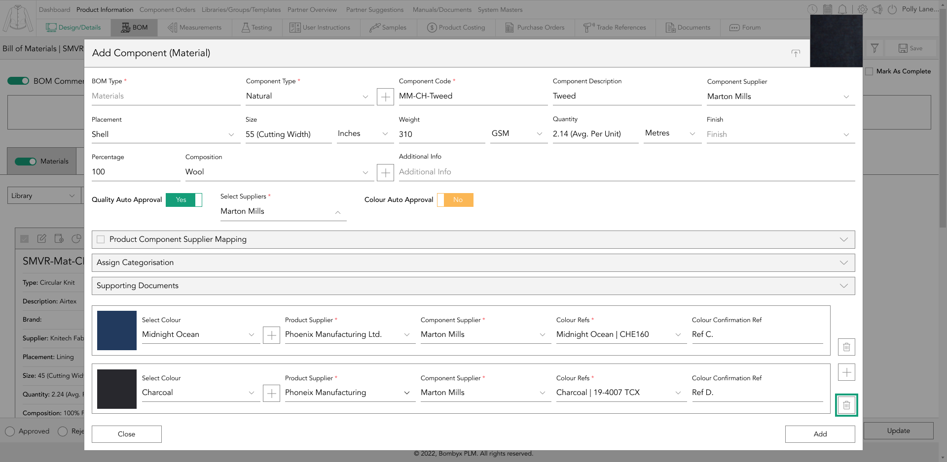
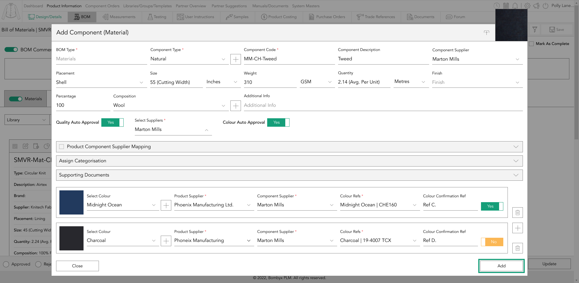
colour auto approval
When turning on the colour auto-approval feature, a further toggle button will appear to the right of each colour reference and colour confirmation line.
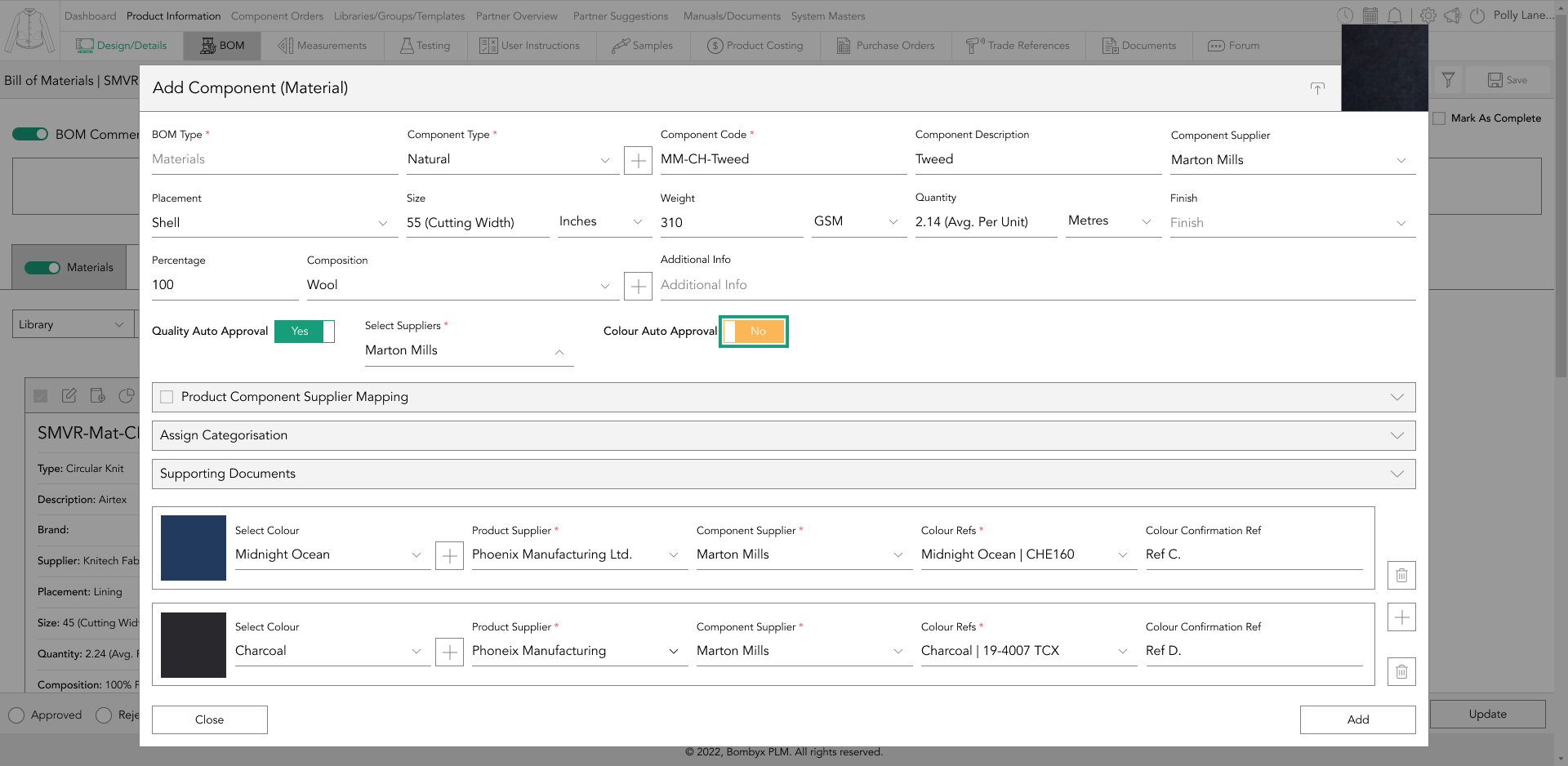
You can then tap the toggle buttons for the colour references that you want to always remain approved by that specific component supplier when importing into a product.
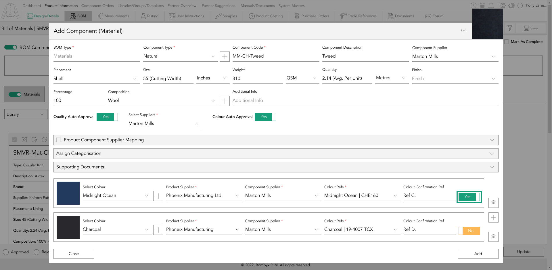
Once you have selected the appropriate colour references, tap the "add" button.
approve/reject colours
To approve or reject a colour, you must first tap on the component card that you wish to update with a new status.
Once you have done so, a panel containing all the colour information will appear down the right-hand side of the page. In this panel, you will notice a checkbox located on the left-hand side of each colourway name and reference.
To update the colour status, simply check the checkbox next to the desired colour status and select "approve" or "reject" from the status update footer bar.
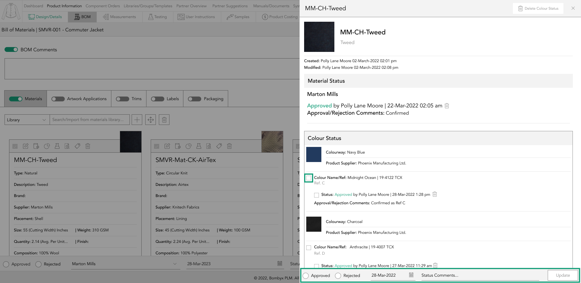
After completing the necessary fields in the status update footer bar, tap the update button located on the right-hand side of the footer bar. The selected status, along with your name and the date/time, will appear underneath the colour for which you applied for the status.
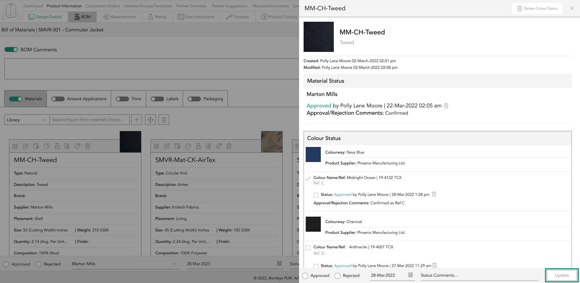
It is important to note that statuses can be overwritten.
delete colour status
If you have made a mistake when applying a colour status, but do not wish to overwrite it, you can simply check the checkbox located to the left of the status information located underneath the colour reference and colour confirmation reference.
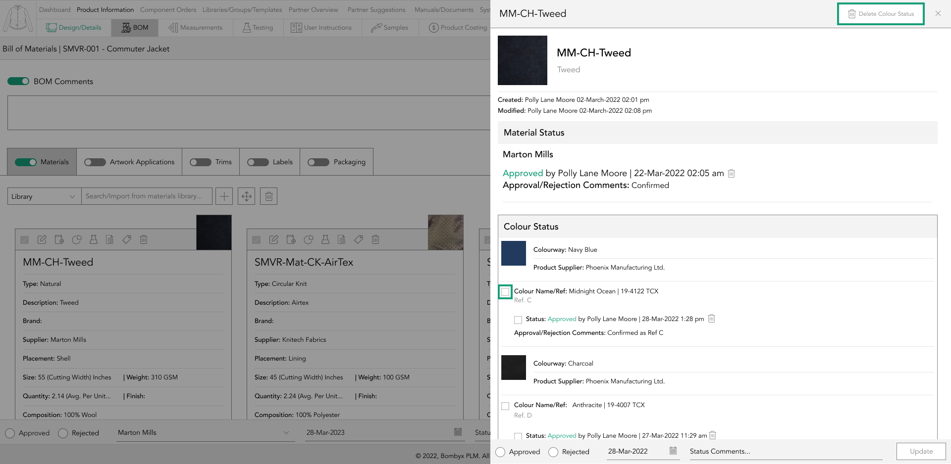
This allows you to clear the status of multiple colour references simultaneously. After selecting the desired colour references, navigate to the header of the side panel and tap the "Delete Colour Statuses" button to clear the selected colour statuses.
navigating to bom usage
The BOM Usage function is a valuable feature that allows you to identify where a particular component is being used in other products.
This feature proves particularly helpful when you need to make changes to a BOM item and want to apply those changes across multiple products, rather than making the changes manually for each product.

To access the BOM Usage page, simply tap on the usage icon located on the component card.
edit
When it comes to editing the information in the Bill of Materials, there is no need to exit the usage popup. You can edit the necessary information directly within the component card and have those changes automatically applied.

To edit the previously entered information for a component, simply tap on the "Edit" icon located in the "action" column and begin making the necessary edits.
created and modified
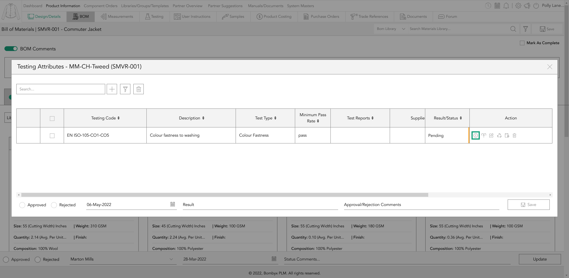
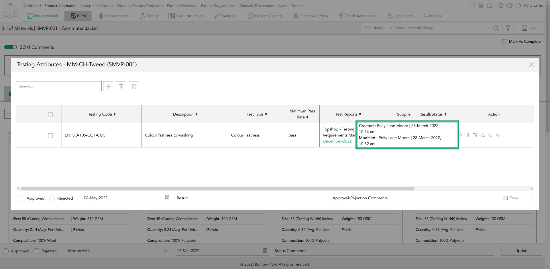
If you wish to view the details of who uploaded or modified a BOM component, simply hover over the information icon located in the Action column. Doing so will display information about when the component was originally uploaded, who uploaded it, and the date and time it was uploaded.
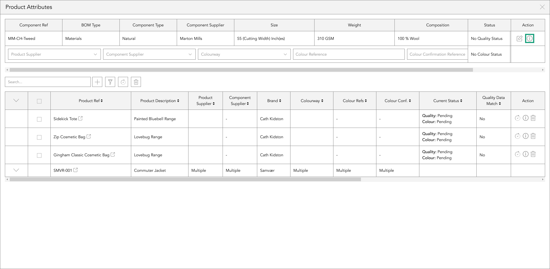
Additionally, it will also show the details of when the component was last modified, who modified it, and the date and time it was last modified.
component filtering
In case you need to review information across multiple products based on a particular product supplier, component supplier, colourway, or colour reference, you can make use of the dropdown menus located at the top table displaying the usage of the BOM component you selected.
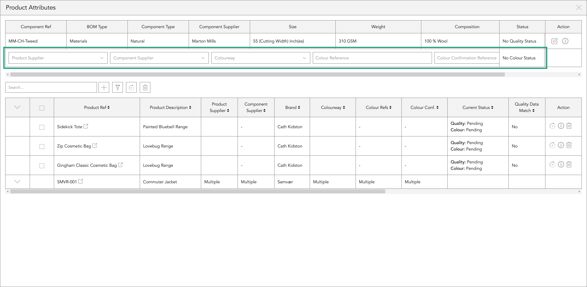
By selecting the relevant options from these menus, you can easily view the required information.
searching products
Located below the top table is a search bar that provides users with the option to filter the results displayed in the bottom table by entering the product number or description in the search field.
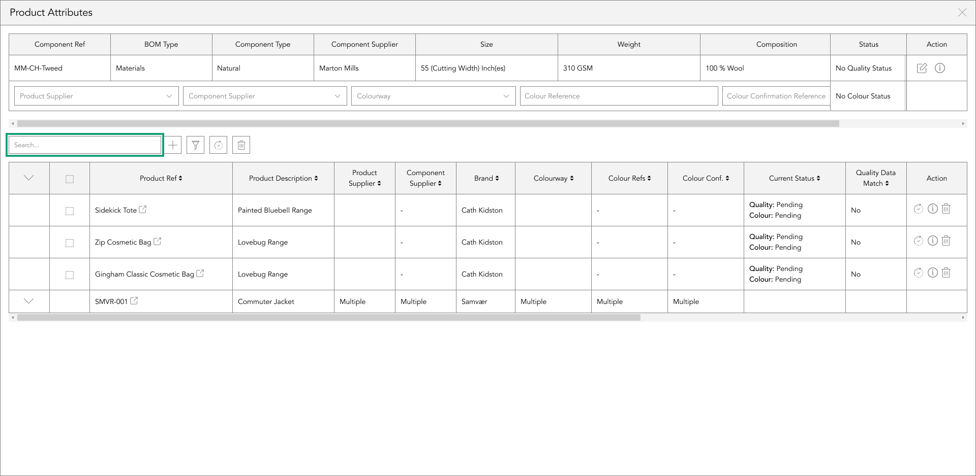
When you enter either of these details into the search bar, the bottom table will only show results that are relevant to your search criteria. Additionally, any product numbers or descriptions that do not match your search criteria will be hidden from view.
adding components to other products
To add the BOM component to a product that does not have it already, locate the + icon positioned to the right of the search bar function in the top table and click on it.
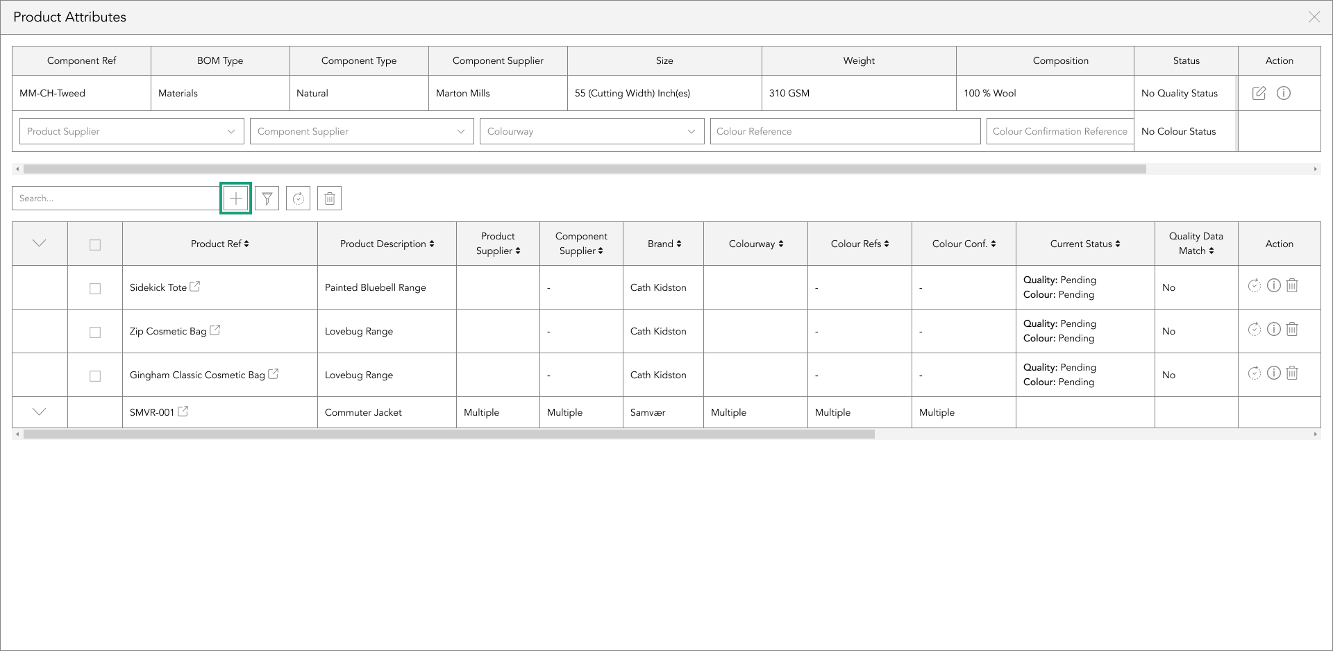
A popup will appear, from here you can select a product from the table, or you can filter through the products based on filters you apply.
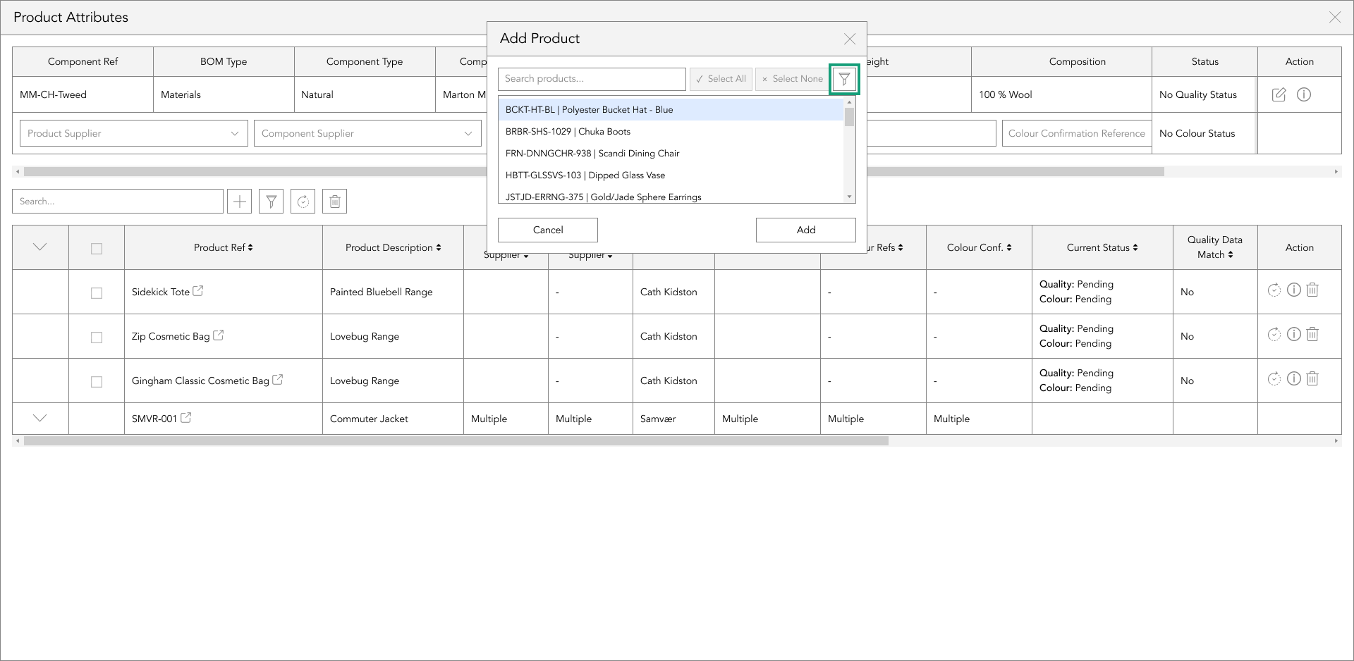
A popup will appear, providing you with the option to select a product from the table. Alternatively, you can use the filters to narrow down your search results.
After making your selection from the dropdown menu, tap the apply button. If you wish to reverse your selection, click on the clear button available in the filter popup.
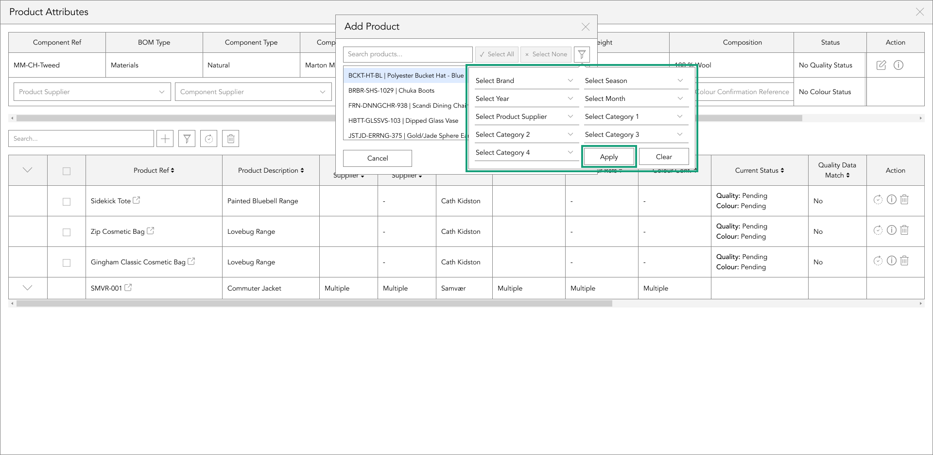
attribute filtering
By using the attribute filter, you can search more specifically for the BOM component from the top table that has been attributed to other products.
To use the attribute filter, select one or more options from the dropdowns.
After selecting from the attribute filter, the bottom table will show only results with the attributes you’ve chosen in the filter.
product syncing
To sync data for a single product, locate the sync icon on the right-hand side of the table in the action panel column and tap it to apply the component data from the top table, including the status of the selected product.
Alternatively, to sync the component data and status from the top table to multiple products in the bottom table simultaneously, select the checkboxes to the left of the bottom table and tap the 'sync' button positioned to the right of the search bar function.
deleting components from another product
To delete a single component from another product, you can tap the delete icon in the action panel column, which is located on the right-hand side of the table. This will remove the BOM component displayed in the top table from the selected row in the bottom table.

However, if you want to delete the BOM component displayed in the top table from multiple products at once in the bottom table, you can select the checkboxes down the left side of the bottom table and tap the ‘delete’ button. This button is positioned to the right of the search bar function.
After that, a popup will appear, asking you if you’re sure you’d like to delete the displayed component in the top table from the selected products in the bottom table. If you select ‘Yes’, those rows will be removed from the bottom table, and that component will no longer exist within that product's Bill of Materials.
On the other hand, if you select ‘No’, they will remain as they were previous to tapping the sync button.
current status
By checking the cell titled ‘Current Status’ in the bottom table, you can see the status of the corresponding Bill of Material component in that specific product.
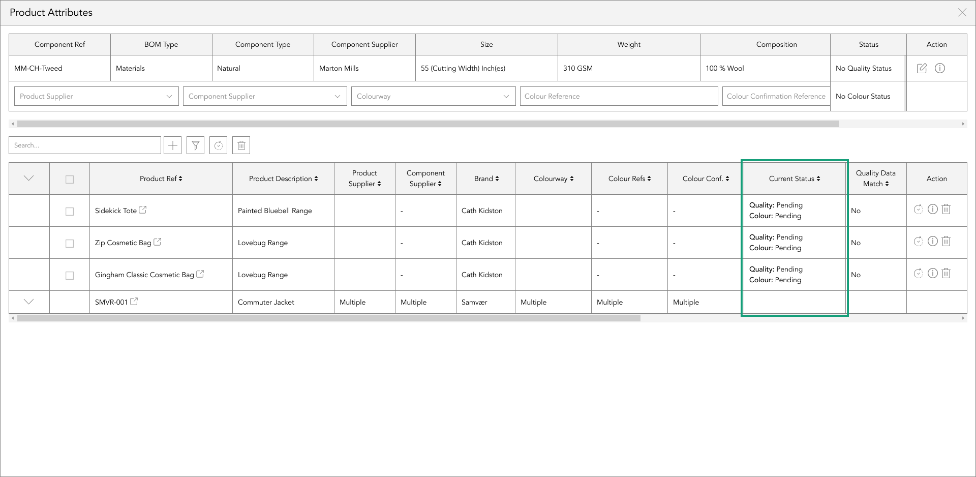
This enables you to determine whether you need to update the product when syncing data from the top table, including the status, to the same component in the BOM of the products displayed in the bottom table
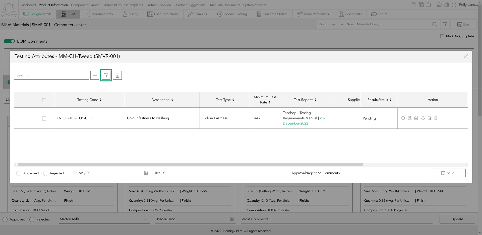
navigating to bom testing
Upon locating the component in the BOM, you can access its testing section by tapping the testing icon.

This icon enables you to assign testing requirements and reports to specific suppliers, components, and colour reference combinations.
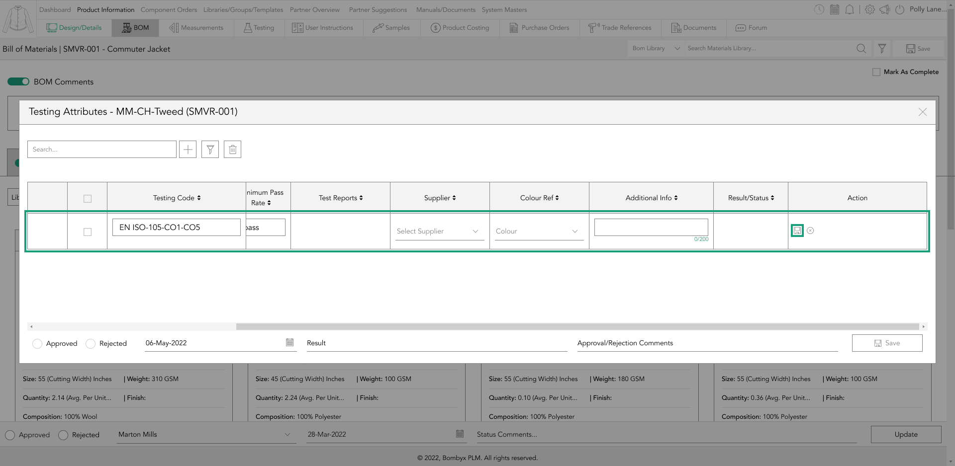
adding a testing requirement
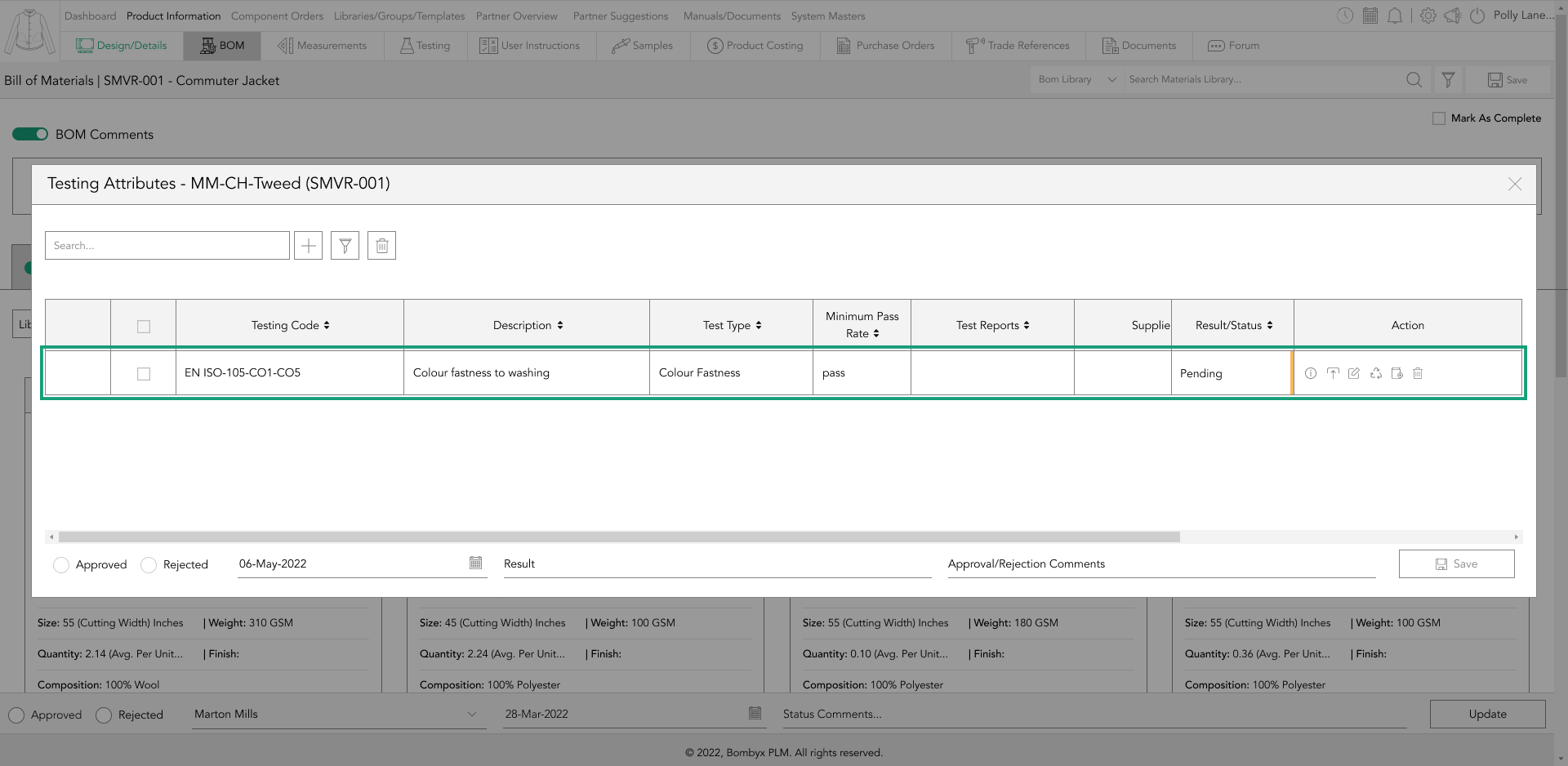
By tapping the + icon, a row will appear in the table, where you can select a testing requirement from the testing code/description dropdown.
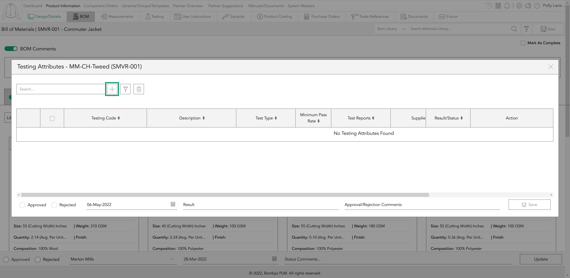
Once you've done this, the testing requirement you selected will be added to the table.
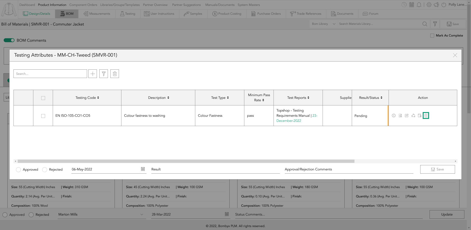
edit testing requirements
In case you want to modify or add data to the component's testing requirements/reports, you can access the editing mode by tapping the edit icon in the action panel on the right-hand side of the table.
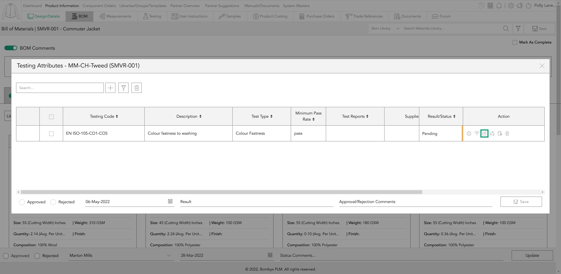
Once you access the editing mode, you can update or edit any information in the table. After you finish editing, tap the save icon in the action panel.
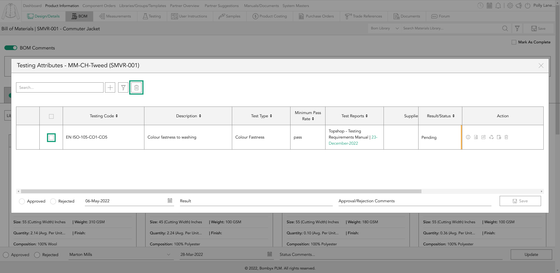
delete testing requirements
To delete a single testing requirement from the BOM component, simply locate the ‘delete’ icon in the action panel column on the right-hand side of the table and tap it.
In case you made a mistake, you can re-add the testing requirement by tapping the + button to the right of the search bar function.
However, if you want to delete multiple test requirements at once, select the checkboxes of the testing requirements to be deleted from the left side of the table, and tap the ‘delete’ button, located to the right of the search bar function.
Upon tapping the ‘delete’ button, a popup will appear asking you to confirm if you want to delete the selected test requirements.
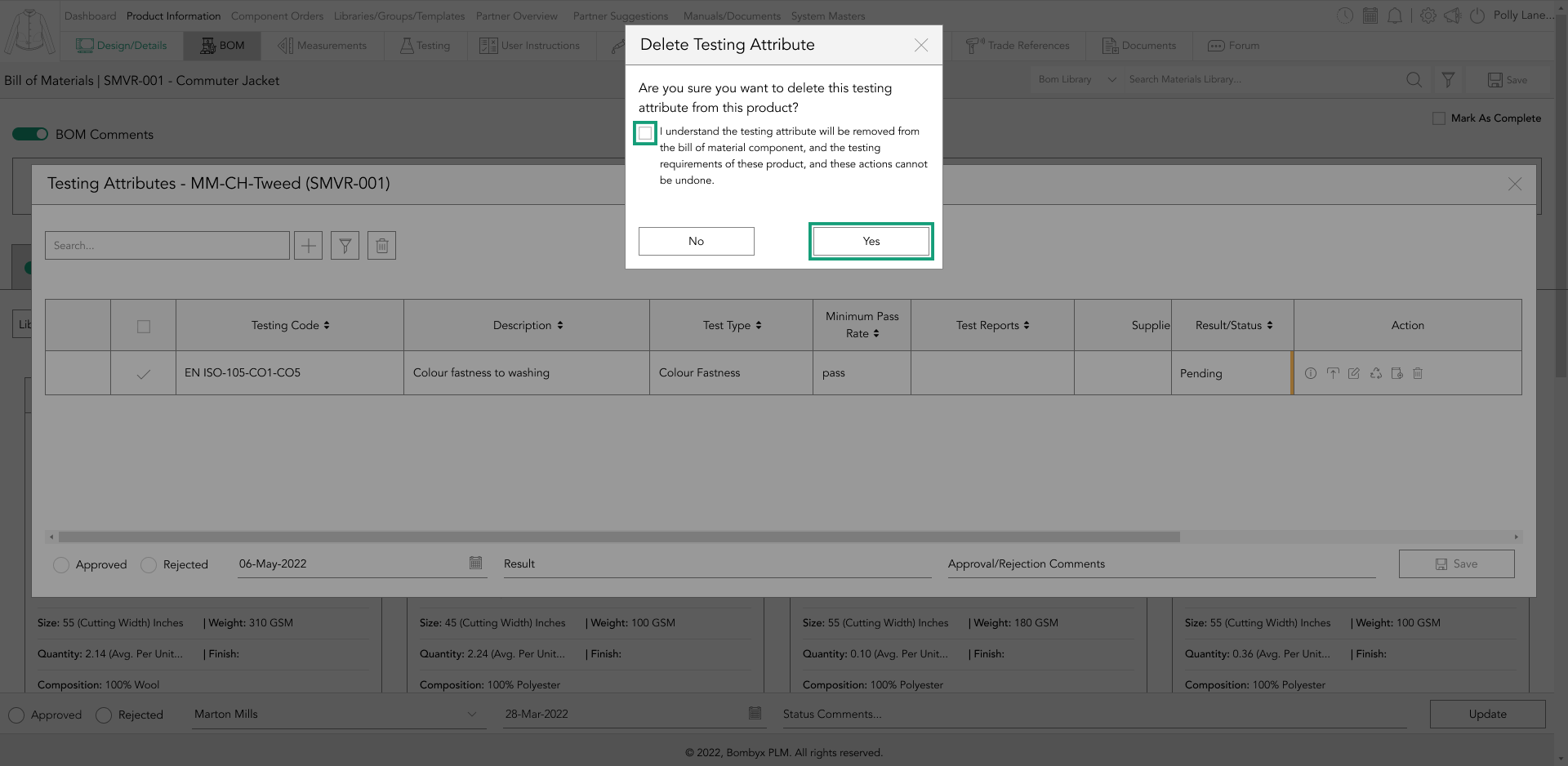
If you select ‘Yes’, the selected rows will be deleted. If you select ‘No’, the selected test requirements will remain in the table.
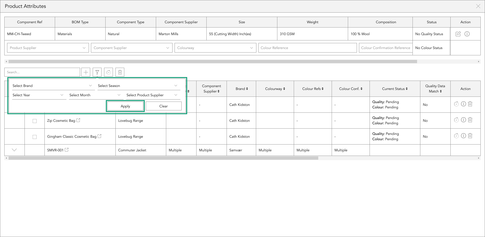
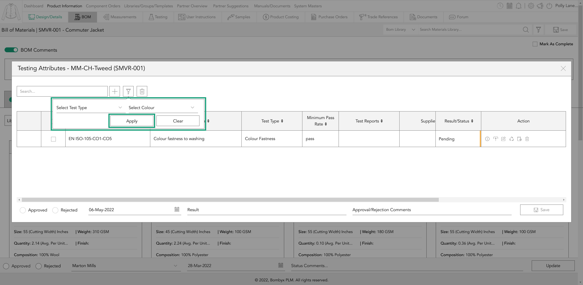
applying search filters
Just like the search bar function, you can also use the filter icon to narrow down the list of assigned tests.
Simply locate the filter icon, positioned second from the search bar function, and tap on it.
You can then select one or more filter options from the dropdowns, and apply them by tapping the ‘Apply’ button.
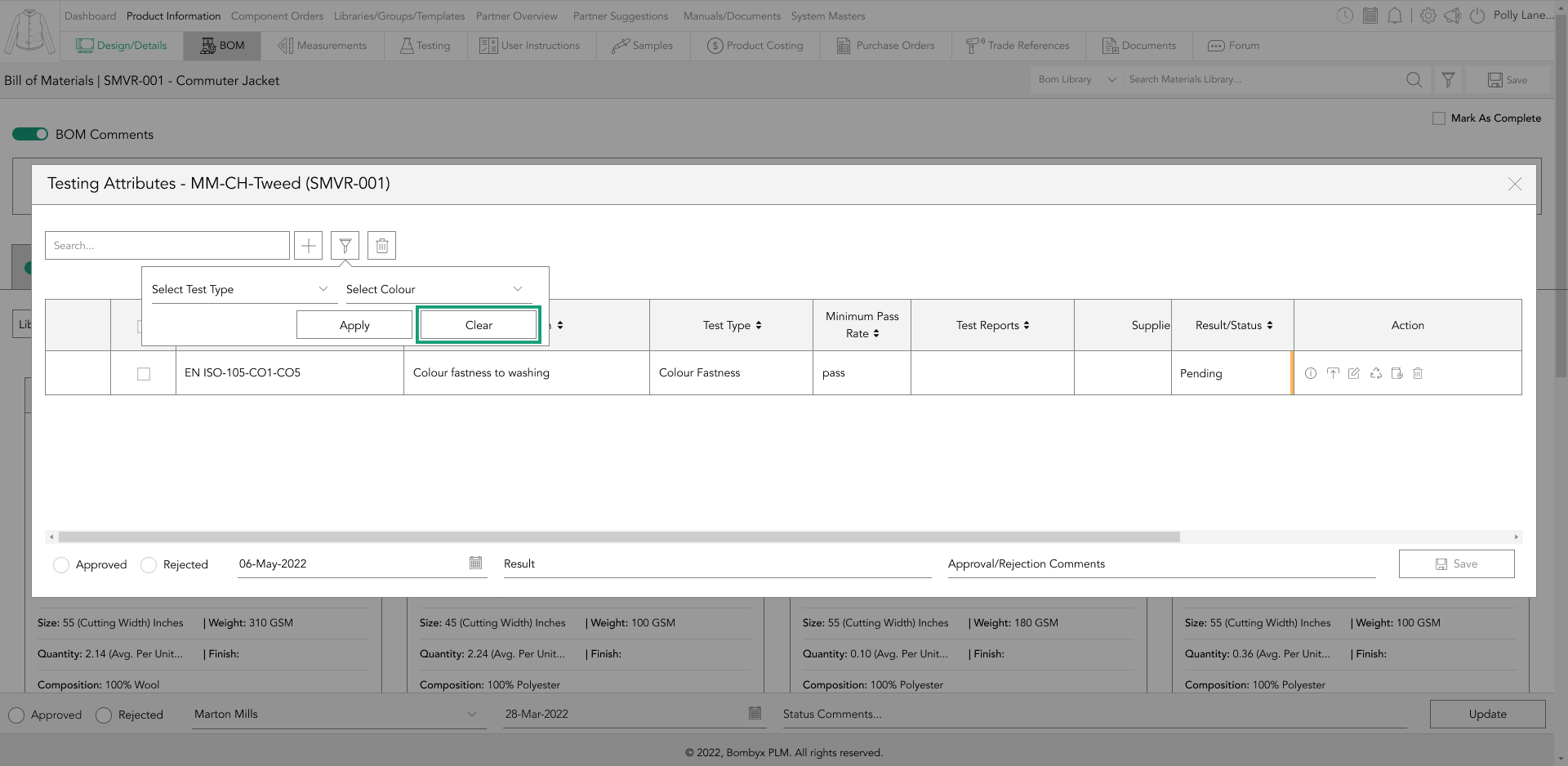
If you want to remove the filters that you have applied, simply tap the ‘Clear’ button.
uploading a test report
To upload a test report, you can follow these steps. First, tap the upload icon in the action panel, and a popup will appear.
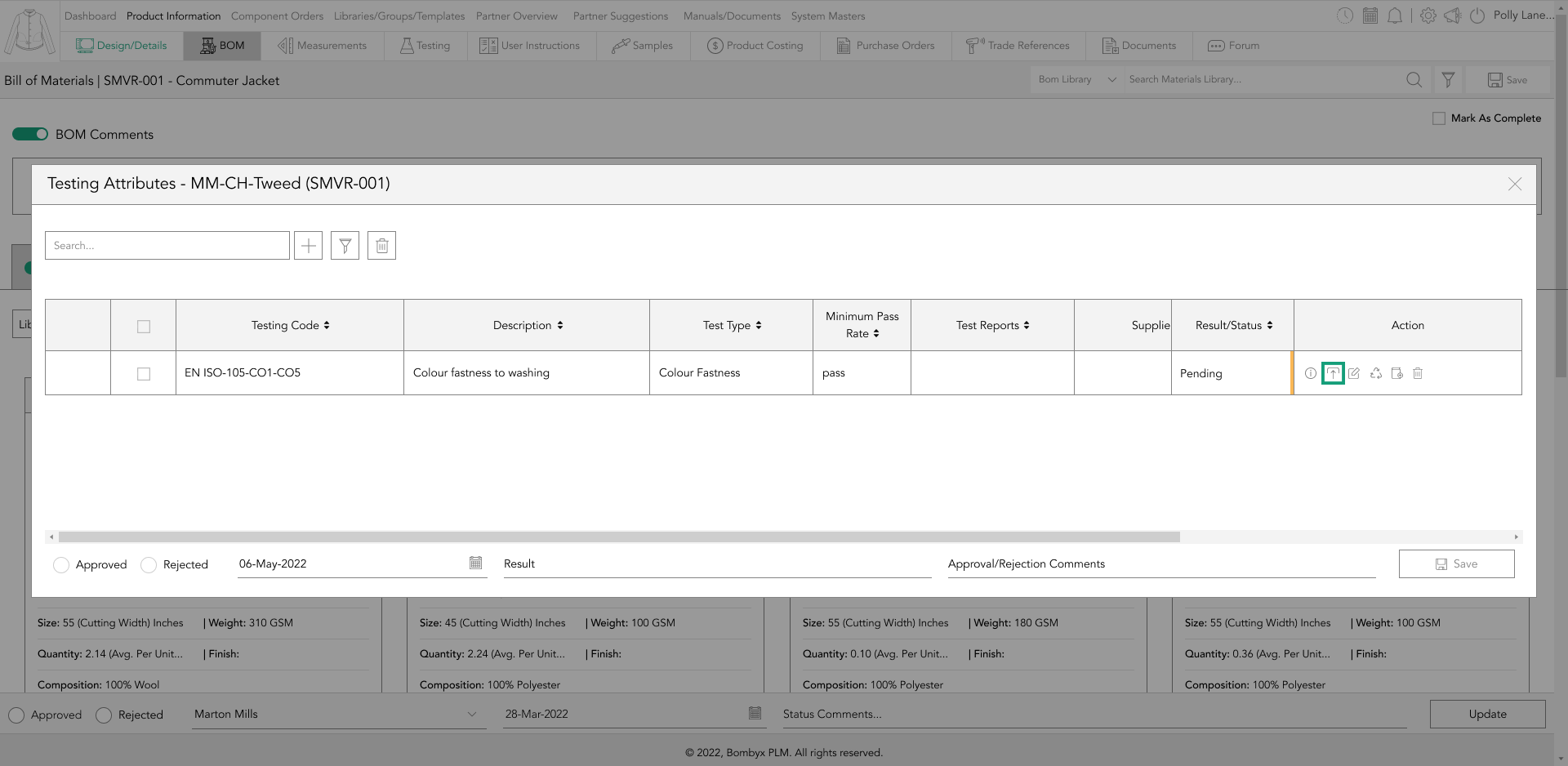
Then, there are two ways of uploading a test report: you can either drag and drop the file into the grey box or tap the upload icon at the bottom right of the grey box.
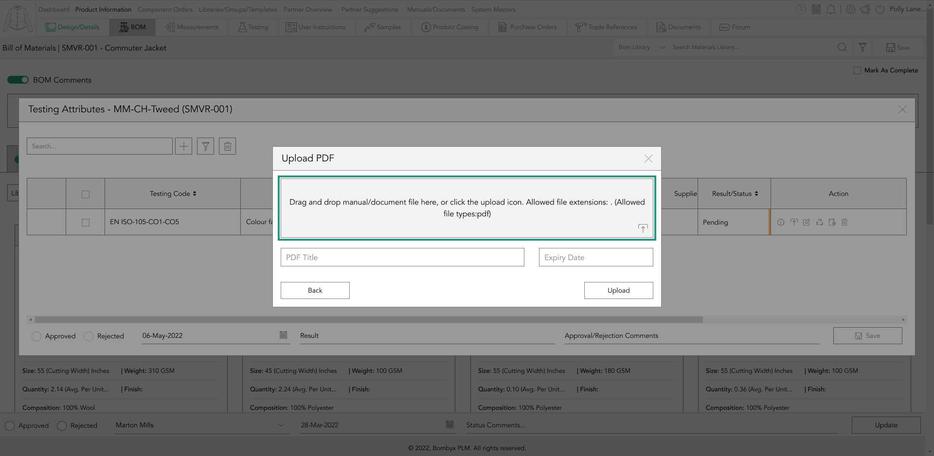
After uploading the report, the file name will automatically be used as the name. If you want to change the name, you can overwrite it in the document name text box.
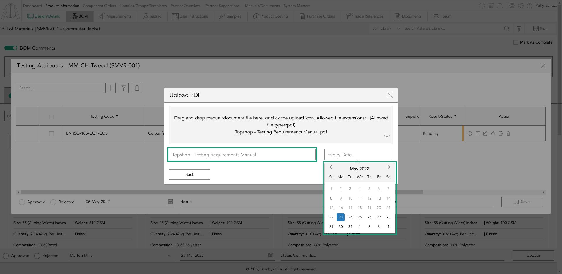
Additionally, if the report has an expiration date, you can add this in the field next to the document name field and tap ‘Add’.
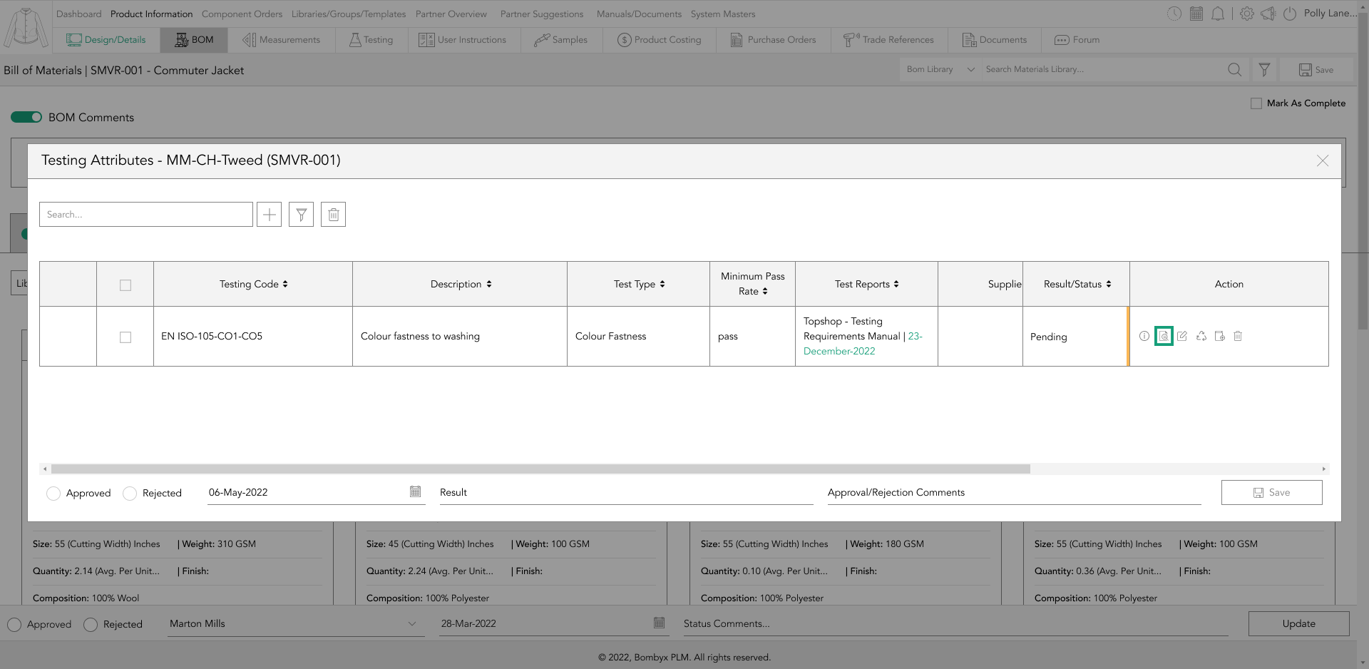
previewing a test report
After a test report has been successfully uploaded, you can view the document by tapping the preview icon located in the action panel.
renewing test reports
To renew a test report, tap the renew icon in the action panel, and a popup will appear.
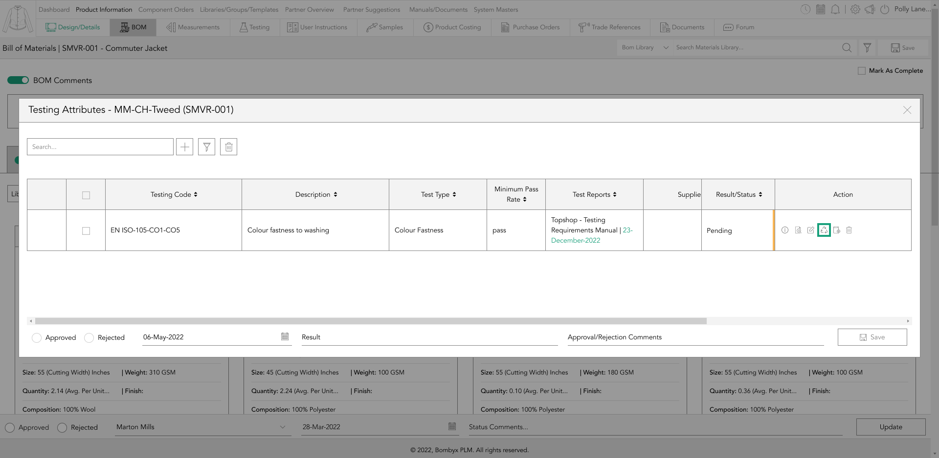
There are two ways you can do it. Firstly, you can drag and drop the new file into the grey box, or alternatively, tap the upload icon located at the bottom right of the grey box.
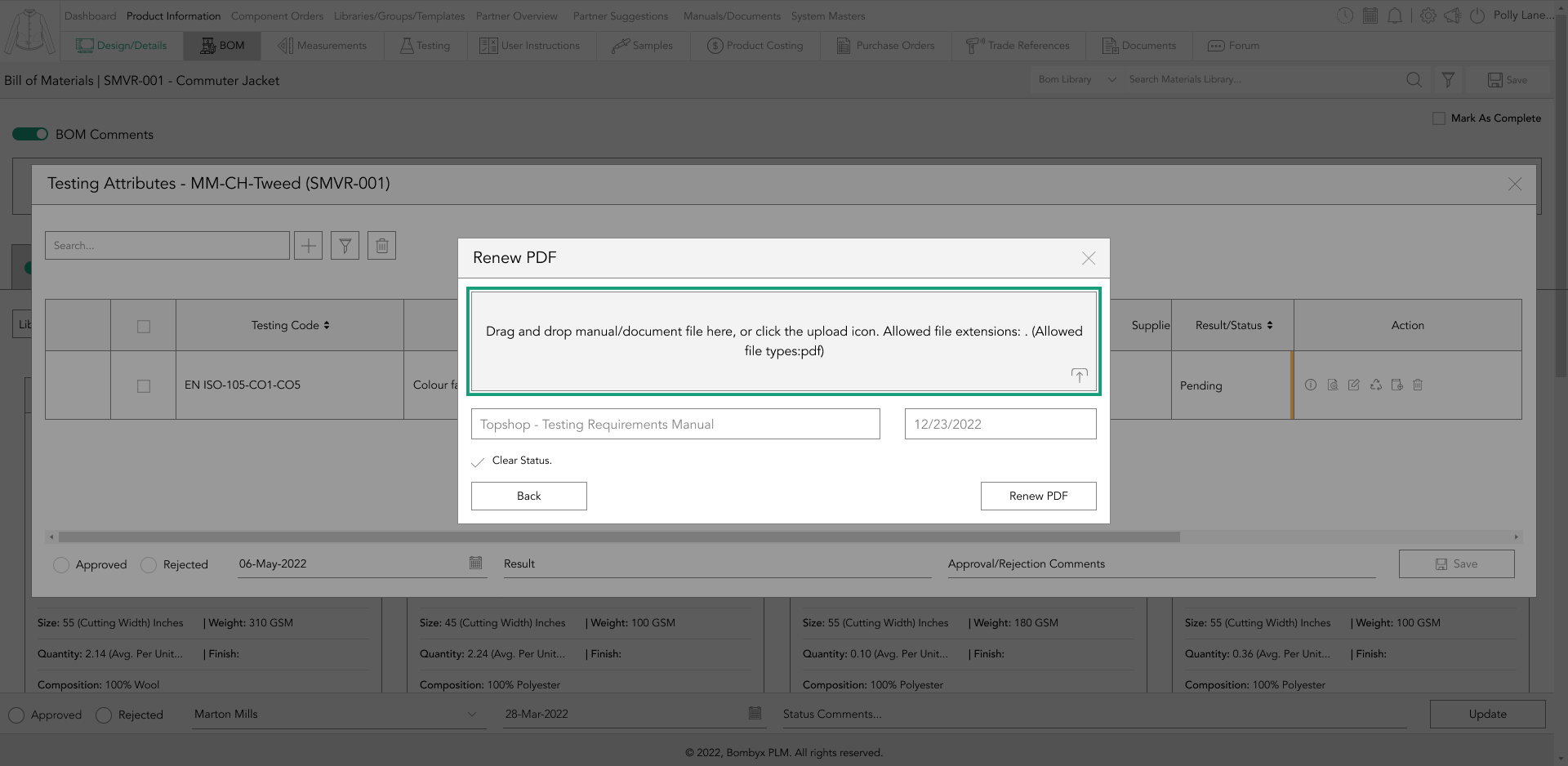
After uploading the new report, the file name will automatically be used as the name. However, if you wish to change the name, simply overwrite it in the document name text box.
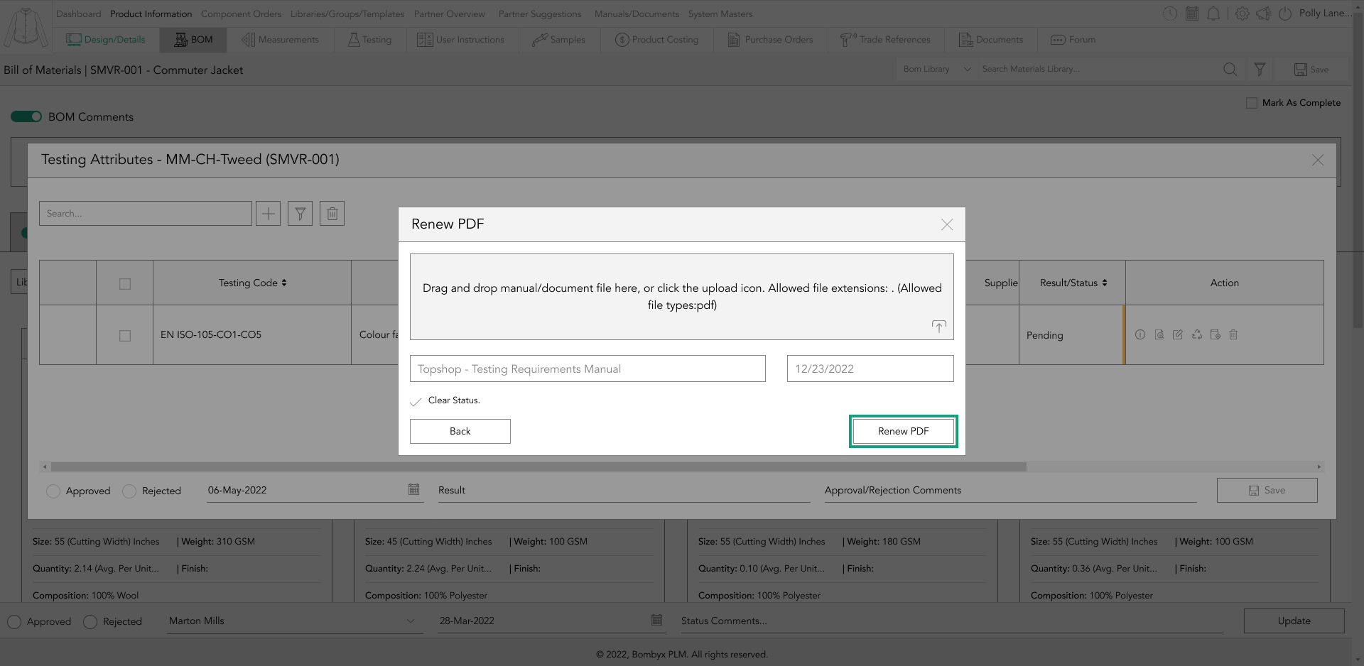
If the report comes with an expiration date, you can add it in the field next to the document name field. Finally, click on the ‘Renew’ button to complete the process.
add/update to library
After renewing a test report, you can update the testing library to ensure that the new report is available for future use in newly added products. To do this, tap the ‘Add to Library’ icon located in the action panel on the right-hand side of the table.
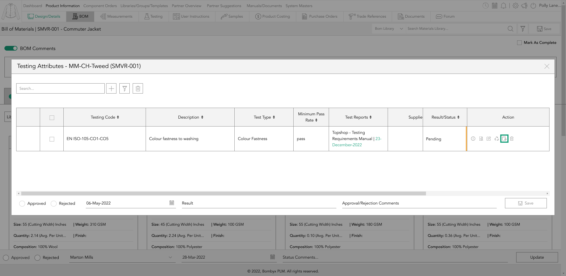
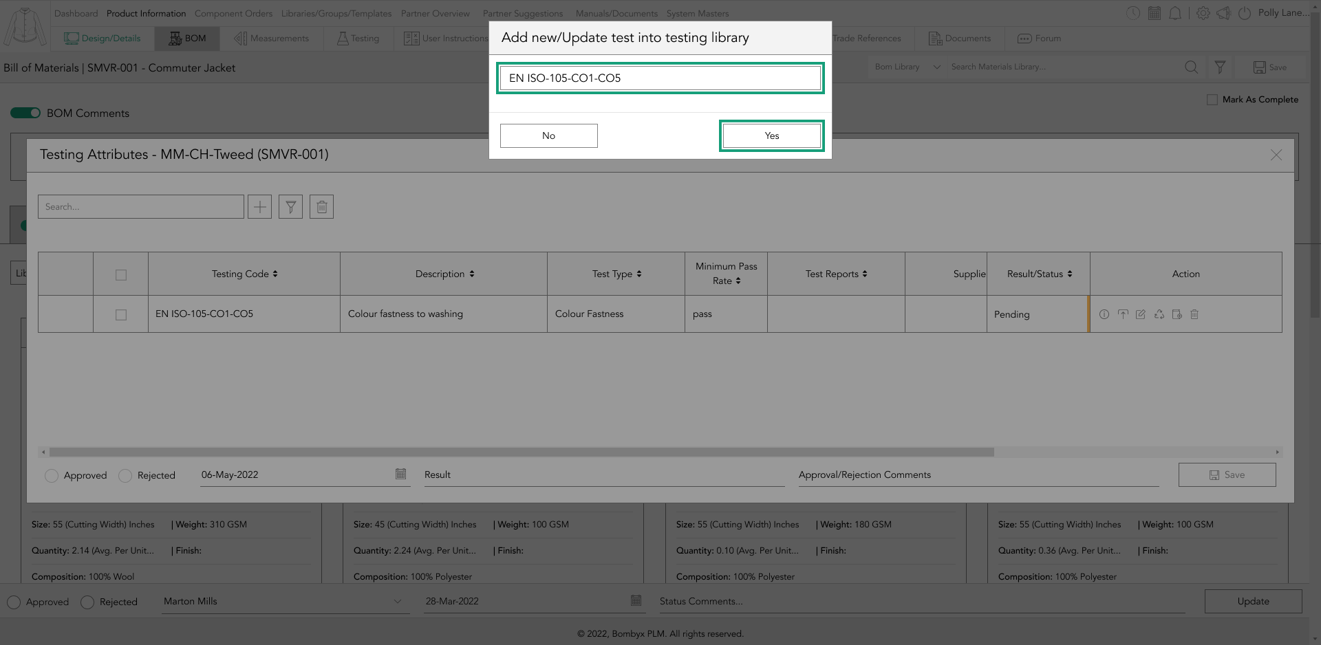
Once you tap the icon, a popup will appear with the testing reference number pre-filled. Then, tap the update button to apply the new details to the library.
This will ensure that the updated testing requirements/reports are available to be assigned to other products in the future.
created and modified
By hovering over the information icon in the Action panel, you can view who uploaded or modified the BOM component. This will show the details of when the component was uploaded and by whom, including the date and time.
Additionally, it will display the last modification date and time, along with the name of the person who made the changes.
approving/rejecting component testing
To approve or reject a component’s testing requirements/reports, start by selecting the checkboxes down the left side of the table. Then, select approve or reject from the footer of the popup.
Once you've done that, you can add the approval date and the result to complete the process.
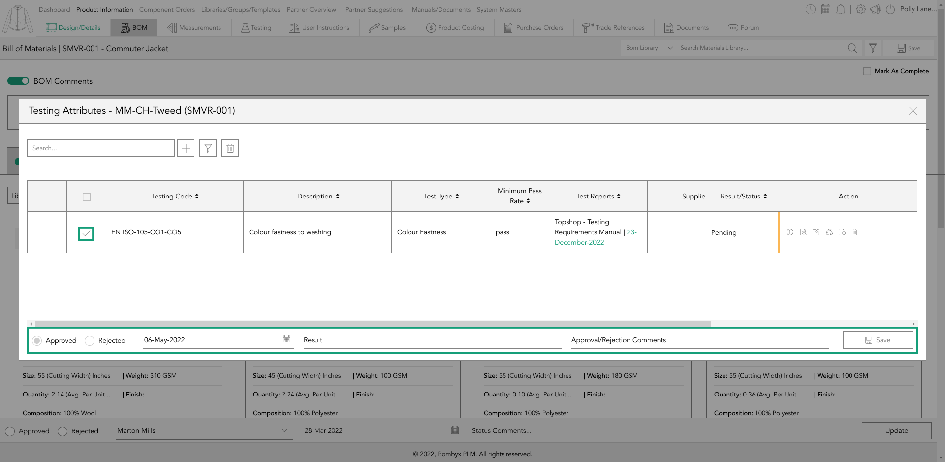
If you want to provide additional information to your suppliers and team, you can make a comment, but it is optional. When you have entered all the necessary information, simply tap the update button to save the changes.

Beyond the Label: Diving into the Sustainable Story with Digital Product Passports
Consumers today are increasingly concerned about the environmental and social impact of their purchases. From the food they eat.
Bombyx’s AI Integration: Advancing Business Excellence in PLM, PIM, and DAM Systems
Let's delve into the exciting realm of Artificial Intelligence (AI) undergoing a transformative evolution. As we Enter the year 2024.

Beyond Baubles: A Stylish Dive into Christmas Fashion Trends.
e explore the latest Christmas fashion trends, with a focus on achieving a harmonious balance between sophistication and comfort. From luxurious velvets to cosy knits

Streamlining Winter Fashion with PLM: Managing Seasonal Changes
Winter fashion production demands meticulous planning and execution. PLM serves as a guiding force in production management, aiding in resource allocation, scheduling

Christmas Experience through Digital Transformation
During the Autumn/Winter months in Europe and the USA, are marked by heightened activity. The festive season introduces an atmosphere of joy and unity. Amidst the era of digital in
Demanding Trends & The Transformative Power of Product Lifecycle Management
Explore how strategic Product Lifecycle Management (PLM) empowers fashion to navigate trends sustainably. This post delves into the symbiosis of trends and sustainability,
The Power of Product Information Management (PIM) With a PLM System.
In today's fast-paced business environment, effective product information management is crucial for success. Product Information Management (PIM) is a powerful tool.

Fashion and the Power of Product Lifecycle Management
In recent years, the fashion industry has witnessed a surge in fashion, a phenomenon characterised by the rapid production and consumption of inexpensive clothing... and a whole l
Supply Chain Management has Forever Changed
Brands make use of product lifecycle data analysis to help them work out price points, marketing and advertising strategies, packaging, growth and expansion… and a whole lot more